Choose the right place card format for your table
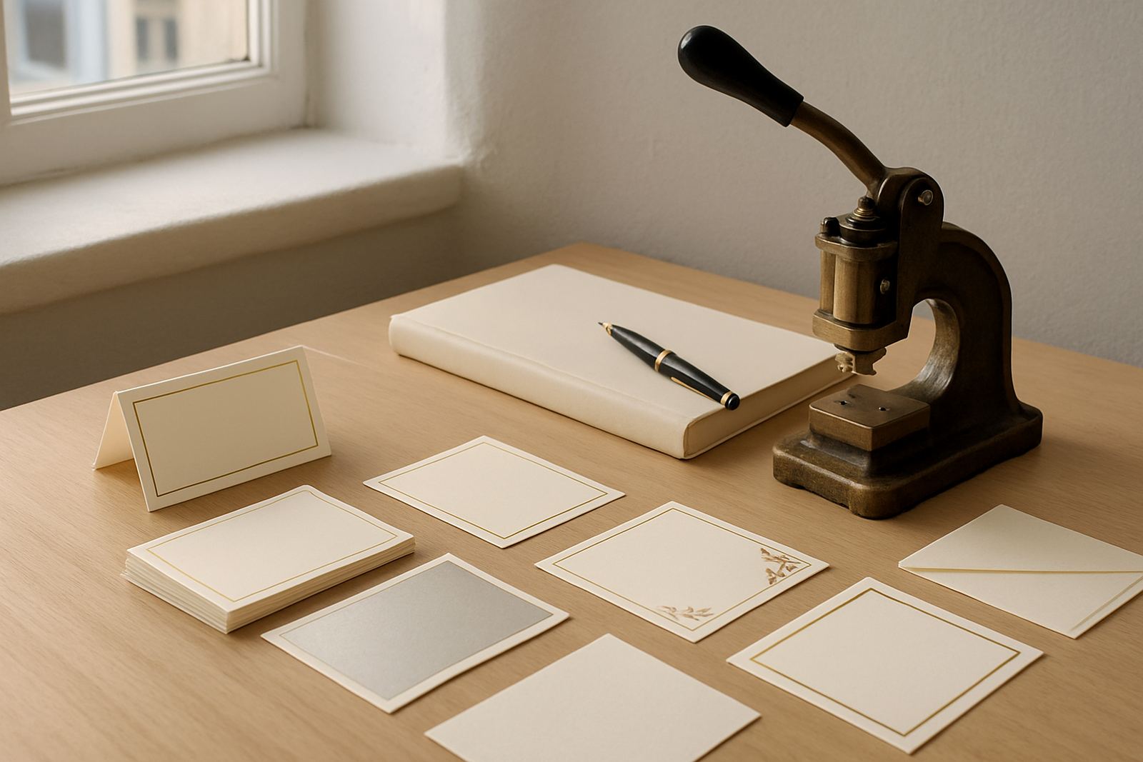
When clients in Cape Town ask about place cards, the first question is usually not about foil or colour, it is about format. Folded, flat and shaped cards each work differently on the table, and the right choice depends on your linen, glassware, menu cards and the amount of information you need to show.
Folded place cards stand up on their own, which is useful for round tables, long family tables and venues where settings are changed at the last minute. Flat cards sit neatly beside a charger plate or napkin and give a lighter look. Shaped cards add a more decorative finish, but they need careful sizing so they do not get lost among cutlery and glass. In a summer wedding in Woodstock, a simple folded card often works better than a heavy shape because the wind and the rush of service can make a flatter, more secure format easier to manage.
- Folded cards suit formal dining and easy visibility
- Flat cards work well with layered table settings
- Shaped cards suit themed or highly personal stationery
Folded place cards for a classic, upright look
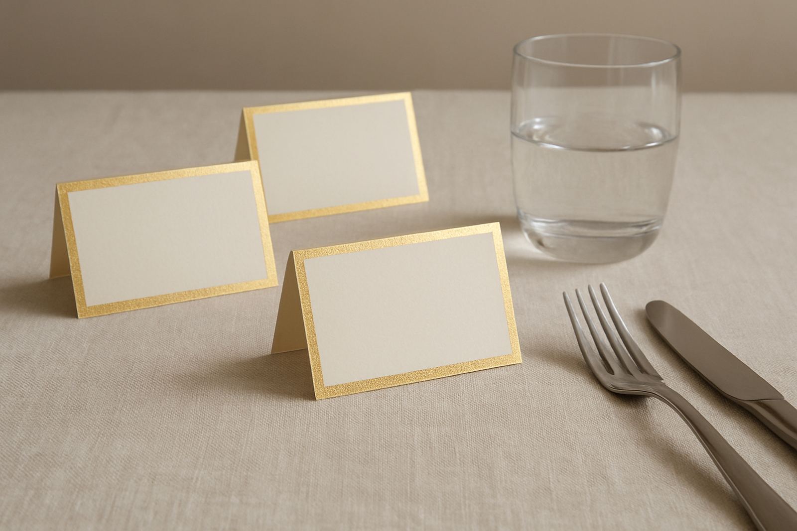
Folded place cards are a steady favourite because they are practical. They can be printed on both sides, scored neatly and placed directly above the cutlery or on the side of a napkin. For weddings, they also create a clear little focal point without taking over the table. If the reception is in Stellenbosch or Paarl, where guest lists often include many family groups and seating changes late in the week, folded cards make it easier to update names without changing the whole table plan.
They also give you more room for detail. A guest name on the front and a menu note, table number or short thank-you line inside can be helpful for events where the table setting needs to do more than one job. We often suggest a heavier stock for this option, especially for venues near the coast where humidity can cause lighter paper to curl. A thicker card holds its shape better and feels more considered in hand.
- Best for formal weddings, corporate dinners and structured seating
- Works well with foil stamping, letterpress or simple typography
- Can include a second line of information inside
Flat place cards for clean, modern table styling
Flat place cards are small, neat and easy to place, which makes them ideal for modern layouts. They can be tucked under a napkin fold, set on a plate, or layered with a menu card for a sharper look. This style is popular for events where the table already carries strong visual elements, such as patterned linen, coloured glassware or a floral runner. You do not want the place card to fight with the rest of the setting.
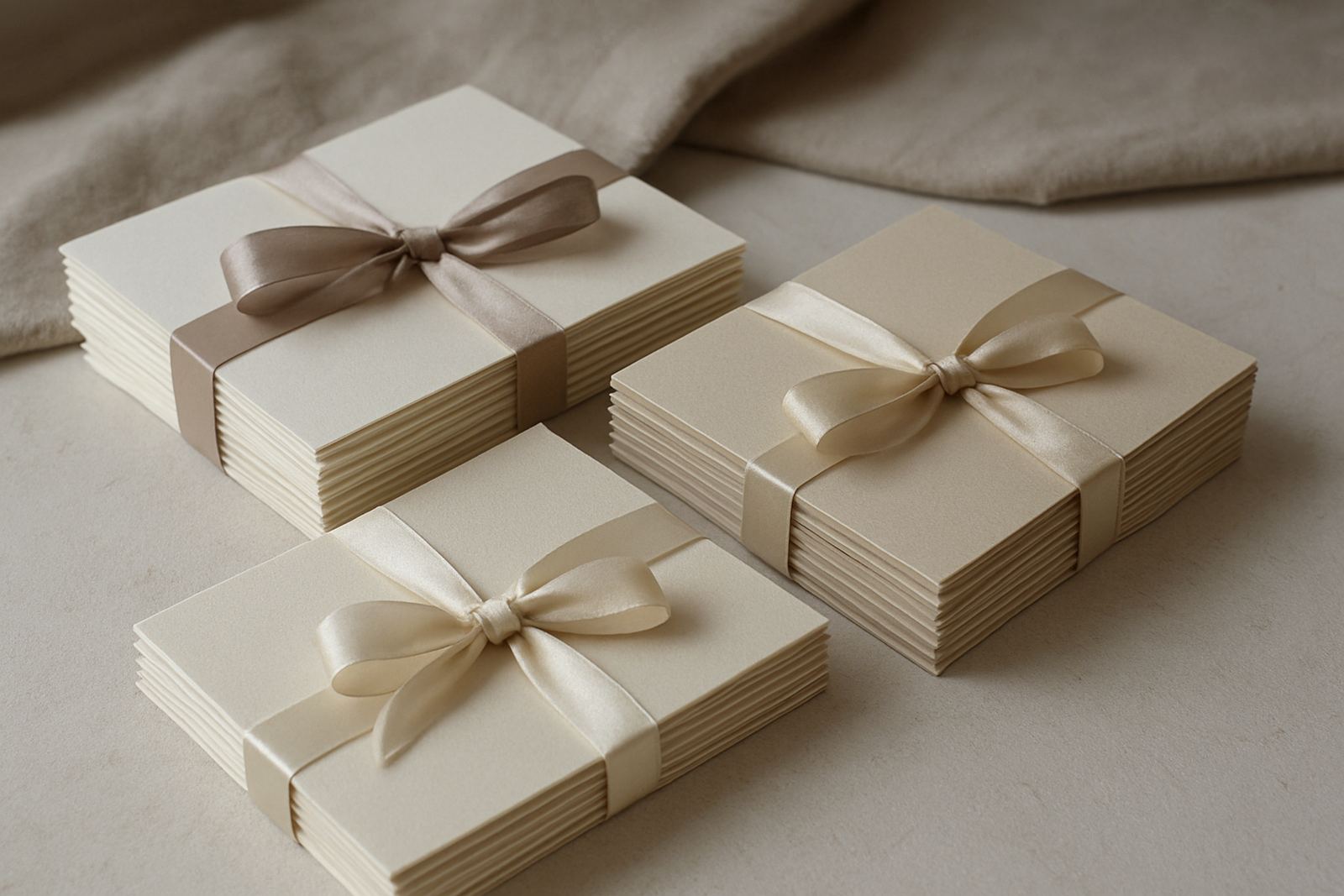
For many Cape Town events, flat cards are also a practical couriered stationery choice because they pack well and arrive in good condition when bundled carefully with the rest of the suite. They can be cut square, rectangular or with softly rounded corners. If you are planning a lunch at a Constantia estate or a small dinner in the Southern Suburbs, a flat card with foil stamping can give you that polished finish without feeling too formal. The trick is to keep the wording short and the spacing generous so the card does not look crowded.
- Good for layered settings and contemporary table plans
- Easy to pair with menus, napkins and wax seal details
- Useful when you want the name to sit quietly in the overall design
Shaped place cards that add character without clutter
Shaped place cards are often chosen by couples who want something a little different but still tasteful. Arch shapes, rounded tops, scallops and custom silhouettes can echo elements from the invitation suite or the venue architecture. The key is balance. A shaped card should feel intentional, not busy. Too much detail in a small format can make the card hard to read and less useful at the table.
We usually recommend shaped cards when the rest of the stationery is relatively simple. That way the form can carry the style while the print stays clear. For example, a pale ivory arch card with a name in gold foil works neatly for a winter wedding in Somerset West, especially if the table decor has candles and muted flowers. Shaped cards also photograph well, which matters when the table setting has been planned as carefully as the dress code. Just make sure the base is stable enough if the card needs to stand upright, otherwise it can lean and look untidy.
- Arch and rounded shapes suit soft, romantic layouts
- Custom cuts work best when the rest of the suite is simple
- Legibility matters more than novelty
Paper, foil and colour choices that suit South African venues
Paper choice makes a bigger difference than many people expect. In Cape Town, especially where couriered stationery may travel to the Atlantic Seaboard, Northern Suburbs or further inland, the card needs to travel well and still look crisp on arrival. A good stock will hold a clean score, resist slight bends and carry foil stamping without patchy edges. For outdoor events, a slightly heavier card is usually safer because it is less likely to slip or lift in the wind.
Colour also needs practical thought. White and soft cream remain popular because they work with almost any flowers or linen, but warm neutrals, muted blush and pale grey can be useful when the table scheme needs more depth. Metallic foil can be very effective, but it should support the palette rather than take over. A small amount of gold, copper or silver can lift the design, while still feeling restrained. The important thing is that the place card can be read at a glance. If the guest can not find their name quickly, the styling has not done its job.
We also advise checking the venue lighting. What looks subtle in daylight can appear brighter under candles or low indoor lighting. That matters at evening receptions where guests move between the bar, dance floor and seating area. Small choices like this save time on the day and avoid last minute confusion.
How to match place cards with menus, envelopes and table details
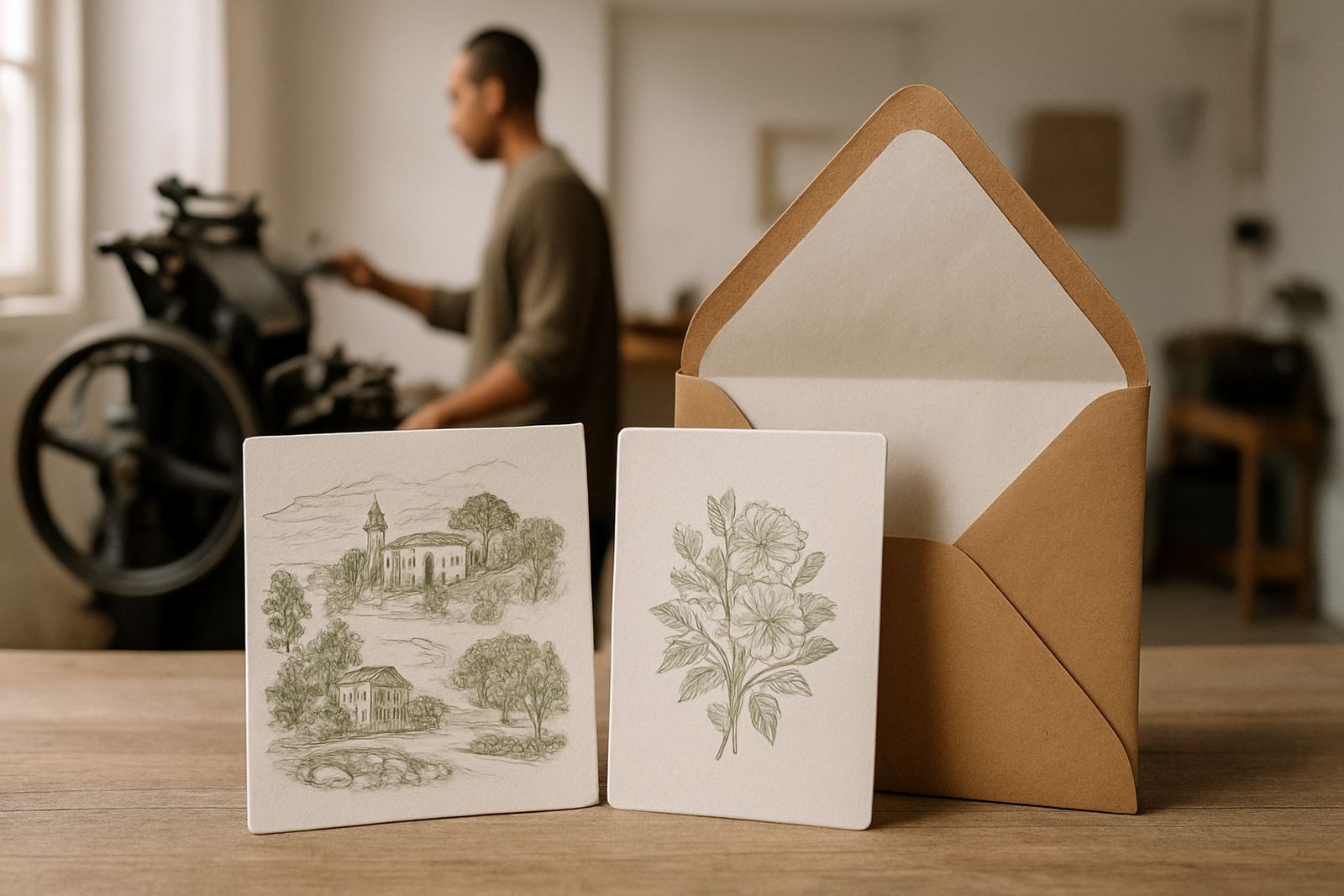
Place cards work best when they are part of the whole table story. If the invitation suite used letterpress finishing, a matching card stock or similar edge treatment helps the setting feel connected. If envelopes were addressed in a flowing script, the place cards can carry a simpler name style so the table remains clear. This is where colour matching and artwork proofing matter, because a slight mismatch can be more noticeable once all the pieces are on the table together.
For events with gift packaging or welcome items, the place card can also double as a small keepsake. Some clients use them to tie in a wax seal, ribbon or a tiny thank-you note. That said, the card still has a main job, which is to guide seating. Keep the name readable first, then add extra detail only if there is space. A crowded card is difficult for guests and can look fussy. In practice, the best designs are often the simplest ones.
- Match paper tone across invitation, menu and place card
- Use one main typographic style for clear reading
- Add extras only when there is space to breathe
A simple local example for a Woodstock reception
Picture a wedding reception in Woodstock with long tables, candles in glass sleeves and low seasonal flowers. The couple wants a warm, elegant look that still feels relaxed enough for a Cape Town crowd. In that setting, a folded place card in ivory stock with a soft gold foil name would sit well beside a linen napkin and a small menu card. If the reception is later in the day and the venue has mixed indoor and outdoor areas, the upright format helps guests find their seats quickly as they arrive.
For a smaller dinner in the Southern Suburbs, the same couple might choose a flat card instead, tucked under the napkin with a narrower table layout. The change is simple, but it changes the tone of the table. That is why place card styles should always be chosen with the venue in mind, not only the colour scheme. A good card does not just look pretty, it fits the way people will actually use the table. That practical bit is what makes the whole setting feel calm and ordered, even when the day itself is busy.