A gentle brief for a modern Bellville celebration
The client, a Bellville family planning a baby shower for a close relative, wanted stationery that felt warm, refined and appropriate for a mixed-age gathering. They were not after anything overly themed or pastel-heavy. Instead, the direction was soft neutrals, clean type, and a layout that would still feel special when tucked into a handbag or placed with a gift. The event was being hosted in Bellville, with guests coming from across the Northern Suburbs, so the invitation had to be easy to read at a glance.
They also needed the set to work for both hand delivery and couriered posting. That meant we kept the format practical, with sturdy stock, envelopes that held their shape, and finishes that would not scuff easily in transit. We have found that with baby showers, the stationery often sets the tone for the whole day, so even a simple piece needs to feel considered.
Paper, foil and finishing choices that suited the brief
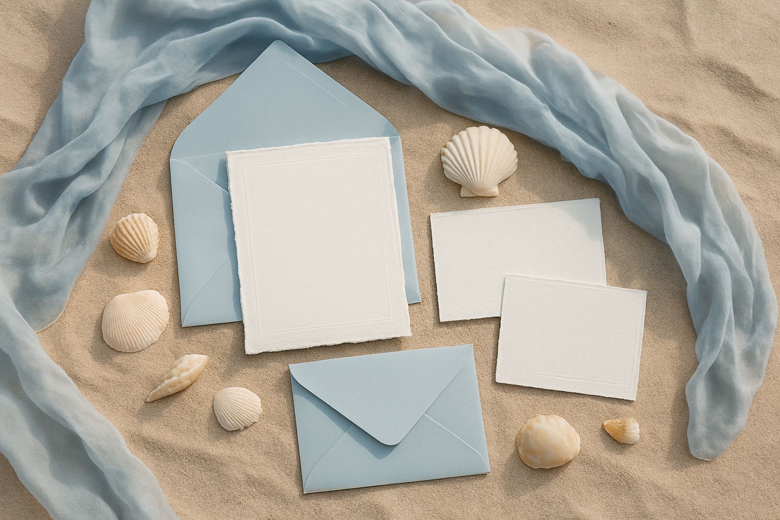
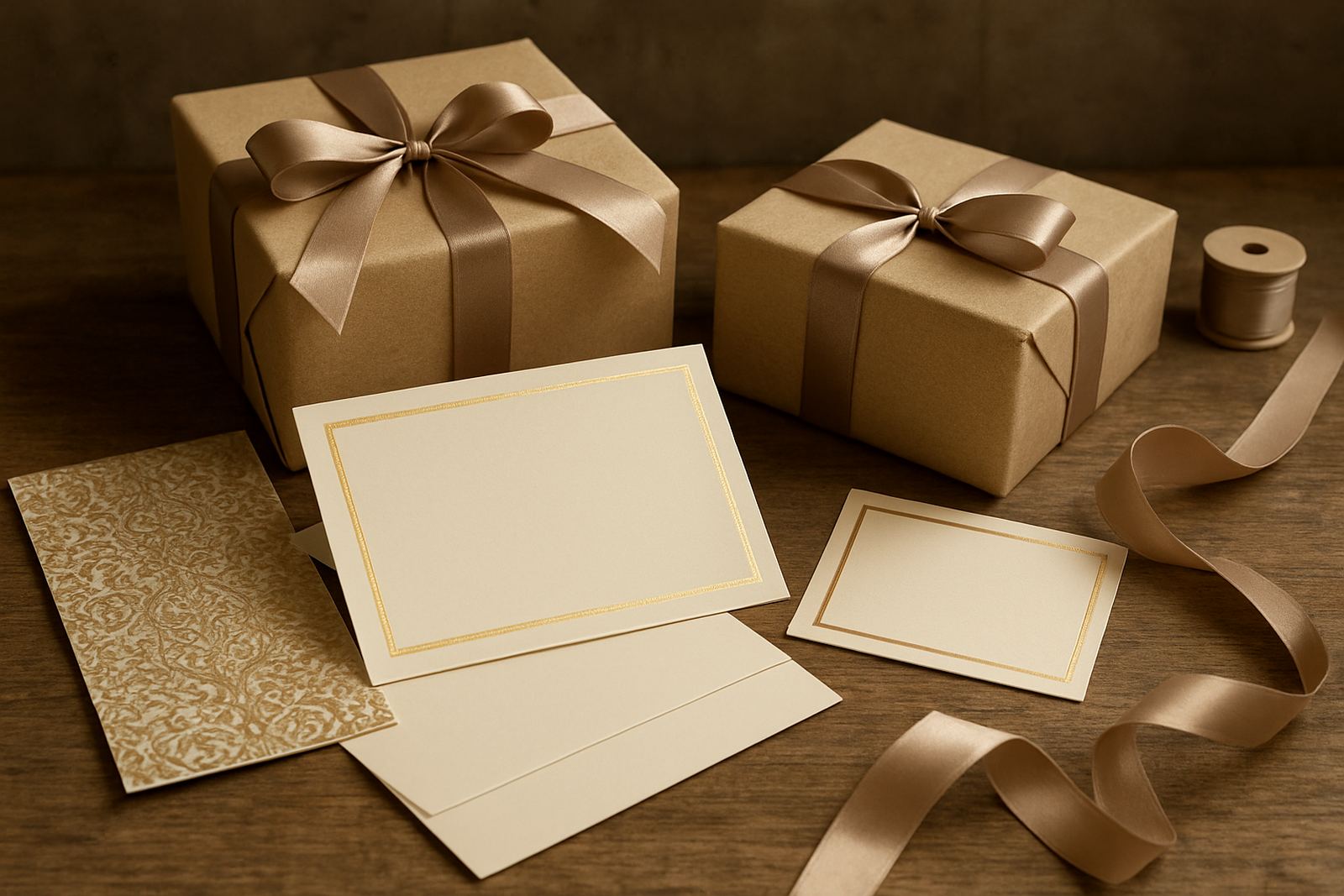
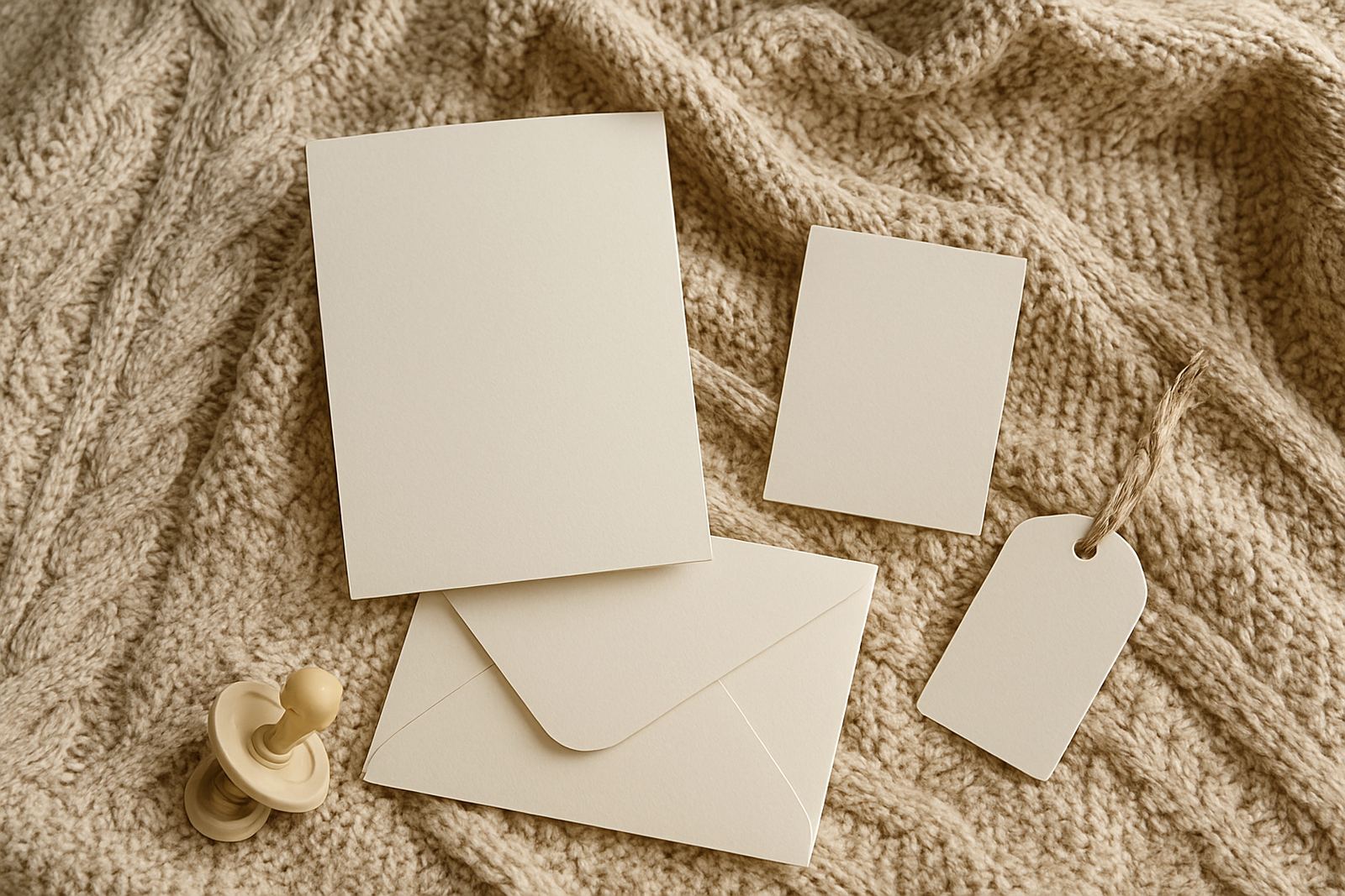
We supplied a custom invitation suite with a soft neutral palette, combining warm ivory, muted beige and a fine metallic foil detail. The main invitation was printed on a premium heavyweight board, with a matching envelope and a small insert for venue and RSVP details. The foil detail was kept light and precise rather than full coverage, which gave the piece a calmer feel and helped the wording stay readable.
- Invitation size: 148 mm x 210 mm
- Stock: 350 gsm premium textured board
- Foil finish: warm metallic foil on names and heading
- Envelope size: 162 mm x 229 mm
- Insert card: venue and event details, 105 mm x 148 mm
The client wanted the paper to feel substantial in the hand, and the textured surface worked well with the foil. It caught the light without becoming shiny or flashy. We also matched the envelope colour to the card stock so the suite felt cohensive from the moment it was opened.
Artwork proofing and wording checks before print
The wording for a baby shower has to be accurate, because there is usually a venue, a date, a time and sometimes gift guidance or RSVP notes that need to be crystal clear. We prepared artwork proofs for review and made a few small adjustments to spacing and line breaks so the page would sit neatly once printed. The client also asked for a gentle balance between formal and friendly language, which suited the overall feel of the event.
Before going to print, we checked the names, event timing, and venue details twice. We also made sure the typography remained legible on the soft-toned paper. For this project, the smallest changes made the biggest difference, especially around the foil placement and the margin around the text block.
- Proof rounds: 2
- Estimated production window: 2 weeks
- Final sign-off: after wording, layout and finish approval
Assembly, addressing and courier-ready presentation
Because some guests were receiving their invitations outside Bellville, we completed the suite with envelope addressing and careful assembly. Each invitation was checked, inserted and packed so it could travel safely without dented corners or marked surfaces. In Cape Town, and especially during busy event seasons, courier handling can be rough on lighter stationery, so we keep the presentation practical from the start.
We also prepared the stationery for the client’s handover in a tidy, grouped format. That made it easier for them to distribute the invitations locally and post the rest nationwide. The final result was neat enough for gifting, which matters with baby shower stationery because the invitation often becomes part of the keepsake box.
What the client received and how it worked on the day
The completed stationery set gave the client a polished invitation that matched the mood of the celebration without overpowering it. It set a calm, thoughtful tone, and guests responded well to the understated finish. The neutral palette also meant the invitation suited both the mother-to-be and the wider family, which was important for this event.
From a practical point of view, the set was easy to distribute and strong enough for couriering. There were no issues with the foil rubbing off, and the inserts stayed aligned during packing. For us, that is always a good sign, because the best stationery should look just as neat after transit as it did leaving the studio.
- Result: refined, readable invitation with a soft celebratory feel
- Best suited for: modern baby showers, intimate family events, gender-neutral themes
- Durability: suitable for courier and hand delivery
What we would repeat for a similar Bellville project
For this Bellville baby shower, we would still choose restrained colour, strong paper weight and one focused foil detail.: restrained colour, strong paper weight, and a focused foil detail. For baby shower work, it is often better to keep the visual language simple and let the materials do the talking. The texture, the foil and the print quality carry much of the character, so there is no need to overload the design.
For a similar Bellville event, we would again recommend a two-week timeline from approved artwork to final handover. That gives enough space for proofing, finishing and packing, and it allows for any small wording adjustments that are often needed once the host finalises the guest list. It also leaves room for local courier collection or direct studio pick-up in Woodstock, depending on the client’s plan.
At Foil Stamping Studio, projects like this are the kind we know well: thoughtful stationery, careful finishing, and no shortcuts in the last mile. The final piece may look simple at first glance, but the making behind it is exacting, and that is what gives it its value.
Key facts
| Project | Bellville Baby Shower |
|---|---|
| Client type | Private family baby shower in Bellville |
| Location | Bellville, Cape Town |
| Timeline | 2 weeks from proof approval to final handover |
| Core finishes | Foil stamping, artwork proofing, envelope addressing |
| Delivery | Couriered nationwide and local handover from Woodstock |