A formal lunch in Milnerton needed a careful first impression
The client was a local fundraising committee in Milnerton planning a charity lunch at a coastal venue with mixed seating, sponsor recognition and a fixed RSVP window. The brief was simple in principle but exacting in practice: the invitation had to feel refined, the wording had to remain clear, and the table cards needed to sit neatly alongside floral arrangements, glassware and sponsor materials without looking crowded. Because the luncheon was being used to raise funds and thank supporters, presentation mattered just as much as function.
Milnerton events often have a practical side to them. Guests may be coming from the Northern Suburbs, the Atlantic Seaboard or Stellenbosch, and organisers still need print pieces that can travel well, read well and hold their shape after courier handling. We planned the stationery around that reality, not just around appearance. The result was formal, tidy and easy for the event team to manage on the day.
- Event type: fundraising luncheon
- Area: Milnerton, Cape Town
- Deliverables: invitations, table cards, envelope addressing and assembly
- Style: polished, restrained, charitable event presentation
The brief: elegant, readable and ready for sponsor names
The organiser wanted a look that felt special without drifting into anything overly ornate. The luncheon honoured donors and guests, so the stationery had to be respectful and composed. We recommended a white and soft metallic palette with foil accents for the invitation title and key wording, then kept the supporting text in a clean layout for easy reading. That balance worked well for a mixed-age guest list and for sponsors whose names needed to be shown clearly.
A second part of the brief was flexibility. Final sponsor details were still being confirmed, and the seating plan changed twice during production. We allowed for proof rounds so the client could check spellings, table allocations and the exact order of acknowledgements. It saved time later and reduced the chance of awkward reprints.
- Foil-stamped invitation cards
- Guest name and table number cards
- Envelope addressing and insert collation
- Proofing for sponsor and guest details
Paper, foil and finishing choices that held up well
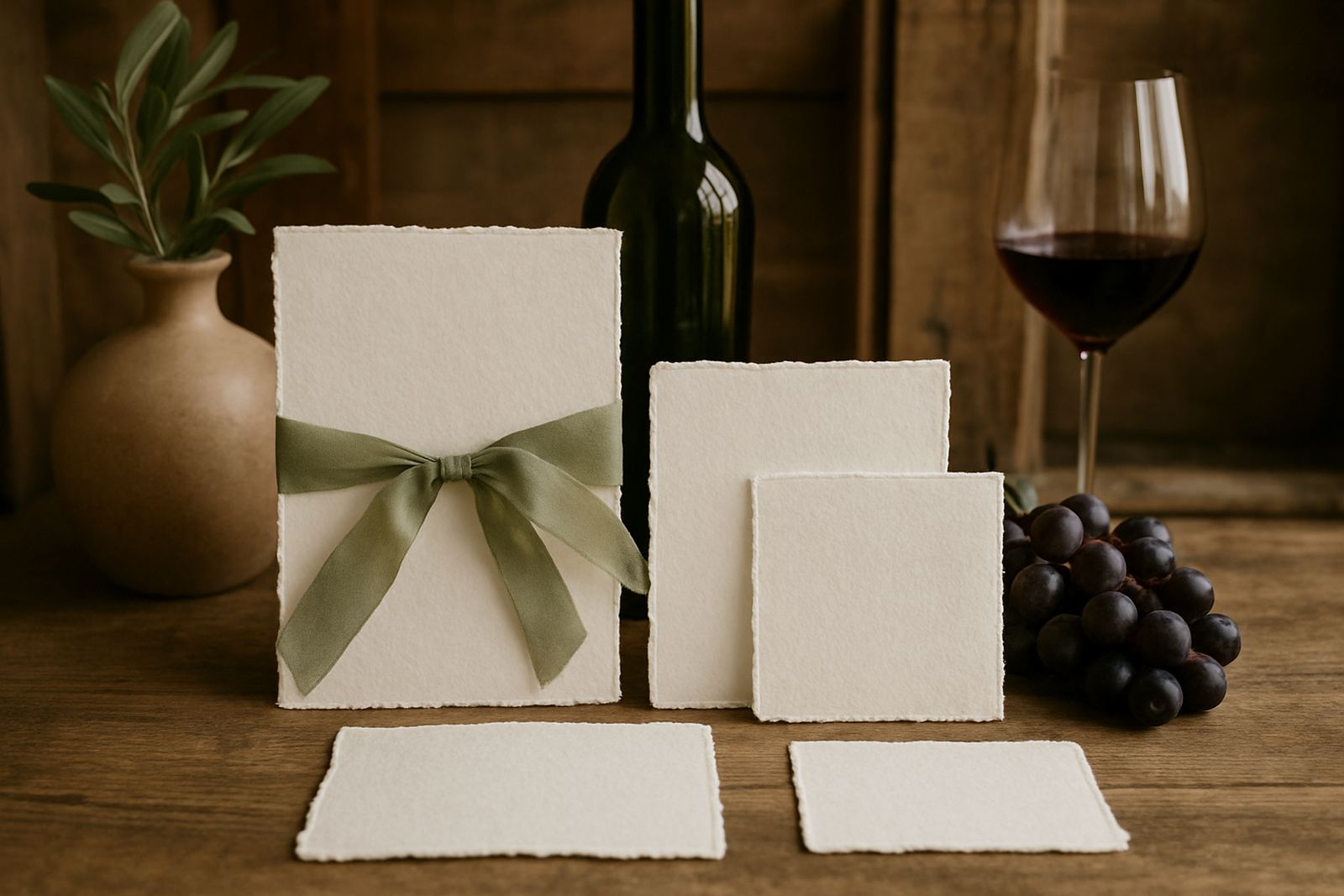
For this project we used a heavier paper stock to give the invitation proper hand-feel and to avoid curling after opening. The table cards were made on a matching stock with a sturdy fold so they would stay upright through a full luncheon service. In Cape Town, especially near the coast, paper choice matters because humidity can cause lighter boards to soften. We kept the material selection practical and avoided anything too delicate.
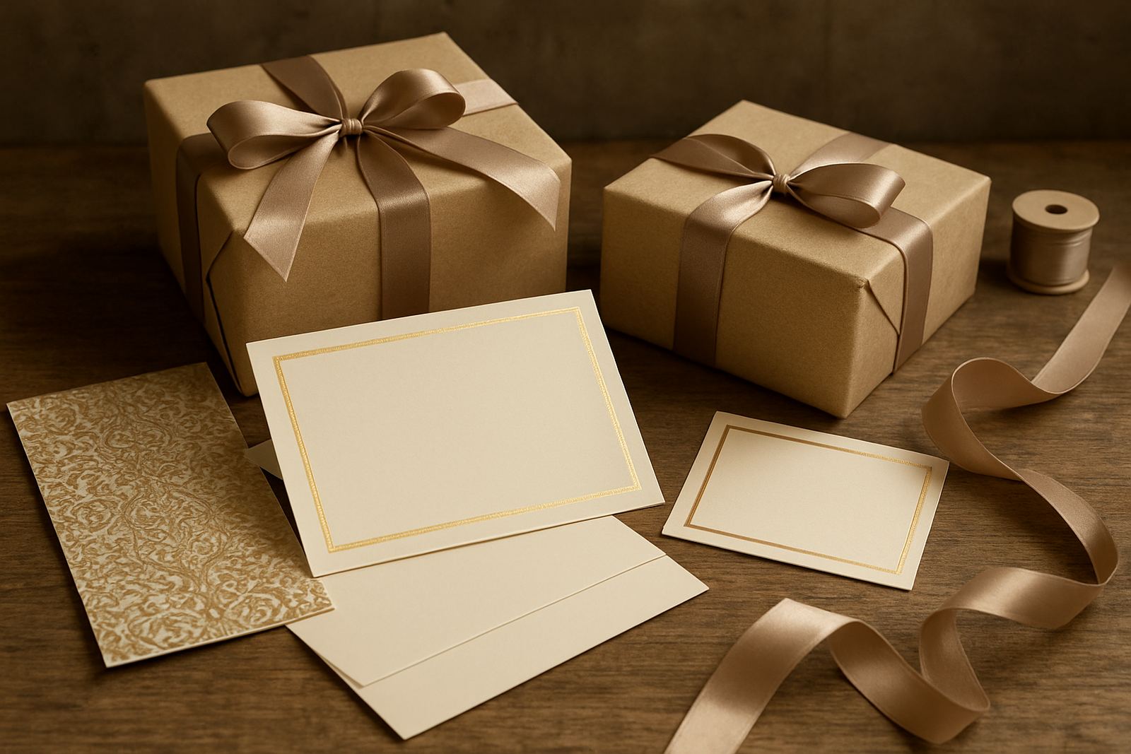
The foil finish was used sparingly, which is often the better choice for charity events. A controlled metallic detail on the title and a small accent line gave the suite a quiet shine without overpowering the event’s message. The envelope addressing was matched to the overall look so the outer presentation felt considered from the moment guests received it.
- Invitation size: A5 flat card
- Table cards: tent fold, approx. 90 x 50 mm when folded
- Paper stock: heavy matte board suitable for foiling
- Finish: metallic foil accent with clean typographic layout
From artwork proofing to final assembly in three weeks
The full turnaround ran over three weeks. Week one covered layout, wording checks and the first artwork proof. Week two was used for revisions, colour matching and production sign-off. Week three covered foiling, trimming, envelope addressing, sorting and final pack-out for collection and delivery. That schedule gave the committee enough time to review sponsor details without pushing the print stage into a rush job.
Because event stationery can change close to print day, we kept the workflow tight and practical. Reece handled client coordination, Anke checked design consistency, and Lwazi oversaw production so the foil impression stayed even across the run. Nolwazi completed the finishing and collation, which included table card folding and pack sequencing. It was a straightforward job on paper, but the moving parts needed careful attention.
- Timeline: 3 weeks total
- Proof rounds: 2 rounds before sign-off
- Production: foiling, trimming, folding and collation
- Final pack-out: sorted for event setup and guest dispatch
What the luncheon stationery achieved on the day
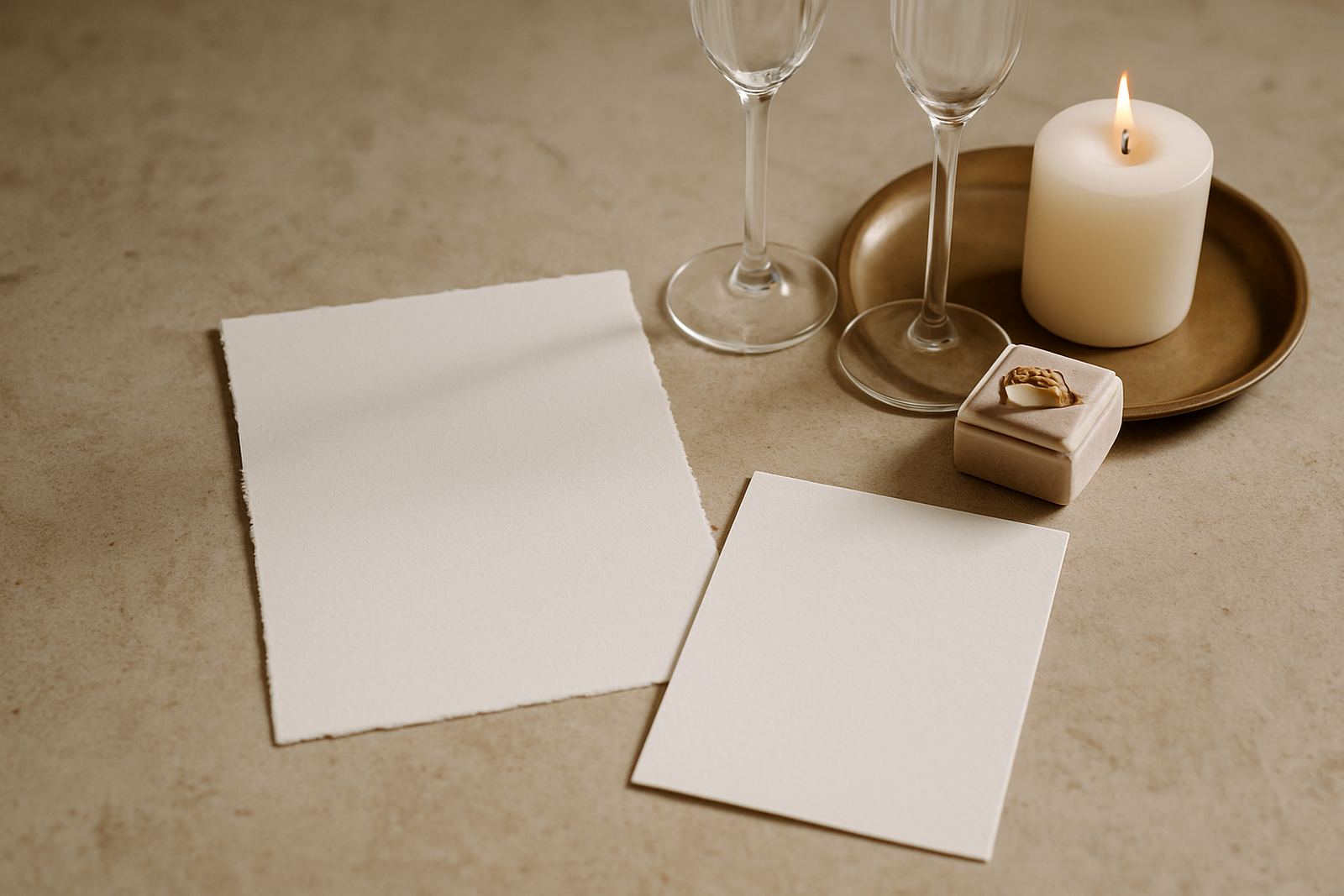
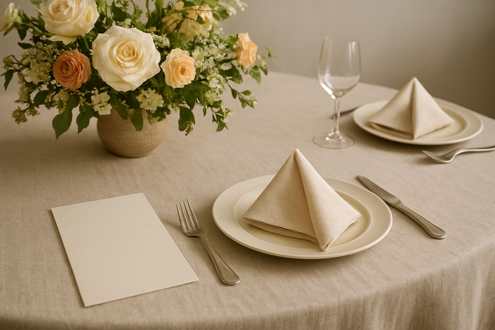
The stationery gave the luncheon a calm, organised feel from the first guest arrival through to table seating. The invitations arrived looking formal and consistent, which helped set expectations for the event before anyone entered the room. The table cards were easy to place and easy to read, which matters more than people think once service begins and staff are moving between tables. The organiser told us the suite helped them feel more in control, especially when last-minute guest updates came in and the seating plan had to be adjusted just a bit.
For a charity event, that kind of support matters. The stationery was not only decorative. It helped the event team communicate clearly, thank supporters properly and keep the room looking orderly throughout the lunch. It also photographed well, which is useful when sponsors later need images for reports or social media posts.
- Clear table identification for guest seating
- Consistent sponsor acknowledgement
- Formal presentation that suited the venue
- Photographic results that held detail well
What we would do again for a similar charity lunch
We would take the same approach again for another Milnerton fundraiser or similar luncheon in the Cape Town area. Keep the palette restrained, keep the typography readable and allow room for sponsor details to settle before print. For events that rely on donations and good will, the stationery should support the message rather than compete with it. That means solid paper choices, a measured foil finish and a production plan that leaves space for final checks.
We would also repeat the courier and pack strategy. When stationery is going to multiple hands, whether in the Southern Suburbs, on the Atlantic Seaboard or further afield to Paarl or Somerset West, it needs to be clearly sorted and protected. A little extra time in assembly saves a lot of stress later. That was definately true here, and it is the same for most charity events we handle.
For enquiries on similar fundraising lunches, clients reach us through the enquiry form on our contact page. We work from Woodstock, Cape Town and courier stationery nationwide.
Key facts
| Client type | Charity fundraising committee |
|---|---|
| Location | Milnerton, Cape Town |
| Deliverables | Foil-stamped invitations, table cards, envelope addressing, suite assembly |
| Paper stock | Heavy matte board chosen for a crisp finish and better handling |
| Timeline | 3 weeks from brief to final pack-out |
| Service area | Woodstock Studio, Cape Town Service and nationwide courier delivery |