Brief for a Formal Winelands Celebration
The client was a private couple planning a formal estate wedding in Stellenbosch, with guests travelling from Cape Town, Johannesburg and a few coastal towns. They wanted stationery that felt refined but not fussy, with a clear sense of occasion from the first envelope opened.
The brief called for layered invitation pieces, a strong foil finish and wording that suited a classic winelands setting. The couple had a defined colour palette already in mind, and they needed the paper and finish to hold up well in summer heat, a few December delivery delays and the usual last minute guest list changes that come with a large family event.
What We Planned and Supplied
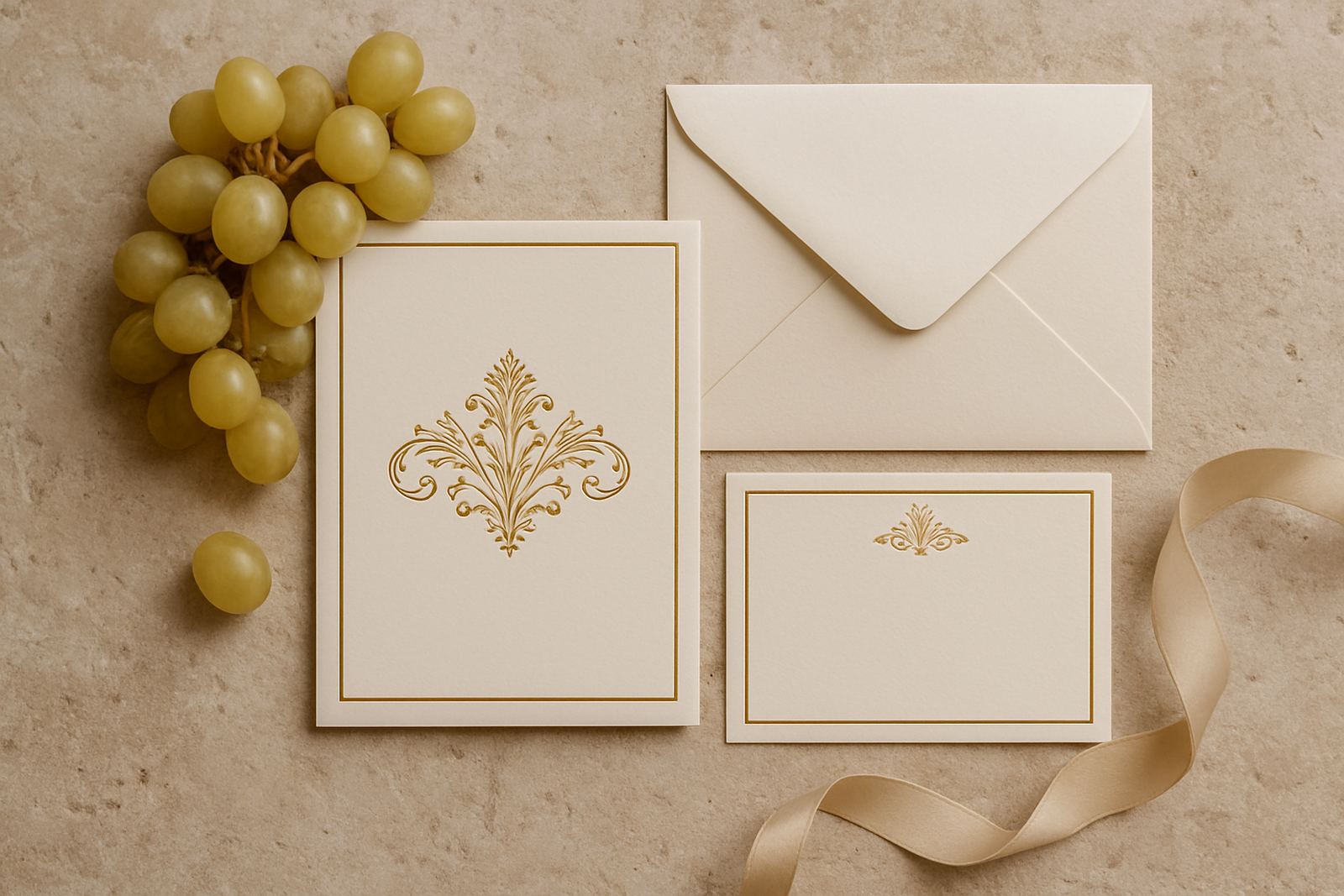
We built the suite around a main invitation card, a details card, an RSVP insert and an outer envelope with matching addressing. The pieces were sized for easy stacking, clean presentation and simple suite assembly, which mattered because the couple wanted a formal opening experience without bulky packaging.
- Main invitation card: 170 x 240 mm
- Details card: 120 x 170 mm
- RSVP insert: 105 x 148 mm
- Outer envelope: custom fit with foil addressed names
- Assembly: layered with enclosure order checked by hand
We supplied paper sourcing, colour matching, artwork proofing, foil stamping, envelope addressing and suite assembly. A small wax seal detail was added to the outer wrap for the final presentation, and the wording was kept crisp so the overall look stayed elegant.
Foil, Paper and Finish Choices
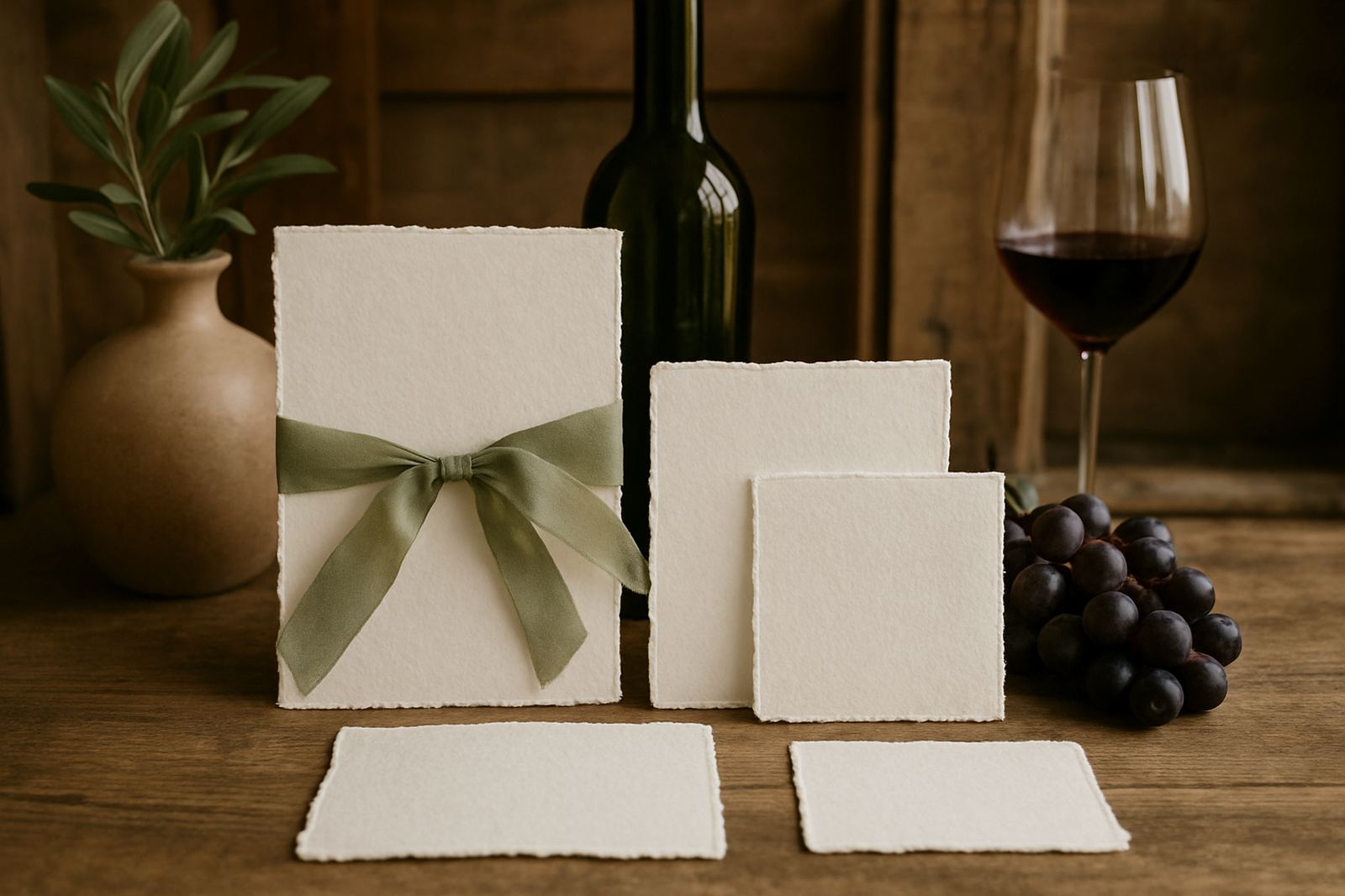
The couple wanted a finish that felt luxurious in person and photographed well in natural light. We used a warm metallic foil on a smooth card stock, then paired it with a soft textured insert paper to give contrast without making the suite feel heavy. The paper weight was chosen to avoid bending in the courier bags and to survive handling during on-site setup.
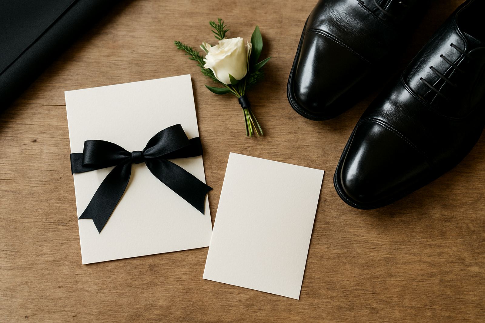
For the colour direction, we matched a deep neutral base with a softer supporting tone that worked against linen tablecloths, stone walls and vineyard greenery. That balance mattered because the stationery had to suit both the ceremony setting and the reception tables, where it was also used in smaller day-of pieces. We kept the palette controlled, with just enough shine to catch light but not so much that it overpowered the floral work.
Proofing, Timing and Production Control
The full project ran over three weeks from first brief to final dispatch. Week one covered artwork setup, wording checks and proof approval. Week two was used for foil stamping, cutting and addressing. Week three was set aside for assembly, sealing and courier coordination to both local and out-of-town guests.
There were a few practical constraints. The guest list changed twice, one delivery was needed for a family member in the Northern Suburbs and the main suite had to stay consistent across all pieces even when the RSVP wording shifted. We kept one production file only, with controlled changes, so the final print run stayed accurate and the schedule did not slip.
- Proof rounds completed: 2
- Production window: 3 weeks
- Courier split: local handover plus nationwide dispatch
- Final check: name spelling, envelope sequence and insert order
How the Suite Performed on the Day
The finished stationery gave the wedding a polished first impression and made the opening experience feel considered. Guests received a clear, elegant suite that was easy to read, easy to keep and suited to the formality of the estate. The couple used the same visual language again for smaller day stationery, so the tables and welcome area felt joined up rather than piecemeal.
From our side, the main success was consistency. The foil held clean edges, the colours stayed even across the batch and the assembled packs travelled well, even with the usual courier handling between Cape Town and other provinces. The suite also photographed well against the estate setting, which gave the couple useful images for their own keepsakes.
- Strong visual unity from invite to day-of pieces
- No visible marking from handling or transit
- Names and addressing remained consistent across the full run
What We Would Repeat for the Next Estate Wedding
We would use the same approach again for a Stellenbosch estate wedding or any formal winelands celebration: start with the venue mood, keep the wording tight, and let the paper carry the weight of the design. That gives the suite room to feel refined without needing unnecessary layers.
For a similar project, we would again recommend a controlled colour palette, a tactile insert stock and envelope addressing done before assembly. For couples planning from the Cape or further afield, this also makes revisions easier when guest lists change late. It is a practical way to keep everything moving, especially when load-shedding schedules and courier cut-offs can complicate production if the job is left too late.
If we were producing this suite again, we would keep the same format, adjust only the foil tone if the floral colours changed, and allow the same three week window so there is enough breathing space for proofing and final finishing.
Key facts
| Project type | Formal estate wedding stationery |
|---|---|
| Town | Stellenbosch |
| Studio base | Woodstock, Cape Town |
| Timeline | 3 weeks |
| Key finishes | Foil stamping, envelope addressing, wax seal finishing |
| Delivery | Couriered stationery nationwide |