A formal invitation for a memorable school evening
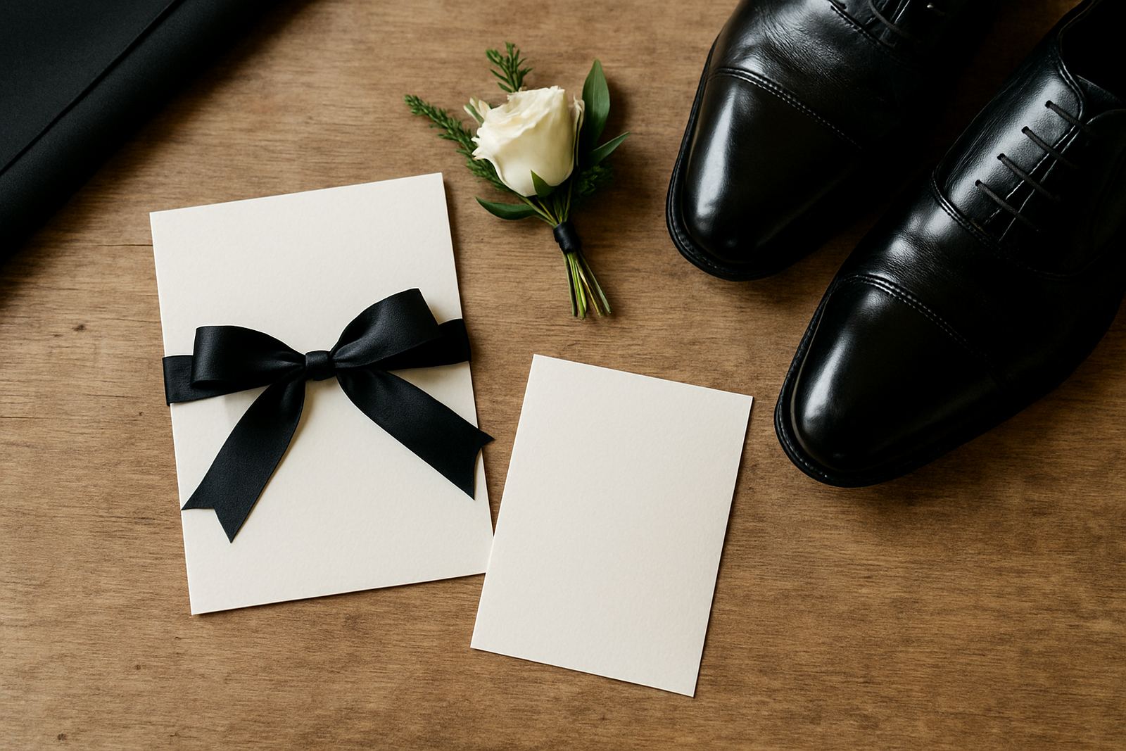
This project came from a school formal committee in Rondebosch looking for invitations that would feel refined without becoming overdone. The event had a classic evening dress code, so the stationery needed to reflect that same tone, with a strong first impression when parents and learners opened the envelope.
Because matric dances carry a lot of excitement, the invitation had to do more than share details. It had to set the mood for the night, confirm the venue and timing clearly, and still feel suitable for a mixed audience of teens, parents and staff. We worked with a neat layout, restrained ornamentation and a metallic foil detail that gave the pieces enough presence without losing clarity.
- Client type: school formal committee
- Area: Rondebosch, Cape Town
- Event: matric dance celebration
- Style direction: elegant, formal, easy to read
What the committee needed us to solve
The main brief was simple in principle but detailed in execution. The invitation had to look special, yet remain easy to produce in batches for a school event where names, RSVP details and logistics often shift during the planning phase. The committee wanted a design that could hold the key event information clearly and still leave space for the finer finishing touches.
We also needed to work around practical school constraints. There were approval steps, a limited lead time and the usual final changes that come with formal events. The invitation had to be durable enough for courier handling, elegant enough for hand delivery if needed, and consistent across every copy. That meant careful checking at each stage, because even a small alignment fault would stand out on a formal card.
- Need for a clean RSVP section
- Room for event details and dress code notes
- Consistent quality across the full print run
- Suitable for local distribution and couriering
Paper, foil and finishing choices
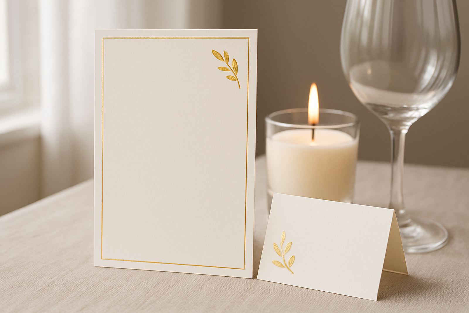
We supplied custom-designed invitations using a heavyweight textured board with a fine grain that supported the foil work neatly. The foil colour was selected to sit well against the background and lighting of an evening formal, so the final piece read as elegant rather than shiny. For a school event, that balance matters. Too little contrast and the details disappear; too much and it starts to feel loud.
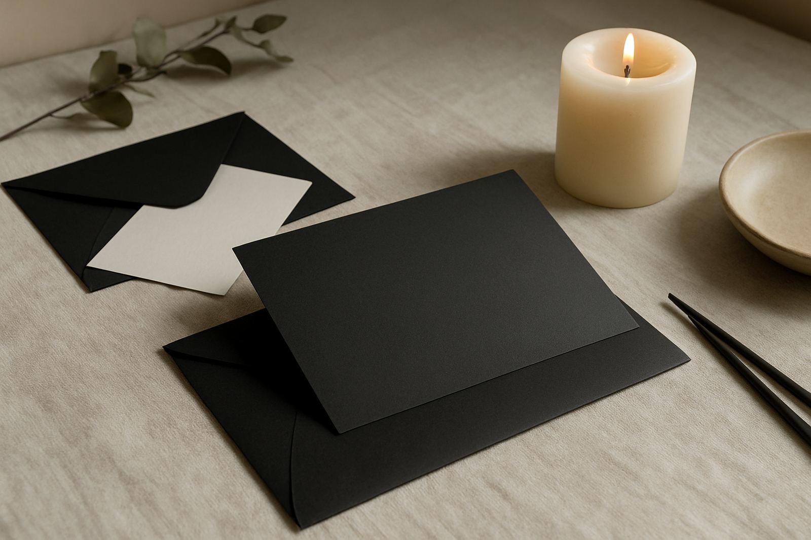
Along with the main invitation, we prepared coordinated envelopes and matching inserts so the pack felt complete. Addressing was handled with a neat, readable style that suited both parent delivery and handouts at school. The finishing included precise trimming, foil stamping and careful suite assembly, with each set checked before dispatch. We also kept the tactile side in mind, because a formal invitation should feel substantial in the hand, not flimsy or rushed.
Key specs for this project included invitation cards at A6 size, matching envelopes, single colour foil stamping and a set of supporting inserts for RSVP and event notes. The final packs were built for practical handling, with enough weight to feel premium but still easy to post or courier.
How the project moved from proof to delivery
For this Rondebosch school formal, the stationery moved from first enquiry to dispatch over three weeks. In week one we reviewed the brief, clarified the wording and developed the initial layout. Week two focused on proofing, where the committee checked names, event details and spacing, and we made the necessary adjustments before production. In week three we completed the foil stamping, trimming, assembly and final checks before handing the job to courier coordination.
This type of work depends on tight communication. The committee needed updates at the right moments, not constant back-and-forth, and we kept the process steady so decisions could be made quickly. One small typo in an RSVP line would have caused problems later, so the proof stage got proper attention. That saved time in the end, and kept the final result clean.
- Week 1: brief, wording and layout direction
- Week 2: proofing and corrections
- Week 3: production, assembly and dispatch
Why the finished set worked so well
The final invitations struck the right balance for a school formal in Rondebosch. They looked polished and occasion-ready, but they were still practical for the committee to issue in a controlled way. The foil detail gave the cards an elegant focal point, while the clear typography made sure the essentials were easy to follow for parents and learners alike.
From a production view, the consistency across the full run was important. Formal stationery only works if every piece feels part of the same set. Because the paper, foil and envelope choices were planned together, the invitation pack held together visually from the first card to the last. The result was something the school could send out with confidence, and the committee could stand behind.
- Strong visual impact without clutter
- Readable event information
- Consistent pack presentation
- Suitable for school approval and distribution
What we would repeat on a similar school event
If we were producing a similar formal again, we would keep the same method: start with the wording early, lock in the paper choice before the proof round and allow enough time for finishing and assembly. School events often change slightly right up to the last step, so building in a bit of breathing room helps a lot.
We would also repeat the approach of combining a restrained foil detail with a solid card stock. For a matric dance, that gives the invitation enough presence without making it difficult to handle or send. It’s a simple formula, but it works. And for a class event with multiple recipients, clarity and finish matter just as much as style.
The project showed why formal stationery still has a place in school celebrations. When the piece is handled properly from the outset, it becomes part of the event itself, not just a note with the details.