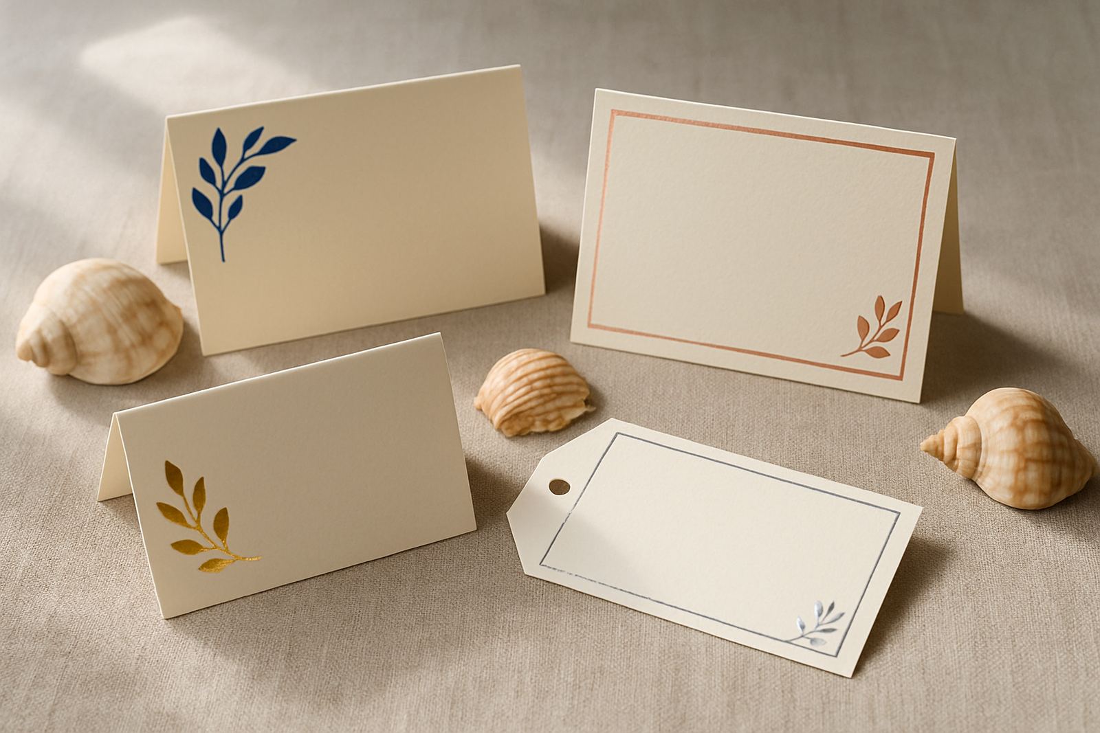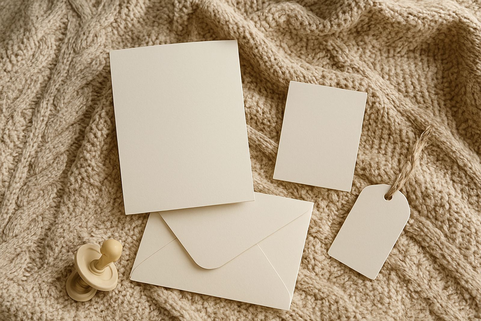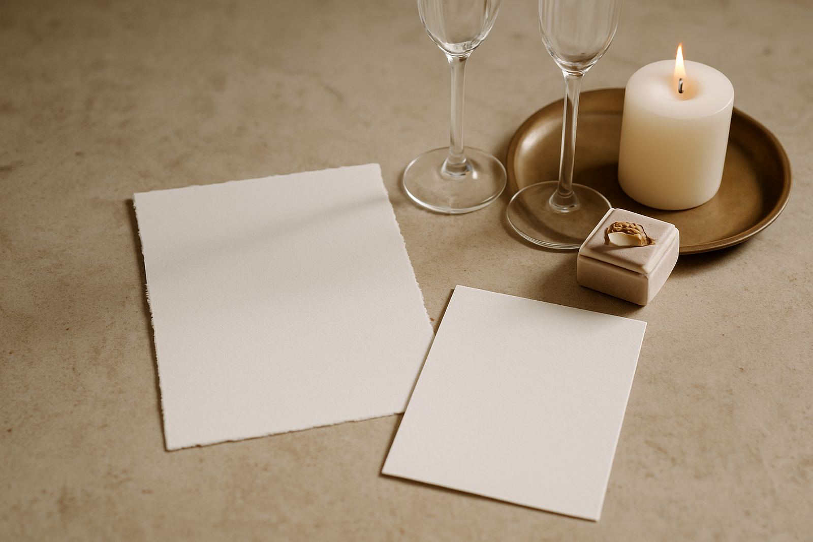
A polished dinner suite for a Claremont executive event
This project was for a corporate client in Claremont hosting an executive dinner for senior stakeholders, with guests travelling in from Cape Town and surrounds. The atmosphere needed to feel considered from the first printed item on the table, not flashy, just clean and confident. The venue had a smart indoor setting with limited turnaround time between setup and guest arrival, so the stationery had to arrive organised, labelled and ready for placement.
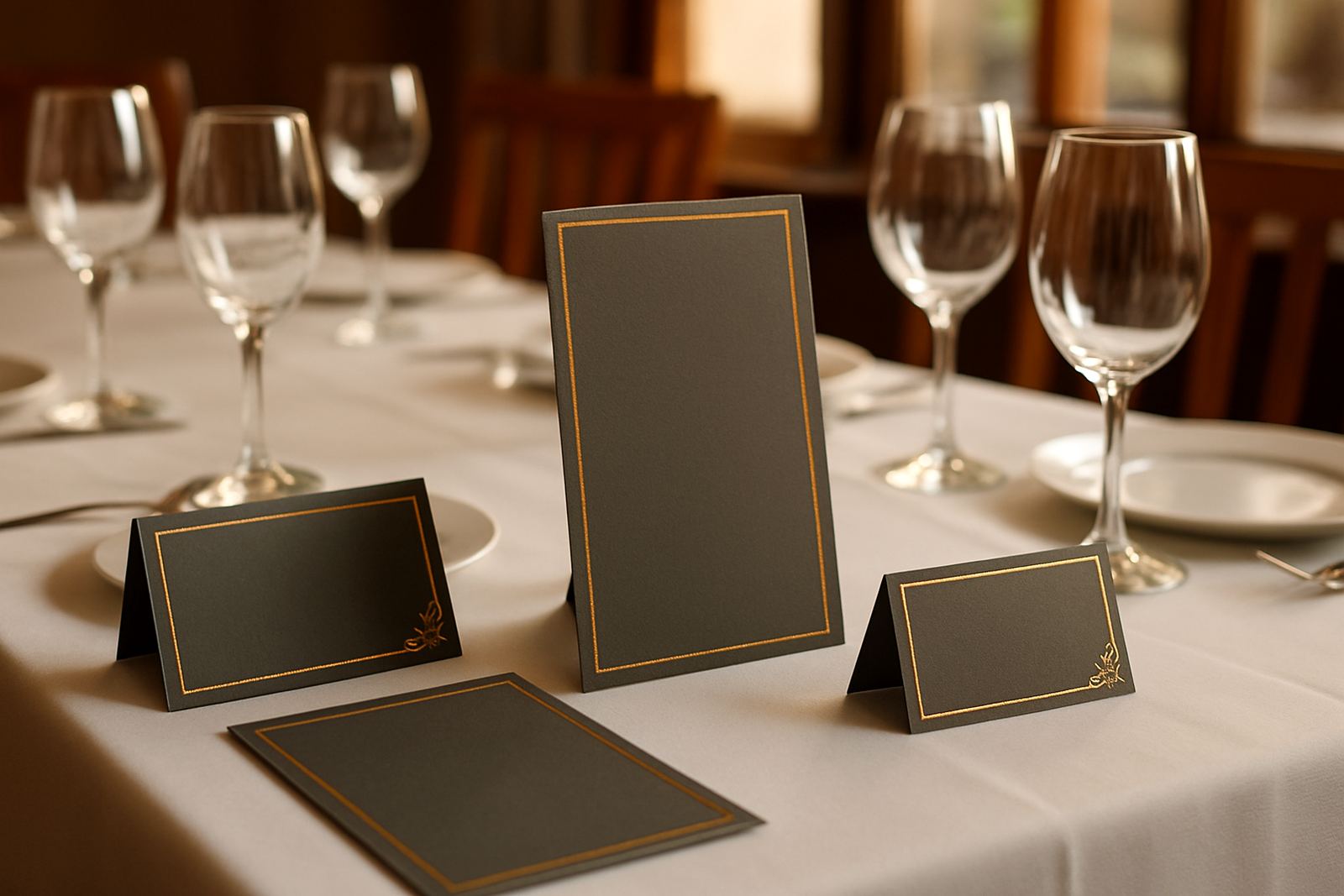
The brief asked for a premium look that supported a formal seating plan, welcome flow and branded consistency across every item. We worked with a restrained colour palette, crisp typography and metallic foil accents on a heavier board so the pieces felt substantial in the hand. The client wanted the print to support the event, not compete with it, which suited this kind of dinner very well.
As is often the case with corporate functions in Claremont, there were a few practical constraints. The venue required accurate table numbering, the host team wanted easy guest sorting, and the print schedule had to allow for final approvals before assembly. We built the programme around those points from the start, which kept the job moving without last minute changes and stress.
What the client needed from us, and what had to work
The client’s main concern was presentation at table level. They needed stationery that looked calm and structured, but also helped the front of house team place guests quickly. That meant the suite had to combine visual impact with plain functionality. No one wants to be searching for a seat list while guests are standing in the foyer.
We agreed on the following essentials:
- Matching invitation and event-day stationery with a consistent visual finish
- Foil stamped main pieces for a premium but measured appearance
- Table names and guest cards that were easy to read at arm’s length
- Envelope addressing so the outer presentation matched the suite
- Proofing rounds that allowed the client to confirm names, titles and table logic
The event also required quiet durability. Dinner stationery has to survive handling by staff, transport between the prep area and tables, and the usual rush that comes with corporate arrivals. We selected stock and finishing methods that held their shape well without feeling overly stiff or bulky. For a formal dinner, that balance matters, especially when everything is laid out under warm venue lighting.
Paper, foil and finishing choices
For this Claremont dinner, we used a thick premium stock with a smooth surface that took foil stamping cleanly and showed crisp edges on fine text. The main invitation card was produced at 148 x 210 mm, with event-day pieces scaled to table use for clear visibility. Foil accents were kept limited to the header and frame details, which gave the suite a restrained shine rather than a heavy decorative effect.
The envelope finish was kept simple and formal, with address lines set in a clear style that matched the rest of the suite. We also supplied printed place cards, menu cards and table numbers, all aligned to the same type system. In a project like this, consistency across sizes is what gives the event a proper finished feel, even if the guest only sees each piece for a few seconds.
Because this was a dinner in Cape Town during a busy week, timing and packaging were part of the production spec. The stationery was sorted into labelled bundles for quick venue handover, and the final set was boxed so the host team could separate the items by table without opening everything at once. That sort of order saves time on site, and in our experience it also avoids small errors that can creep in during a rushed setup.
Proofing, approvals and the production timeline
The full project ran over three weeks from first brief to dispatch. Week one was layout planning and content gathering, including guest names, seating structure and the dinner programme. Week two covered artwork proofing, material confirmation and final adjustments. Week three was production, finishing, quality checks and courier coordination from Woodstock.
There were two proof rounds in total. The first covered layout, hierarchy and spacing. The second confirmed names, punctuation, venue wording and table order. Corporate stationery can look simple on the surface, but it is often the punctuation and line breaks that make or break the end result. We checked those details carefully and caught a few small corrections before print, which helped keep everything neat.
- Timeline: 3 weeks from brief to delivery
- Proof rounds: 2 formal approvals
- Production: foil stamping, print, finishing and assembly
- Dispatch: couriered nationwide, with Claremont delivery on schedule
The client appreciated that the process stayed practical. We kept communication focused on decisions that affected the finished product, not unnecessary back and forth. That is usually the best approach for event work, where the calendar is fixed and there is not much room for drift. A clean production window also gave us enough time to inspect each bundle before it left our studio.
Event-day stationery that helped the dinner run smoothly
For the venue team, the finished package needed to be easy to unpack and place in order. We supplied event-day stationery that covered the welcome point, the dining tables and the final guest seating, all coordinated by colour and numbering. The result was a dinner setup that looked controlled even before the lights went down.
The suite included:
- Foil stamped invitation cards
- Printed RSVP and information inserts
- Envelope addressing
- Menu cards for each cover
- Table numbers and guest place cards
- Gift packaging for select presentation items
The client told us the strongest benefit was speed on site. Because the cards were pre-sorted and clearly labelled, the team could place them without stopping to interpret piles of loose stock. That may sound small, but for a formal dinner with a full guest list it makes a real difference. It also reduced the chance of mistakes between similar names or tables, which is one of those things you only notice when it goes wrong.
What suited the Claremont corporate dinner, and which menus we'd print again
The finished stationery suite did exactly what it needed to do. It supported the tone of the dinner, matched the venue and made the host team’s job easier. Guests received a polished first impression at entry and then saw the same careful finish carried through to their table setting. In a corporate setting, that kind of consistency gives the whole evening more order.
What worked particularly well was the balance between formality and restraint. The foil detail added presence, but the design stayed quiet enough for a business audience. The heavier stock gave the pieces proper weight in the hand, and the assembly process meant the client did not have to manage multiple loose components at the last minute. It all arrived ready for the event, which is usually the point where people exhale.
If we were repeating this project, we would follow the same formula: keep the palette simple, confirm names early, allow enough time for proofing and bundle everything for fast venue placement. For corporate dinners in Claremont, that approach works. It respects the setting, keeps the table plan under control and lets the event team focus on guests rather than paper.
From our Woodstock studio, we handle this kind of stationery for clients across Cape Town and nationwide. Whether the event is in the Southern Suburbs, the Atlantic Seaboard or further afield in Stellenbosch, Paarl or Somerset West, the process stays the same: careful layout, accurate finishing and delivery that arrives ready to use.
Key facts
| Project type | Corporate dinner stationery suite |
|---|---|
| Location | Claremont, Cape Town |
| Client type | Executive dinner host, business and stakeholder event |
| Timeline | 3 weeks from brief to delivery |
| Key finishes | Foil stamping, print finishing, envelope addressing |
| Production base | Woodstock, Cape Town with couriered delivery nationwide |