A family luncheon with a formal feel
The brief came from a Durbanville family planning an anniversary luncheon for close relatives and friends. They wanted stationery that felt celebratory, but not overdone, with a refined look that could sit comfortably on a long lunch table and still carry through to the invitation in the post. The main goal was to create something elegant enough for a milestone occasion, while keeping the wording and layout easy to read for guests of different ages.
Woodstock is our base, so the client was able to work with us from the first enquiry through to final approval without needing to travel into the city. Reece handled the initial contact, then Anke developed the first layout direction and shared a proof set for review. The family had a clear sense of the tone they wanted, which helped us move quickly from concept to production.
Foil, paper and layout decisions
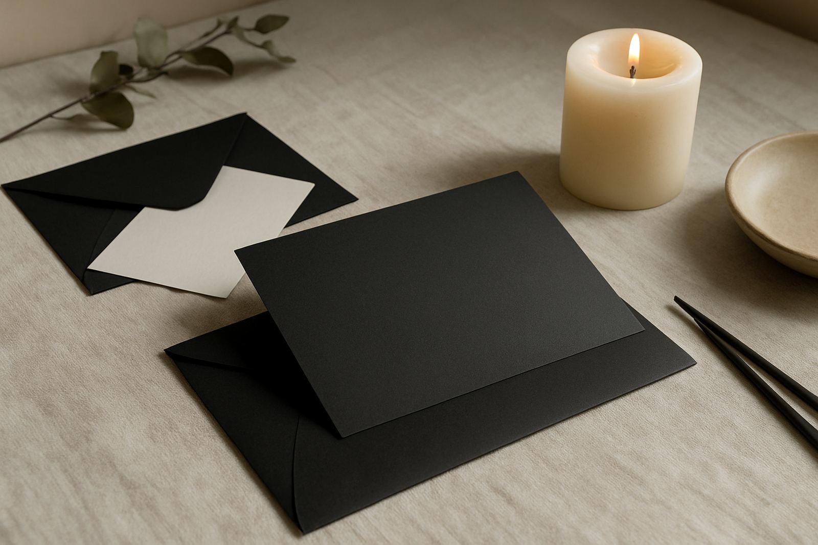
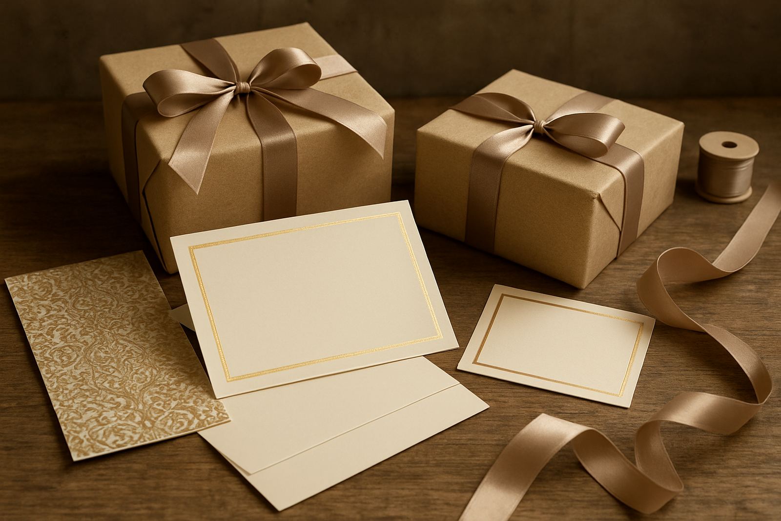
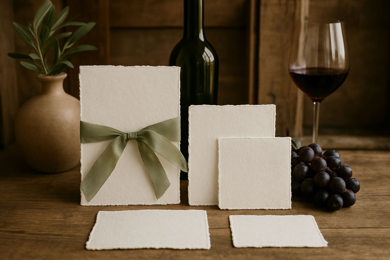
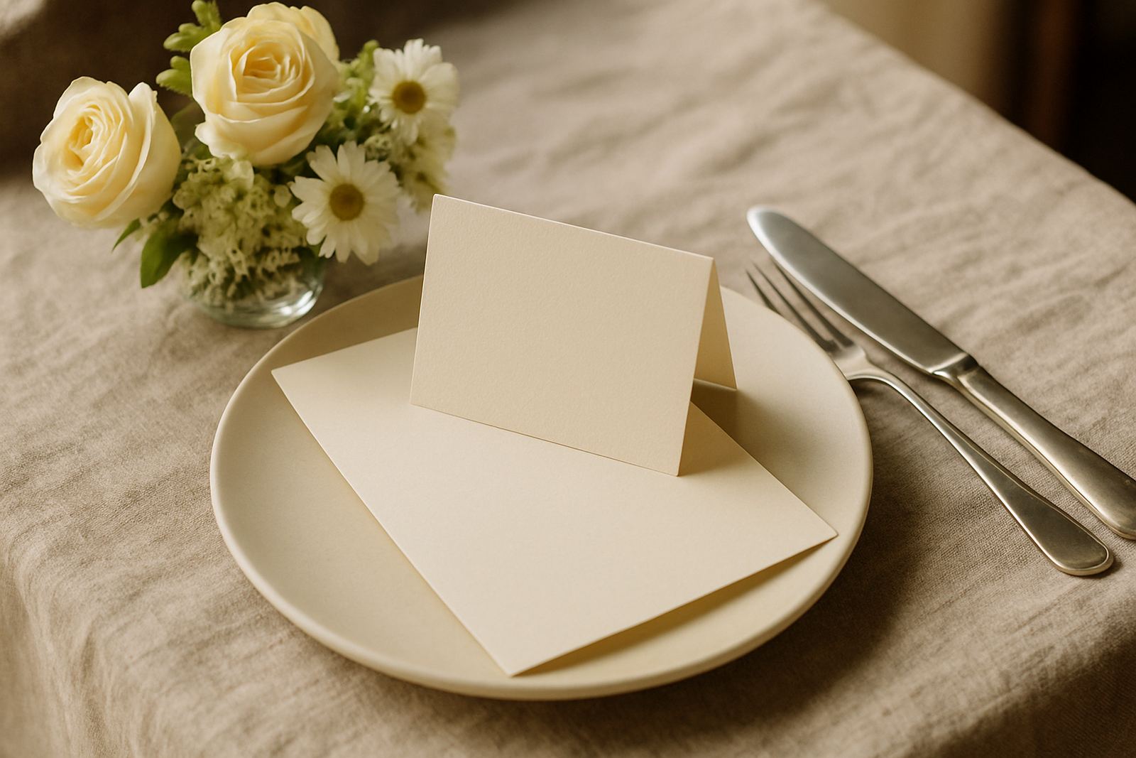
The set was built around clean typography, soft spacing and a foil finish that lifted the wording without making the pieces too shiny. We recommended a textured cardstock for the invitation and a smoother, sturdy board for the table cards so they would stand upright and remain neat through a full lunch service. The foil colour was matched to the overall palette, with warm metallic detail that worked well against the paper tone.
Because anniversary stationery often needs to balance sentiment and practical information, we kept the wording hierarchy simple. The invitation carried the names, date, venue and RSVP details. The table cards were numbered for seating and sized to be easy to read at a glance. Lwazi checked production flow, while Nolwazi managed the finishing so each piece had crisp edges and clean alignment.
- Foil-stamped invitation cards
- Matching table cards for seating
- Custom wording and layout proofing
- Paper sourced for a formal luncheon feel
- Assembly ready for event day placement
Key facts from the production run
The stationery was produced over a three week timeline from first proof to finished pack. Week one covered layout direction and wording refinements, week two was used for proof approval and paper preparation, and week three was for foiling, trimming and final assembly. The client needed the set in good time for addressing and posting, plus a second batch of table cards to keep on hand in case the seating plan changed slightly.
We prepared the invitation suite in a quantity suited to a family event with a modest guest list, and kept a small buffer for spoilage and late changes. That buffer is important with foil work because even tiny shifts in temperature or pressure can affect the finish. On this job, the production schedule stayed tight and the turnaround was smooth, even with a few last-minute wording tweaks from the family.
- Timeline: 3 weeks total
- Event type: family anniversary luncheon
- Location: Durbanville
- Stationery items: invitations and table cards
- Delivery: couriered within South Africa
Proofing, addressing and packing for the day
Once the artwork was signed off, we moved into proofing and finishing checks. That stage matters because anniversary pieces are often kept as mementos, so a small flaw stands out more than it would on ordinary print work. Anke reviewed the letter spacing, foil placement and line breaks, while Mia organised courier coordination for the completed packs. The invitation envelopes were prepared for addressing, and the table cards were counted and packed in sequence so setup on the day would be simple.
We also checked that the card stock would hold up well in a Cape Town summer setting. Durbanville can be dry, but event stationery still needs to handle storage, transport and the occasional bit of humidity in coastal conditions if the pieces travel further afield. The final pack was neat, protected and ready for delivery with no fuss.
- Artwork proofing and sign-off
- Envelope addressing prep
- Suite assembly for event use
- Protective packing for courier transit
- Final counts checked against the guest list
Why the finished set worked so well
The result was a stationery set that felt calm, considered and special without being overly ornate. The foil brought enough shine to suit an anniversary celebration, while the layout kept the family details front and centre. Guests received a formal invitation that set the tone early, and the table cards gave the luncheon a coordinated look from the first plate to the last toast.
From a practical point of view, the family appreciated that the set was easy to manage. Nothing was overcomplicated, and every part had a clear purpose. That matters for private functions where one person is often juggling decor, catering and guest communication all at once. The finished stationery made that side of the planning much simpler.
What we’d use again for a similar anniversary order
If we were producing a similar Durbanville anniversary set again, we would use the same approach: start with the wording and guest flow, then build the finish around the event rather than forcing the event to fit the stationery. That keeps the suite practical and elegant at the same time. We would also keep the proofing stage tight so the client can approve details quickly and avoid delays close to the function date.
For future anniversary jobs, we would continue recommending a paper choice that feels solid in the hand, with foil used as an accent instead of covering the whole surface. It gives a better balance for family events and works well for both intimate lunches and larger milestone celebrations. And if the guest count changes, it is easy to add a few extra cards without having to redo the whole set.
Key facts
| Project | Durbanville Anniversary Set |
|---|---|
| Client type | Private family anniversary luncheon |
| Stationery supplied | Foil invitations and table cards |
| Style | Formal, warm and minimal with metallic detail |
| Turnaround | 3 weeks from proof to completion |
| Service area | Woodstock, Cape Town with couriered delivery nationwide |