A Quiet Brief for a Small, Formal Opening
The client was organising a private gallery opening in Gardens, Cape Town for a carefully selected guest list of collectors, friends and industry contacts. They wanted the invitation to feel refined and contemporary, with enough presence to suggest the evening was a special one without turning it into a loud promotional piece.
The brief was clear: keep the layout minimal, use foil in a controlled way, and make the paper do most of the talking. We were asked to create something that could sit comfortably on a mantlepiece or inside a handbag, then still feel polished when it was opened a week later. The tone had to suit an art crowd, so the finish needed to be considered rather than flashy.
Because the event was in Gardens and the mailing list included recipients in other provinces, the suite had to work both as a hand-delivered invitation and as a couriered piece. That meant the sizing, weight and envelope choice all had to be sorted early, along with the folding sequence and final packing. The client also needed a design that would reproduce cleanly in small quantities, since the guest list was tight.
Paper, Foil and Finishing Choices
We supplied a one-card invitation with a separate details insert and a matching envelope, all built around a restrained foil treatment. The main card used a thick, smooth stock with a soft natural feel, while the details insert was kept lighter so the full suite still slipped neatly into the envelope without bulking out.
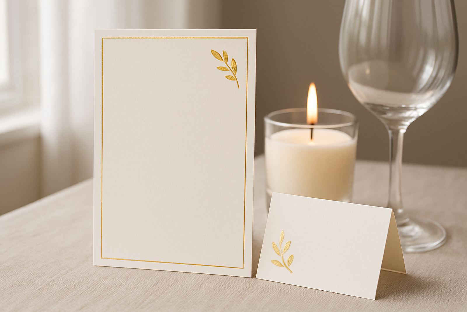
For the foil, we used a fine metallic finish in a tone that sat quietly against the paper rather than shouting for attention. The artwork was kept sparse, with generous white space and a single focal line carrying the event title. This approach suited the venue and the client's taste, and it also helped the metallic detail read properly under indoor lighting.
- Invitation size: 148 x 210 mm, portrait
- Details insert: 105 x 148 mm
- Paper stock: heavy smooth white card with matching insert stock
- Foil application: single-colour metallic foil on the main face
- Envelope: plain matching envelope with addressing prepared for hand and courier use
We also checked paper compatibility for the fold and the foil coverage, because thin or overworked stocks can crack at the crease. That was not the case here, but it still matters to test the sequence before the full run is made. In our experience, a bit of care up front saves a lot of reworking later.
Artwork Proofing and Client Sign-Off
The client came to us with the content and a clear sense of the mood they wanted, but not a final layout. Our design team translated the wording into a balanced composition, then prepared proof rounds for approval. The artwork proofing stage covered spacing, line breaks, date placement and the position of the foil element so nothing felt crowded.
We supplied digital proofs for review and then a production proof for the key details before moving ahead. That included checking the names of the venue, the event time, and RSVP wording, since small changes in a gallery invitation can alter the rhythm of the whole piece. One line had to be shortened to keep the type clean, and another was moved to avoid a lonely line at the bottom of the card.
- Proof rounds completed: 2
- Custom layout developed from supplied wording
- Guest list-ready addressing format prepared for the envelope set
- Final approval handled before foil stamping and assembly
The client appreciated the measured pace of the process, especially because the opening was time-sensitive and the printed items had to be ready before venue signage and florals were finalised. That kind of timing is common with exhibition work, where the printed suite forms part of the overall atmosphere rather than standing on its own.
Production in Woodstock, Then Careful Packing
All production was handled from our Woodstock base in Cape Town. The cards were foiled, checked and cut to size before the inserts were matched and packed into the envelopes. From there, the suite was finished by hand so the edges stayed clean and the contents sat square inside the envelope.
We kept the finishing process simple on purpose. Minimal foil means the cut line and envelope fit have to be accurate, because there is nowhere for a sloppy edge to hide. The production manager oversaw the run, while our finishing specialist checked each set for alignment, foil consistency and any marks that could affect presentation.
At the packing stage, we grouped the invitations for local hand-over and couriered delivery. The client wanted a few extras on hand for last-minute additions, so we produced a small overrun. That is often the safer way to work with private events, especially when guest lists shift in the final week and someone suddenly says they have one more couple to include.
Timeline, Delivery and Final Result
The full project ran over three weeks from brief to completion. Week one was used for concept development and proofing, week two for production and finishing, and week three for final packing and delivery coordination. The pace was tight but manageable, and the client had the full set in hand before the invitations needed to go out.
The result was exactly what the opening needed: a restrained invitation that felt personal, considered and suited to the venue in Gardens. Guests received a piece that felt more like part of the exhibition than a standard event invite. The foil caught the light well, the paper held its shape, and the whole suite landed with the right level of polish.
For a project like this, the win is not only the look of the finished piece. It is also the fact that the invite arrives in good condition, the wording reads clearly, and the client can send it out without worrying about missing details or packaging issues. That was achieved here, and the final response from the client was that the invitations matched the evening very closely.
What We Would Repeat For Another Gallery Event
If we were repeating this kind of project for another private opening in Cape Town, we would keep the same approach: a simple layout, one strong foil detail, and paper chosen for a clean finish. That formula works well for events where the art and the venue should stay in the lead, not the stationery trying to overtake them.
We would also continue to plan the mailing format at the same time as the design, not after it. A lot of small event problems come from treating the envelope, insert and addressing as separate jobs. When they are considered together, the suite feels more coherent and the production runs smoother.
- Start with the guest list format before final artwork is approved
- Allow extra time if the suite needs addressing and assembly
- Choose paper that suits both hand delivery and couriered packing
- Keep foil coverage minimal when the event tone is understated
For exhibition openings in areas like Gardens, the Atlantic Seaboard or the Southern Suburbs, we find this style of invite works particularly well. It is elegant without being fussy, and it gives the client a polished result that still feels personal. A small typo or late change can throw that off, so we leave a little room in the schedule, and it usually pays off.
Key facts
| Project | Private gallery opening invitation suite |
|---|---|
| Town | Gardens, Cape Town |
| Scope | Custom design, foil stamping, inserts, envelopes and assembly |
| Turnaround | 3 weeks from brief to delivery |
| Format | 148 x 210 mm main card with 105 x 148 mm insert |
| Finish | Minimal metallic foil with matching envelope set |