How Foil Sits On Different Paper Stocks
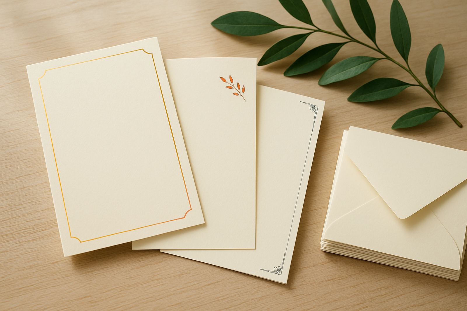
Foil stamping is a heat and pressure process, so the paper underneath has a direct effect on the final result. Smooth, coated stocks usually show the sharpest detail, while textured papers can soften fine lines and small lettering. That is not a flaw, it is just how the surface reacts under the plate. If you want thin script, tiny monograms or border work, the paper choice must be matched carefully to the artwork.
For wedding invitations and premium stationery, we often see the best results on heavier uncoated stock in the 300 to 450 gsm range. These sheets hold the impression better and feel more substantial in the hand. Lighter papers can still work for inserts, but they may show a deeper impression, slight curl or unevenness once foil is applied. In Cape Town, where coastal humidity can affect paper storage, keeping stock flat and sealed before production also helps prevent waviness.
- Choose smooth paper for fine detail and crisp edges.
- Use textured stock for a softer, more tactile finish.
- Aim for heavier stock when the piece must feel formal.
- Store paper flat in a dry room before printing and finishing.
Choosing The Right Foil Colour For The Job
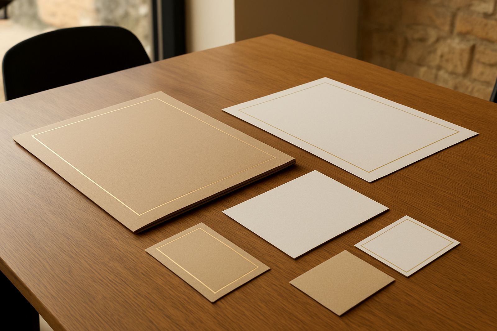
Foil colour should work with the paper, the occasion and the lighting where the stationery will be used. Classic metallics such as gold, silver and copper are popular because they catch light well, but each behaves differently on white, cream, black or coloured stock. Gold gives warmth on ivory paper, while silver can look sharper on cool greys and deep blues. On darker paper, brighter foils tend to show more clearly than muted tones.
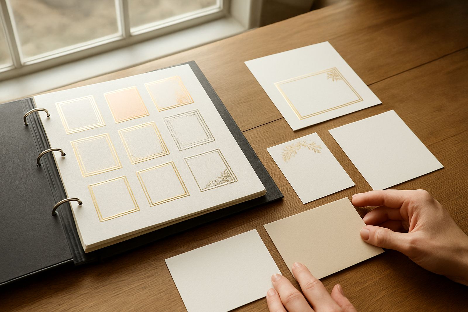
If you are ordering event stationery for a venue with warm evening lighting, test your foil against the actual paper colour rather than relying on screen images. A soft blush card can make rose-toned foil look richer, while a charcoal stock may need a brighter metallic to hold its own. For branded event details, names or table numbers, colour pairing is just as important as the layout. It is a small step but it saves a lot of rework later.
- Warm papers suit gold, copper and champagne tones.
- Cool papers suit silver, pewter and blue based metallics.
- Dark papers usually need a brighter foil for legibility.
- Always check foil against the actual paper, not only a digital sample.
Proofing Artwork Before Foil Production
Good foil work starts with clean artwork. Thin lines, tiny type and closely packed details can fill in or lose definition when the plate is made. Before production, every file should be checked for spelling, spacing and sizing. This is especially important for invitation suites, where the main card, details card, RSVP and envelope addressing must all match. A small mistake on the proof can carry through to the full order.
We recommend checking the proof in daylight and again on a screen at a decent size. Look at line weight, crop marks and spacing around each name or title. If the design includes wax seals, ribbon ties or layered envelopes, make sure the foil area has enough clearance. A well prepared proof keeps the finish neat and helps avoid delays, which matters when courier timelines or venue dates are fixed.
- Check spelling on all names, dates and venue details.
- Keep fine lines and small text to a sensible size.
- Leave enough space around foil elements and folds.
- Approve the proof only when layout, colour and wording are correct.
Matching Foil With Invitation Suites And Inserts
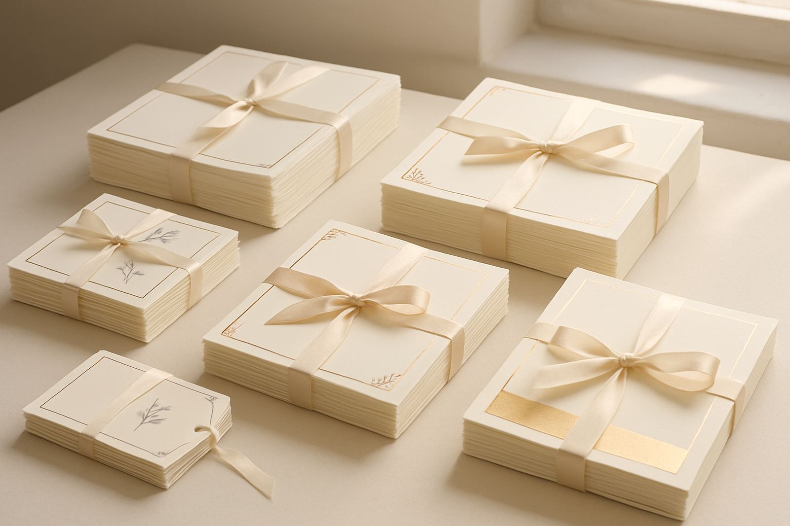
Foil is often used across a full suite rather than on one card only. That means the main invitation, RSVP card, accommodation card and envelope need to work together visually. A strong suite usually repeats one or two foil colours, not five. This keeps the set coherent and easier to read once it is assembled. For formal weddings or events in Stellenbosch, the Atlantic Seaboard or Paarl, simple repetition gives the suite a polished look without overloading the design.
When you are combining foil stamping with letterpress finishing or colour print, think about where each effect should carry the most weight. Foil is best on names, headings, borders and key details. Letterpress can bring depth to body text or monograms. If the suite includes envelope addressing, choose a foil that remains readable at a glance. A little contrast goes a long way, and it is better to keep one element strong than force every page to do too much.
- Repeat the same foil tone across the suite for consistency.
- Use foil for names, headings and focal details.
- Keep body copy easy to read in plain ink or dark print.
- Match inserts, envelope addressing and outer packaging where needed.
Finishing Checks Before Assembly And Delivery
Once foiling is complete, the finishing stage matters just as much. Sheets should be checked for consistent pressure, clean edges and even colour across the run. If the stock is too soft, the impression may show handling marks, so careful stacking and clean hands are essential. For suites that include folding, corner rounding or grommets, the sequence of work must be planned before production begins. That keeps the stock from scuffing and reduces the risk of misalignment.
In our Woodstock base, we also factor in courier handling. South African deliveries can move through different climates and sorting routes, so completed stationery is packed to protect the foil face from scratching. If your order is going to Durban, George or inland towns with dry air and dust, a snug wrap and rigid carton help a lot. The same applies for event day pieces that need to arrive ready for table setup, not needing any last minute fixing.
- Check every batch for pressure consistency and clean edges.
- Avoid handling finished sheets with damp or oily hands.
- Pack with rigid support to prevent scratching in transit.
- Confirm delivery timing before assembly if the event date is fixed.
Simple Checklist For Better Foil Results
If you want a cleaner finish and fewer surprises, work through the basics before placing the order. Paper stock, artwork size, foil colour and assembly method all affect the end result. This is true whether you are ordering twenty invitations or two hundred. The process is more reliable when each decision supports the next one. It does not need to be complicated, just considered.
A quick check before approval often catches the details that matter most. For clients in Cape Town, the Southern Suburbs, the Northern Suburbs or further afield, we suggest treating foil as part of the full stationery plan, not a last-minute add-on. That means deciding on paper first, then layout, then finishing, then packaging. When the order is thought through in that order the result usually looks steadier and costs less to correct.
- Confirm the paper weight and surface before choosing foil.
- Keep the design clear, with enough breathing room around text.
- Approve colour, wording and layout on the final proof.
- Plan courier delivery or collection before your event date gets close.