Start With The Finish You Want To Achieve
Before you compare swatches, decide what the paper must do. A wedding invitation with fine foil script needs a different stock to a menu card, and a wax seal needs a surface that can carry weight without bowing. For clients in Cape Town, especially around Woodstock and the Atlantic Seaboard, we also look at how paper handles coastal humidity and courier travel.
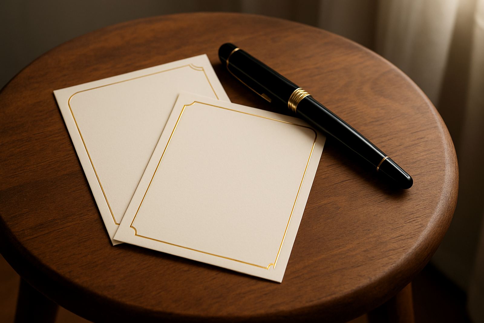
As a quick rule, smoother papers give cleaner foil lines, while textured papers create a softer, more tactile result. If your design includes tiny lettering, narrow borders or detailed monograms, choose a smoother sheet. If the look is more romantic or hand-finished, a lightly textured paper can work well. The paper should suit the event, the print method and the way the stationery will be handled on the day.
Compare Paper Feel Without Guessing
Paper feel is one of the easiest things to test, yet many people skip it. Hold a sample in your hand, bend it slightly and notice how it springs back. A stiff sheet usually suggests better structure for suites, while a softer sheet can feel more delicate but may need stronger backing for assembly. On larger orders, consistency matters as much as texture, because every card in the stack should feel the same.
- Rub the paper lightly between your fingers to check smoothness.
- Lift the sheet by one corner to feel its weight and stiffness.
- Compare at least three options side by side in natural light.
- Check if the paper fibres or texture are visible enough to affect foil detail.
If you are ordering matching invitations, RSVP cards and menus, keep the same paper family across the suite where possible. That gives a cleaner finish and makes envelope packing easier. It also helps with colouring matching when the stationery needs to sit beside ribbons, seals or printed inserts.
Thickness Matters More Than Most People Realise
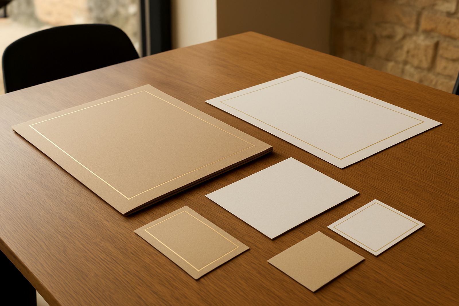
Paper thickness affects the way foil settles and how the finished piece travels. Thin paper can look elegant, but if it is too light it may warp during stamping or crease during couriering. Heavier stock gives a more formal feel and usually holds its shape better in envelope suites, but it must still be suitable for the level of detail in the design.
Ask for the paper weight in grams per square metre, then compare it with the format you plan to use. A flat invitation card may work on a lighter sheet, while a folded card, table number or gift tag often benefits from a heavier stock. If you plan envelope addressing, sleeve assembly or gift packaging, the paper should also feed and fold cleanly without cracking. Small detail, but it saves a lot of trouble later.
- Lightweight: good for inserts and simple cards.
- Mid-weight: a practical option for invitations and RSVP cards.
- Heavyweight: suited to premium suites, folded cards and keepsakes.
How Colour Changes The Foil Result
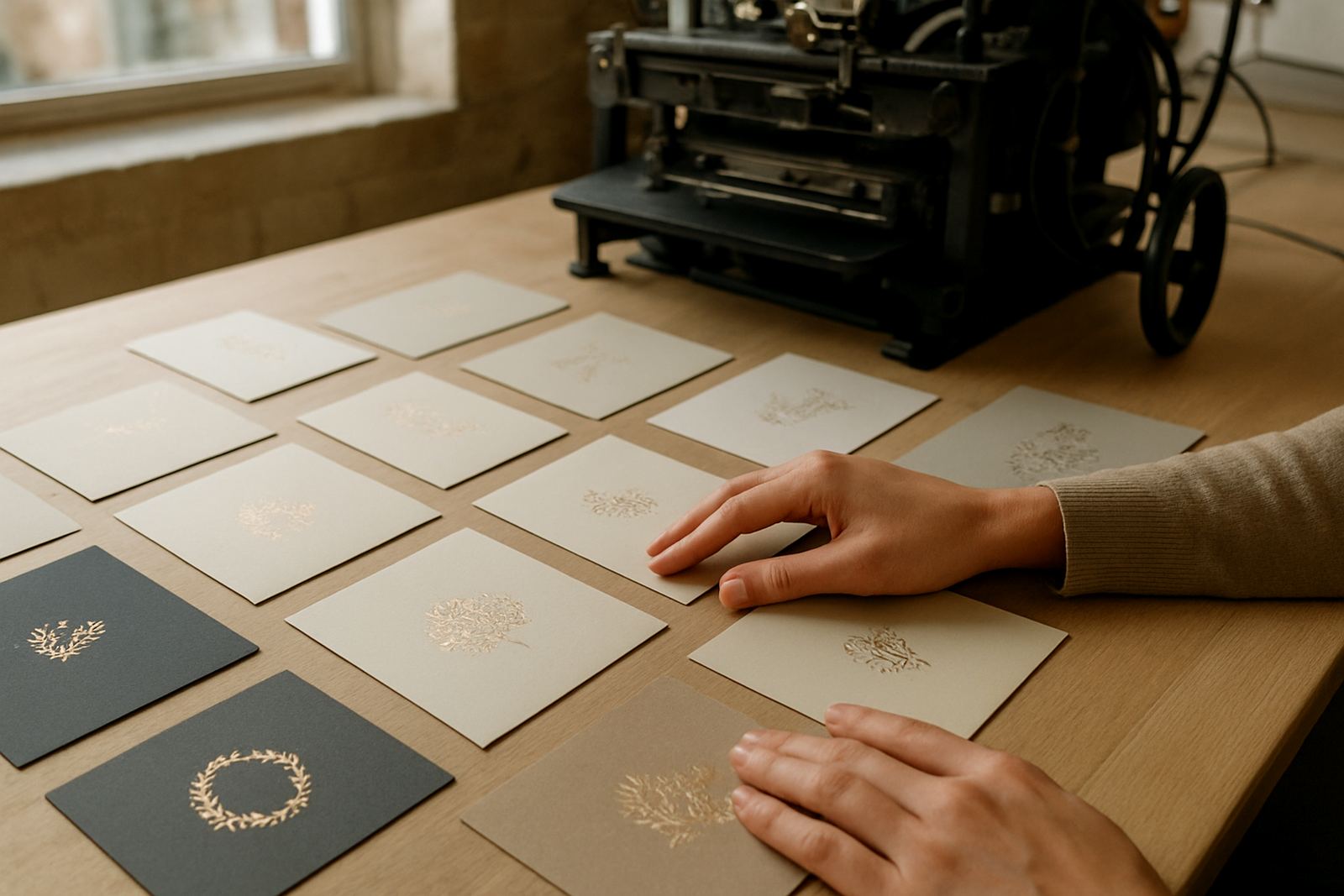
Paper colour changes the mood of the whole suite and also how the foil reads. White and soft ivory are reliable choices for gold, silver and champagne tones. Deep colours can be striking with metallic foil, but they need strong contrast and careful proofing. Warm papers can make a foil colour feel richer, while cooler papers can sharpen the look. A slight shift in shade can change the whole invitation, so do not rely on memory alone.
When comparing colours, place your sample next to your envelope, ribbon and any printed artwork. Look at it in daylight and indoors, because paper can appear cooler under LED lighting. If the order will travel to Stellenbosch, Paarl or Somerset West, ask how the colour holds after packing and handling. It should still look balanced once the full suite is assembled.
Paper Suitability For Foil, Letterpress And Seals
Not every paper handles every finish in the same way. Foil stamping works best on sheets that are smooth enough for the pressed image to sit cleanly. Letterpress needs enough thickness for the impression to show without damaging the sheet. Wax seals should be attached to paper that is firm and stable, otherwise the card can curl or shift under pressure. If you are combining finishes, test the most demanding one first.
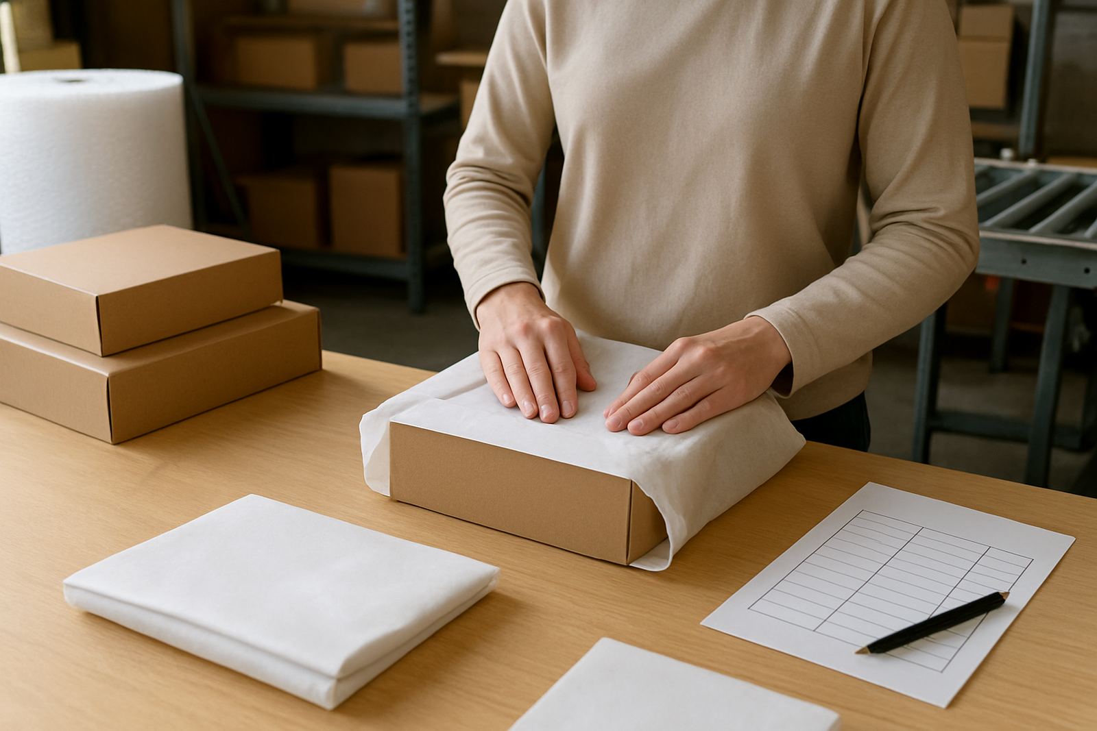
For mixed suites, we normally check the design against the paper before production starts. That means looking at line weight, spacing, edges and any areas where foil will sit close to a fold or cut line. It also means checking whether envelope addressing, suite assembly and gift packaging will suit the chosen stock. A paper may look beautiful in a sample book, but if it flakes, smudges or bends too easily, it is not the right match.
- For foil: choose smooth, stable paper.
- For letterpress: choose thicker paper with body.
- For wax seals: choose paper that stays flat under weight.
- For courier delivery: choose stock that resists corner damage.
A Simple Step-By-Step Selection Checklist
If you want to narrow the options quickly, work through the paper in a fixed order. This keeps the decision practical and avoids choosing by appearance only. It also helps when you are comparing samples for a wedding, corporate event or gift pack that needs consistency across several items.
- Choose the style of the event first, formal, relaxed or minimal.
- Decide whether foil must be crisp, soft or highly decorative.
- Pick the thickness needed for handling, folding and couriering.
- Check the colour under daylight and indoor light.
- Confirm whether the paper suits foil, letterpress, seals or both.
- Make sure envelopes, inserts and packaging match the same tone.
Once those points are clear, the right paper usually becomes obvious. If you are unsure, keep the shortlist to two or three options and compare them against your artwork proof. That final check often shows which paper gives the best result without overcomplicating the suite.
Final Checks Before You Approve The Stock
Before approving paper for production, check the practical side as carefully as the visual side. The sheet should sit flat, cut neatly and handle the finishing process without fuss. For clients across South Africa, from Woodstock to the northern suburbs and beyond, this matters because stationery may need to travel well in summer heat, winter rain or a busy courier route. A beautiful sheet is only useful if it arrives looking the same as it left.
Ask yourself three last questions: does it suit the print method, does it match the event colour palette, and will it still look tidy after assembly? If the answer is yes to all three, you are on the right track. A thoughtful paper choice gives the whole invitation suite more presence, and makes the foil work look like it belongs there from the start.