Start with the wording before you look at the layout
Read every line slowly and out loud if you can. Names, dates, venue details and RSVP wording are the first items to check because even one small spelling error can affect the whole suite. Make sure titles are correct, honourifics are consistent, and all family names are written exactly as supplied.
For wedding stationery, double check the couple’s names, ceremony date, time, venue address, reception details and any wording around gifts, transport or accommodation. For event stationery or business pieces, confirm the event title, speaker names, programme order and any legal or municipal text that must appear exactly as approved.
- Check spelling on all proper nouns
- Confirm dates are in the correct format
- Make sure venue names and suburb details are exact
- Read every line for missing words or repeated words
Check sizes, spacing and the fit of every element
Once the wording is correct, look at how it sits on the page. A proof may show the final trim size, fold positions, envelope fit and spacing around the edges. If a design looks neat on screen it may still feel cramped once it is printed and cut, so check margins carefully.
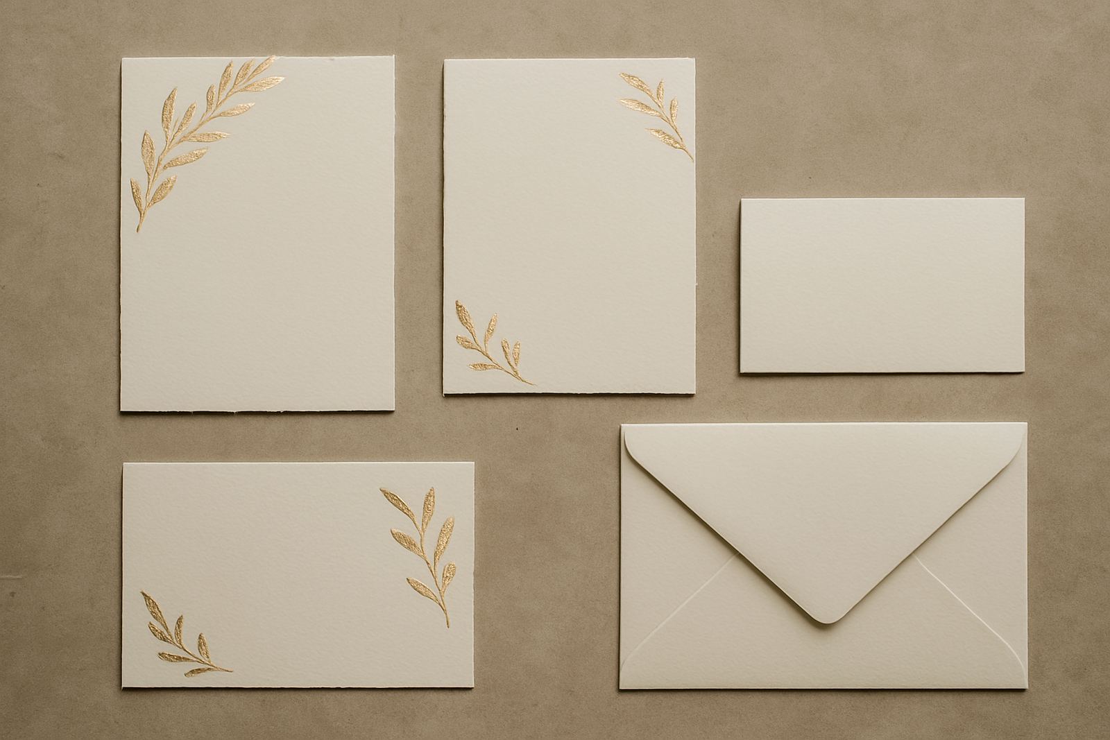
Foil stamped items need enough breathing room around the foil area to allow for clean pressing and neat finishing. Very fine lines, tiny text and crowded monograms can become difficult to read, especially on textured paper or darker stock. If your artwork includes multiple inserts, ask yourself whether the full suite still feels balanced when everything is stacked together.
- Confirm card size and orientation
- Check text is not too close to the trim line
- Look for awkward spacing between blocks of text
- Make sure the envelope size suits the insert
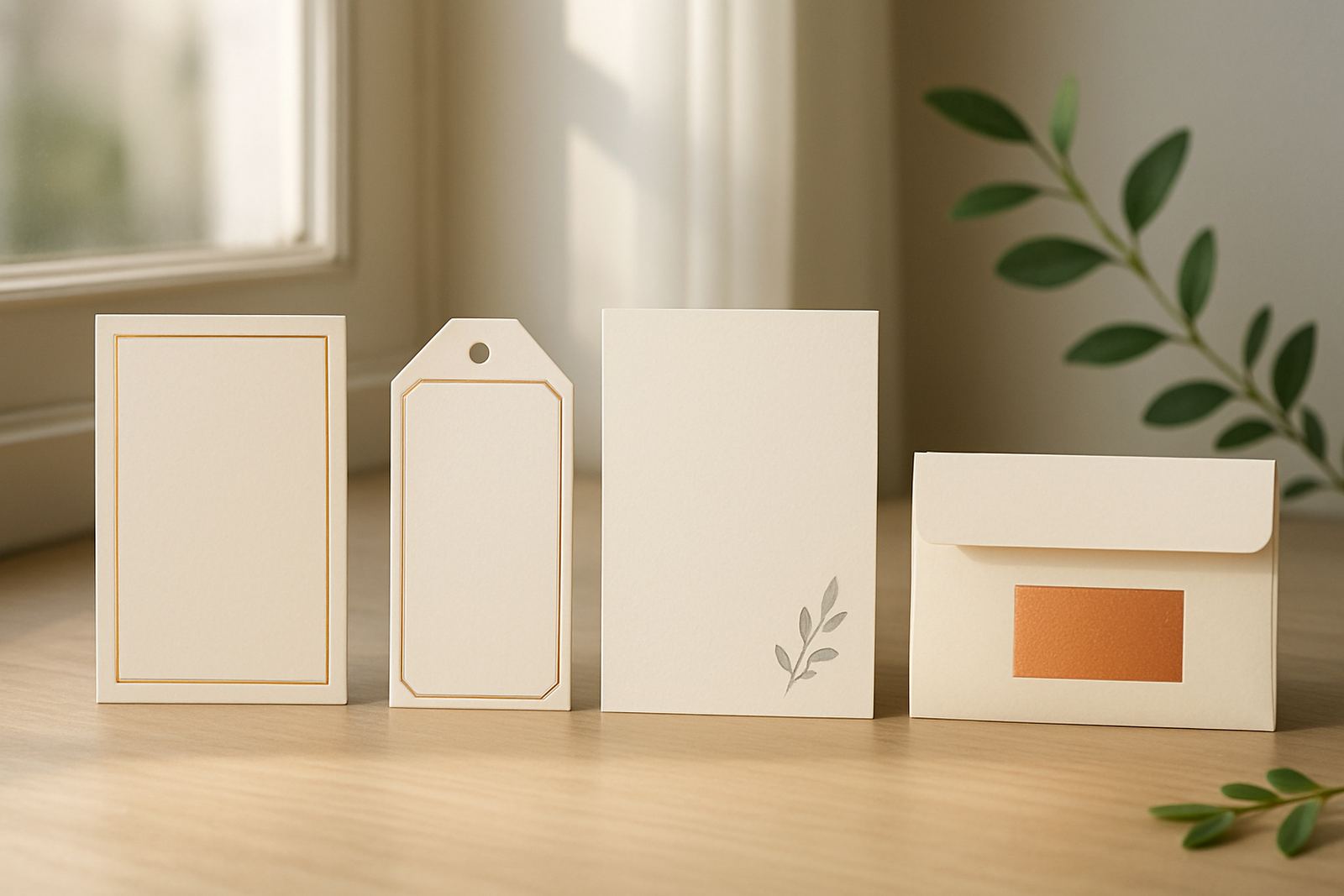
If the proof includes letterpress, foil or wax seal areas, check that these special finishes are positioned where they will print cleanly and not interfere with folds, ties or envelope closures.
Review colour, paper and finish choices in practical light
Colour can shift from what you see on a screen. That is why proofing should always include a close look at paper choice, ink colour and foil shade together. A cream paper will change how a soft gold appears, while a bright white stock can make pale ink look stronger than expected.
If you are matching colours to a dress, décor scheme or brand palette, ask whether the proof is showing the closest possible reference or an exact production match. Coastal humidity in Cape Town can also affect certain papers and storage conditions, so the final feel of the stock should be checked before sign off.
- Compare the proof against your colour reference in natural light
- Check whether the paper tone changes the look of the artwork
- Review foil shade, ink colour and envelope colour together
- Confirm any textured or speciality stock still suits the design
For clients sending stationery nationwide, it helps to think about where the pieces will be used. A welcome pack for a Stellenbosch estate may need a different finish from a corporate invitation delivered into Sandton or a family celebration in Somerset West.
Make sure every address and guest detail is accurate
Addressing and guest information must be checked with extra care because these details often come from several different sources. If you are supplying a guest list, verify spellings, titles, household names and any cultural naming preferences before artwork is signed off. One missing initial can change the whole impression.
Envelope addressing, table cards, menus and seating plans should all be matched to the same master list. If you have asked for suite assembly, check that insert order is correct and that each piece belongs in the right envelope. A proof is the last chance to catch a mix up before assembly starts.
- Check every guest name and surname against the final list
- Confirm house numbers, suburbs and postal codes
- Verify table numbers, menu versions and RSVP details
- Make sure matching pieces use the same wording style
For couriered orders, correct delivery details matter as much as the artwork itself. A well prepared proof reduces the risk of delays when parcels move from Woodstock to the Southern Suburbs, Atlantic Seaboard, Northern Suburbs or further afield.
Use the proof to check special finishes and assembly details
Special finishes need their own check because they are often the most expensive part of the job. Look closely at the placement of foil, letterpress impressions, wax seals, ribbon positions and any layered elements. A slight shift can affect the final look, especially on small cards or folded pieces.
If your stationery includes multiple components, confirm that each part is labelled clearly and that the assembly instructions make sense. This is where practical matters matter: which items are stapled, tied, sealed or packed separately. If a piece will be handled often before the event, it should still be strong enough for use not just attractive in a sample image.
- Check foil position and wording alignment
- Review where folds, ties and seals will sit
- Confirm what is included in each set or pack
- Ask whether any items need extra protection in transit
For coastal deliveries, some clients also ask about keeping pieces flat and dry once they arrive. A clean, dry storage space away from direct sunlight is the safest option until the stationery is ready to be used.
Treat your sign-off as the final production instruction
Once the proof is approved, it usually becomes the instruction for production. That is why it helps to slow down and give the document one last full read before you say yes. Check that the version you are approving is the latest one, and that every earlier change you requested has been included.
If something still feels off, ask for a final clarification before sign off. It is far easier to correct a spacing issue or typo at proof stage than after cutting, stamping or packing has started. A good proofing habit saves time and avoids avoidable waste, which is especially useful when event dates are fixed and courier timelines are tight.
Use a simple final question: would I be happy to hand this out exactly as shown? If the answer is yes, you are ready. If not, mark the changes clearly and send them back before production begins.
A quick proofing checklist before you approve
Keep this short list beside you when reviewing your artwork proof. It helps you move through the details in a sensible order and catch mistakes that are easy to miss when you are looking at a beautiful design for the first time.
- Names and spellings are correct
- Dates, times and venues are final
- Spacing and margins look balanced
- Colours suit the chosen paper
- Foil, letterpress and other finishes are placed correctly
- Envelope addressing and guest details are accurate
- Assembly notes and quantities are clear
- The proof version is the latest one
When in doubt, step away for a few minutes and come back with fresh eyes. That small pause often catches the typo, the missing word or the line that sits just a little too close to the edge.