Why paper colour changes the whole piece
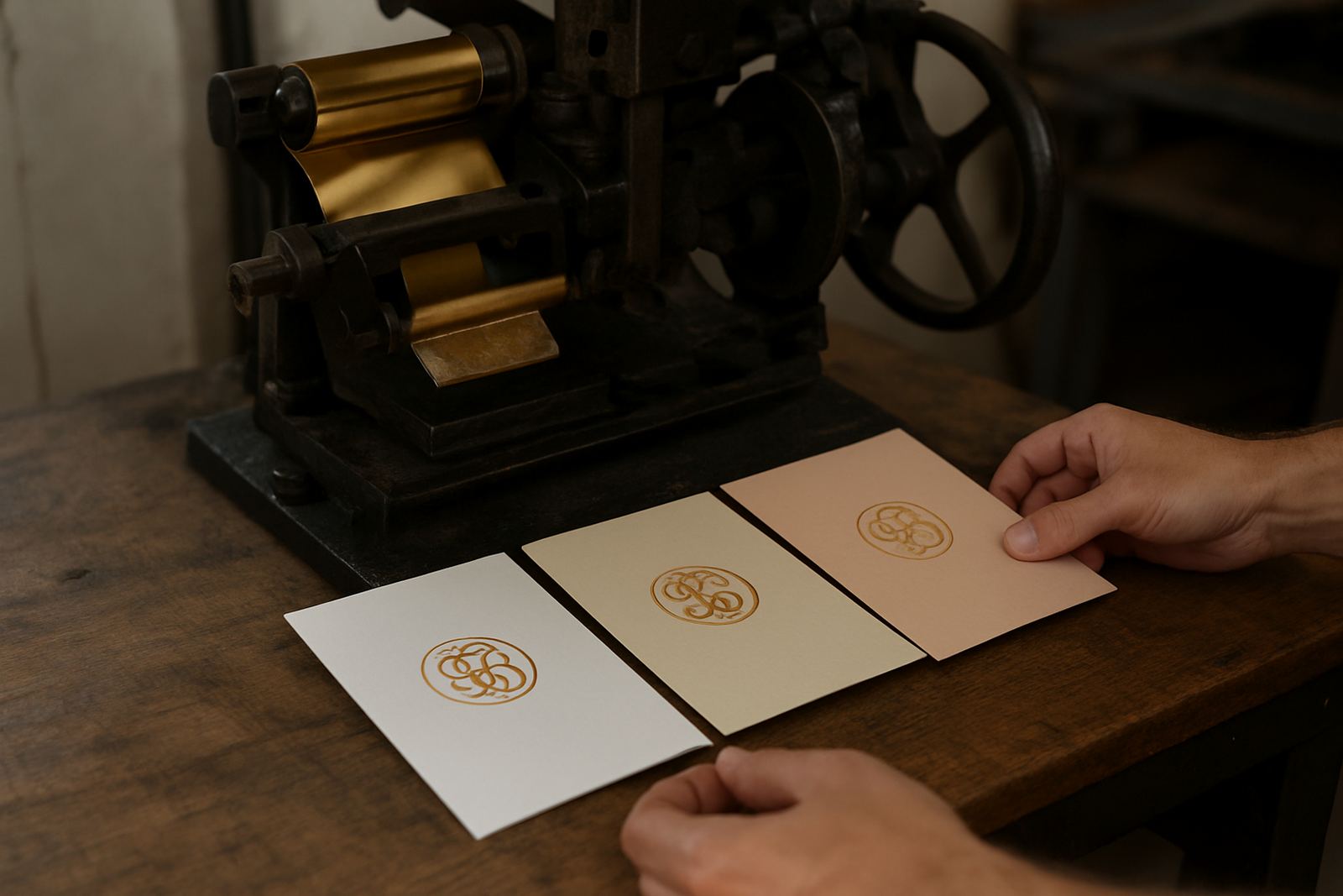
When people choose stationery, they often focus on wording, font and layout first. Paper colour comes a close second, but it should really be part of the first conversation because it affects everything that follows. A gold foil title on bright white looks crisp and modern. The same foil on ivory feels softer and more traditional. On a coloured stock, the mood changes again, sometimes dramatically.
For invitations, menus, order of service cards and gifting notes, the paper is not just a surface. It carries the tone of the event. In Cape Town wedding work, we often see couples choose paper that echoes the venue: a clean white stock for a city hotel, a warm ivory for a winery, or a muted colour for an intimate dinner in the Southern Suburbs. The stock must also suit the printing method, especially where foil stamping and letterpress are involved, because texture and thickness affect the final result.
White stock: sharp, formal and easy to read
White paper is the safest choice when clarity matters most. It gives strong contrast for dark ink, fine line work and metallic foil, especially silver, black, copper and gold. If your stationery includes a lot of text, white stock usually makes the reading experience easier, particularly for older guests or busy event schedules where people need to scan details quickly.
There are a few shades of white, and the small differences matter. A bright white can feel fresh and contemporary, while a softer natural white gives a gentler finish. In South African summer light, especially near the Atlantic Seaboard, a very bright white can look almost blue in some photos, so it is worth checking a sample in daylight and indoor light. For formal business event stationery, white often stays the most practical option.
- Best for strong contrast and detailed typography
- Works well with most foil colours
- Photographs cleanly for sharing and archiving
- Suitable for modern, formal and minimal styles
Ivory stock: warmer tones for classic elegance
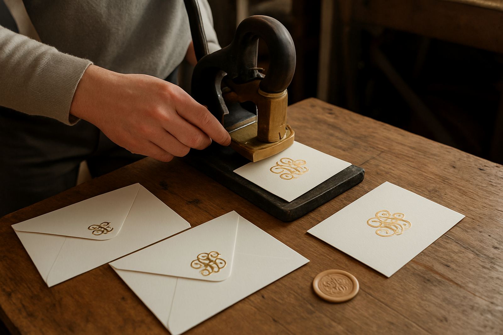
Ivory brings warmth without going beige. It is a good choice when the brief calls for something refined but less stark than white. On ivory, gold foil can look rich and almost candlelit, while dark brown, deep green and burgundy tones feel calmer and more grounded. That is why ivory remains popular for wedding invitations, thank-you notes and keepsake suites.
For venues in Stellenbosch or Paarl, where the setting often already feels warm and textured, ivory stock can sit naturally with stone, wood and greenery. It also suits envelope addressing where you want a softer first impression before the card is even opened. The main point is to test the exact shade of ivory against your chosen foil, because a creamy paper can shift the look of rose gold or champagne tones in a way that surprises people. The result can be lovely, but only if it is planned.
- Softens metallic finishes
- Feels classic without looking too formal
- Pairs well with natural themes and warm lighting
- Often hides handling marks better than bright white
Coloured stocks: character, contrast and restraint
Coloured paper can make a strong statement, but it needs discipline. A deep navy, forest green or blush stock changes the whole mood of a suite before any printing is added. It can work beautifully for event day stationery, menus and gift packaging, especially when the event palette is already well defined. Foil on coloured stock needs careful testing because not every combination reads clearly. Some shades absorb light while others reflect it, and a colour that looks calm in the studio can seem louder on the table.
The strongest results usually come from one of two approaches: either keep the printed detail simple and let the stock carry the colour, or use a contrasting foil so the lettering sits above the background. If a design has fine script or detailed borders, the stock should not fight with the artwork. That is where colour matching matters. A muted dusty pink can be elegant, but if it leans too peach, the effect changes completely. Small shifts like this are easy to miss until the proof is seen in person.
How foil, texture and thickness change the final look
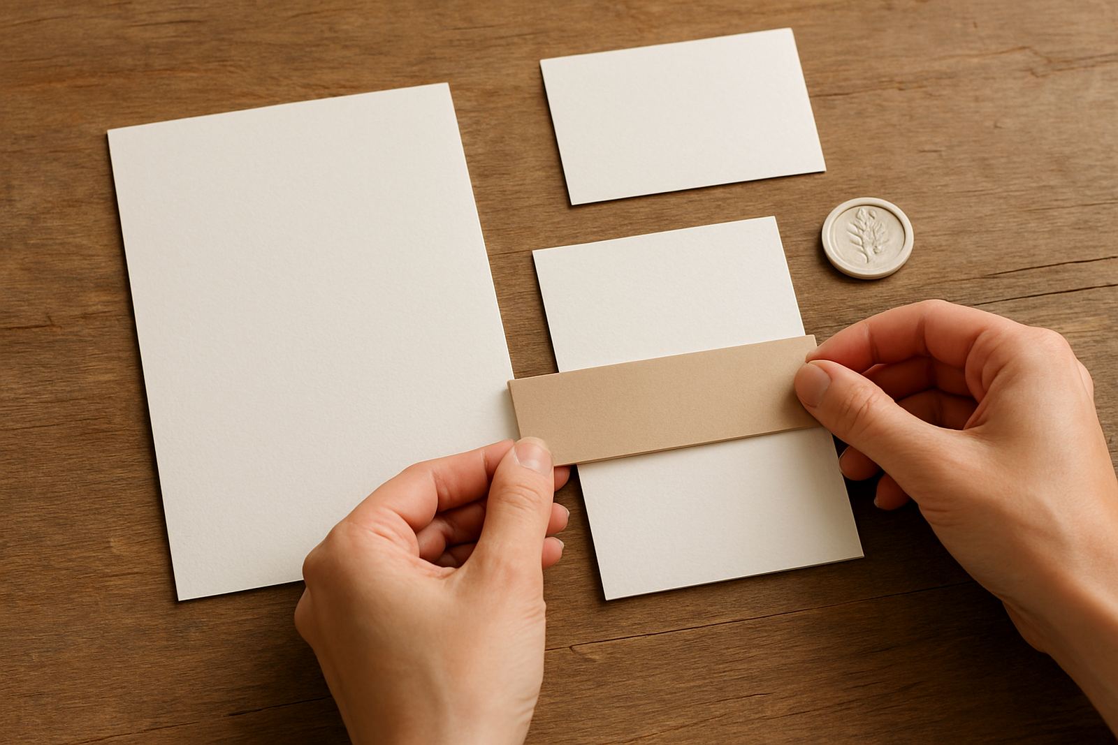
Paper colour never works on its own. The surface texture, thickness and finish all influence how the final piece behaves. A smooth sheet gives a crisp foil edge, while a lightly textured stock softens the shine and can make the piece feel more tactile. Heavier boards also sit better in hand and hold up better when suites include wax seals, ribbons or layered cards.
In practice, we look at how the paper takes pressure, how it folds, and whether the edge remains clean after cutting. This matters for envelope addressing and suite assembly as much as it does for the main invitation. Some papers show tiny fibres more clearly, and that can be beautiful if the design suits it. Others need a cleaner finish to keep the lines neat. If the stationery is being couriered nationwide, especially through summer heat or coastal humidity, the stock also needs to travel well without buckling or scuffing. The wrong finish can mark before it reaches the client.
- Thicker stock holds foil and embossing better
- Smooth papers sharpen fine detail
- Textured papers soften shine and add depth
- Humidity and courier handling should be considered for final packing
A Woodstock example: choosing the right stock for a Cape Town wedding
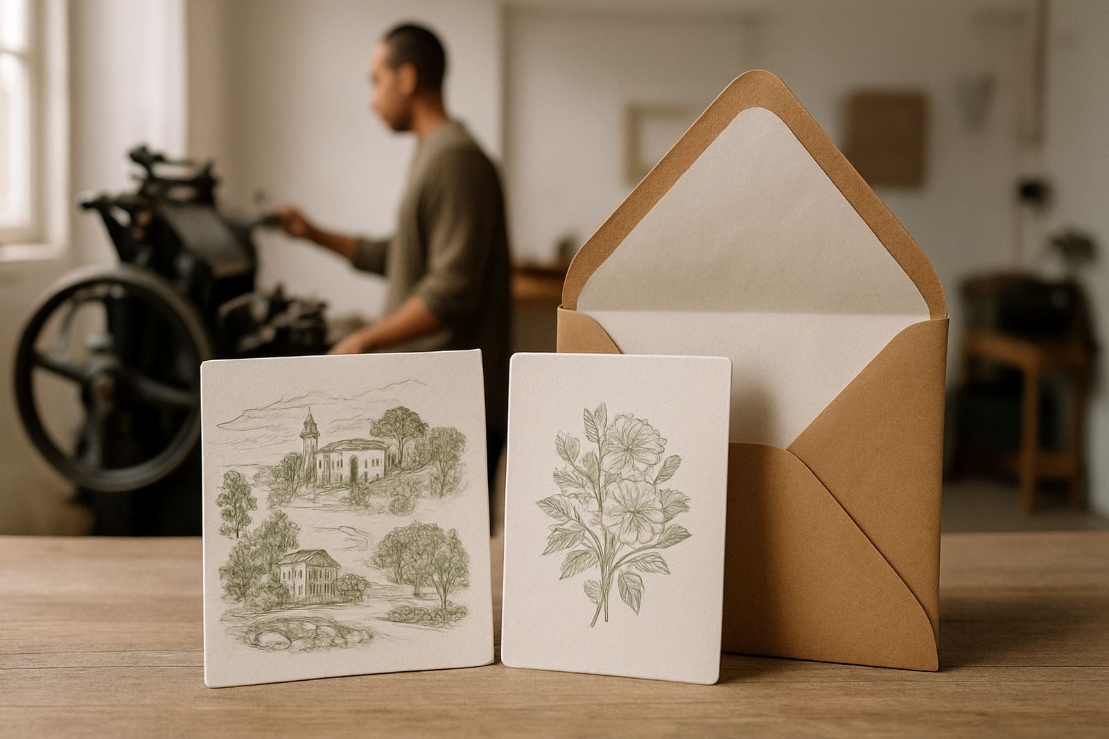
Take a wedding planned from Woodstock for a venue in the winelands. The couple wants a quiet, elegant look with gold foil, pale green accents and a clean layout. White paper gives the strongest contrast, but it can feel slightly formal against the natural setting. Ivory softens the gold and sits more comfortably with the landscape. A muted sage stock would echo the palette beautifully, yet it may reduce legibility if the wording is detailed.
In a case like this, the decision often comes down to how the stationery will be used. If guests only need an invitation and a reply card, a coloured stock may work well. If there is a full suite with travel information, accommodation notes and event day stationery, a lighter stock often keeps the whole pack easier to read. That practical balance is what makes the difference between pretty and useful. It also saves time during proofing, because fewer adjustments are needed once the paper choice supports the layout.
When clients in the Southern Suburbs or out in Somerset West ask for help, the conversation usually starts with mood, then moves to colour, then to what the paper must actually do. That order is useful, because a beautiful finish still needs to be legible, postable and suitable for the event. A neat idea on the screen can become awkward on the wrong stock, so the sample stage matters more than people expect.
Choosing with confidence before you approve the proof
The simplest way to choose paper colour is to ask three questions: what must stand out, how formal should it feel, and where will it be used. If the answer points to clarity, white is often the right place to start. If the brief asks for warmth and softness, ivory usually wins. If the event has a strong visual identity, a coloured stock may be the best option, provided the print contrast still works.
A good sample should be viewed in daylight and under indoor light, held next to the envelope, and checked against the foil and any other finishes. That avoids expensive changes later. For local clients across Cape Town and nationwide, a little time spent on stock choice usually pays off in a better final result, fewer reprints and a suite that feels considered from the first touch.
Paper colour is not just decoration. It is part of the message, and when it is chosen well, the rest of the stationery falls into place, neat and intentional.