When bold foil coverage earns its place
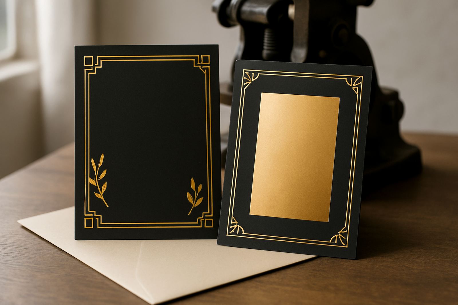
Fuller foil coverage works best when the piece needs to lead with formality, glamour or strong visual contrast. A fine border or small monogram can be enough for some jobs, but there are times when wider foil areas, larger lettering or repeated patterns carry the design better. Think of black-tie wedding invitations, milestone birthdays, corporate functions, or luxury launches where the stationery is part of the first impression.
In South Africa, that choice often comes down to more than style. Clients have to consider the envelope journey, courier handling, and whether the invite must still read clearly under indoor lighting at a venue in Stellenbosch or in evening light on the Atlantic Seaboard. A bolder foil layout can solve that by giving the invitation a stronger focal point, even if there are other details around it.
- Use stronger coverage when the event calls for formality
- Choose it if the invitation must be read quickly and clearly
- It suits dark paper stocks and layered suite formats
- It helps if the design will be photographed at the event
How paper choice changes the effect
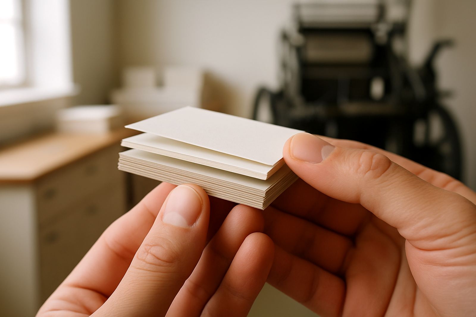
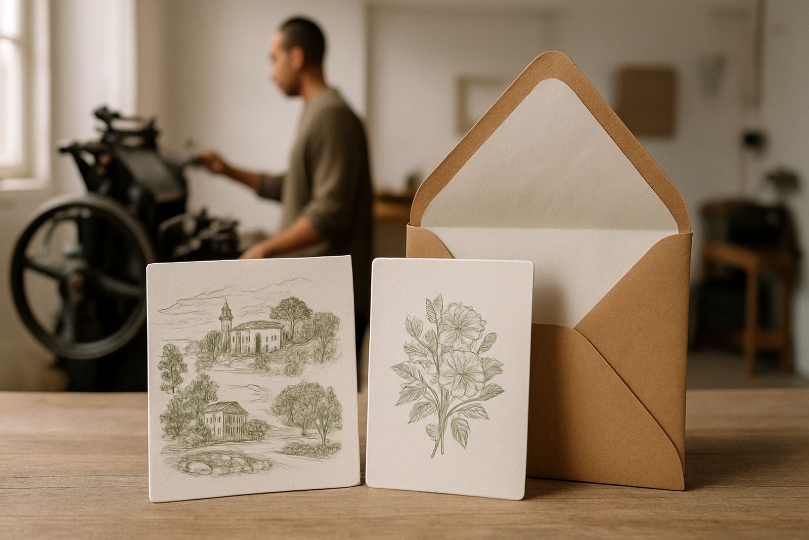
Foil is only half the story, because the paper underneath changes everything. Smooth heavier stock gives a clean edge, while textured paper can soften the shine a little and make the result feel more tactile. If the foil area is broad, the paper must be able to take the pressure of stamping without denting or showing marks around the image. That matters when the final suite includes multiple sheets, belly bands or wax seals.
For Cape Town clients, paper choice also needs to cope with local conditions. Coastal humidity can affect storage, and if a suite is assembled in advance for delivery to the Southern Suburbs or Paarl, the stock must stay flat and stable. We often guide clients toward papers that hold crisp foil detail but still sit neatly inside an envelope without snagging.
- Heavy stock supports larger foil panels better
- Textured papers soften the shine for a more classic finish
- Dark papers can make gold, silver or coloured foil look sharper
- Paper thickness should match the envelope and assembly method
Patterns, borders and repeated detail
Bold foil does not have to mean one oversized emblem in the middle of the page. It can also be a patterned band, a wide frame around the edges, or repeated foil motifs across cards in a suite. This approach works well when the design needs structure and rhythm. A repeating motif can tie together the main invitation, RSVP card and details insert without relying on too many separate elements.
For example, a couple in Woodstock planning a winter wedding might want an invitation that feels rich but not heavy. A narrow foil border on its own may seem too quiet for the venue, while a large all-over pattern could become busy. In that case, a double frame, a foiled crest and matching envelope addressing can give the suite weight without losing legibility. It also helps when the invitation is posted nationwide and needs to stand out when it arrives.
- Use borders when the page needs definition
- Use repeated motifs to link all the suite pieces
- Keep spacing generous so the design does not feel crowded
- Match the front cover and insert cards for a consistent finish
Matching foil strength to the occasion
There is a difference between making a statement and overloading the page. A wedding invitation for 20 guests at a family home in Somerset West may need a more intimate treatment, while a formal event for 300 guests in Cape Town city centre can carry a stronger visual punch. The same is true for corporate stationery, where a product launch or awards evening may call for bolder foil than a standard event notice.
We look at the occasion, the guest list, the venue and the way the stationery will be used on the day. If the piece is meant to be kept as a memento, stronger foil coverage can be worthwhile. If it is purely informational, the foil should support the text rather than dominate it. Good design is about deciding what the recipient must notice first, second and third.
- Formal events can carry larger foil areas
- Personal celebrations often work best with one strong focal point
- Informational cards need clearer hierarchy than decoration
- Event day stationery should match the tone of the invitation suite
What to check before approving a bold foil layout
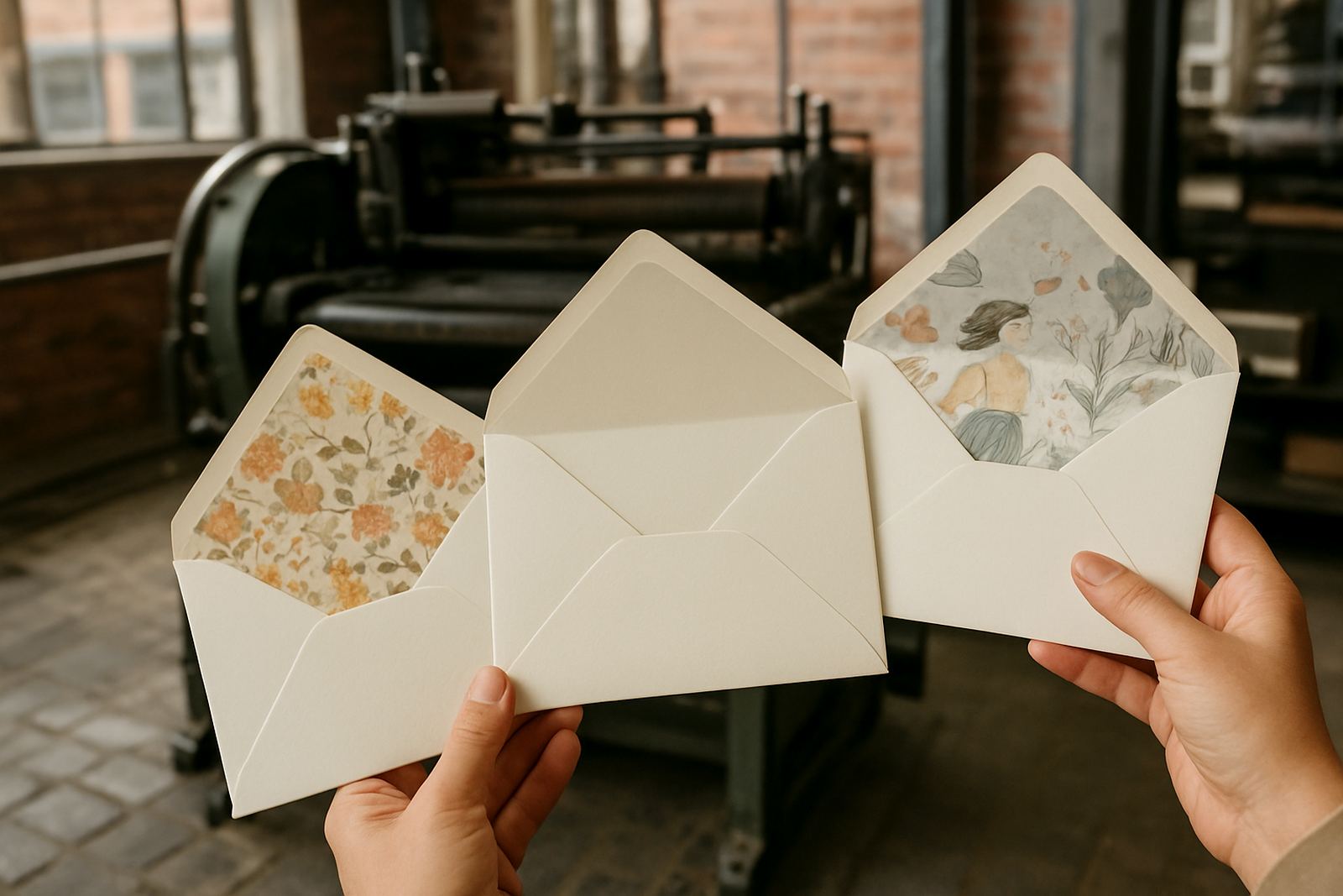
Before sign-off, it helps to examine a few practical points. Large foil sections need enough breathing room around text and artwork. Fine lettering may need to be enlarged slightly so it stamps cleanly. If there is an envelope liner, wax seal or folded menu involved, all the parts should be reviewed together so the finished set feels intentional rather than pieced together at the last minute.
Artwork proofing is especially important with stronger coverage, because any issue becomes more visible once the foil is pressed into place. A small spelling error or a crowded margin can spoil the effect, so the proof stage should be handled carefully. We also check how the package will be assembled, because a thick suite can behave differently from a simple single card, and the final stack must still fit the envelope properly.
- Check text size and spacing before approval
- Confirm the foil area works with envelopes and inserts
- Review the full suite together, not each item on its own
- Allow enough lead time for proofing, finishing and courier delivery
A Woodstock example with nationwide delivery
A recent Cape Town project started with a wedding suite for a couple based in Woodstock, with guests spread across Gauteng, KZN and the Winelands. They wanted something dramatic but still refined, so the final direction used a larger foil monogram, a full border on the main invitation and matched foiled names on the envelope. The result had real presence in hand, and the heavier coverage carried well through courier delivery to multiple provinces.
That is often the advantage of bold foil. It gives the stationery enough visual weight to survive both the photo stage and the posting stage, while still feeling special when opened at home. For clients in the Atlantic Seaboard, Northern Suburbs or nearby towns like Stellenbosch and Paarl, this approach also works well when events are planned around busy calendars and deliveries need to arrive ready for assembly. In practice, the foil has to look good under natural light, at a reception table and in a guest's hands, not just on the proof.