Where Floral Artwork Works Best in a Stationery Suite
Floral illustration is most effective when it has a job to do, not just when it fills space. On a wedding invitation, it can frame the wording, soften a formal layout, or give a clear sense of season and setting. On the day itself, the same artwork can carry through to menus, place cards, table numbers and welcome signs so the stationery feels connected without looking repetitive.
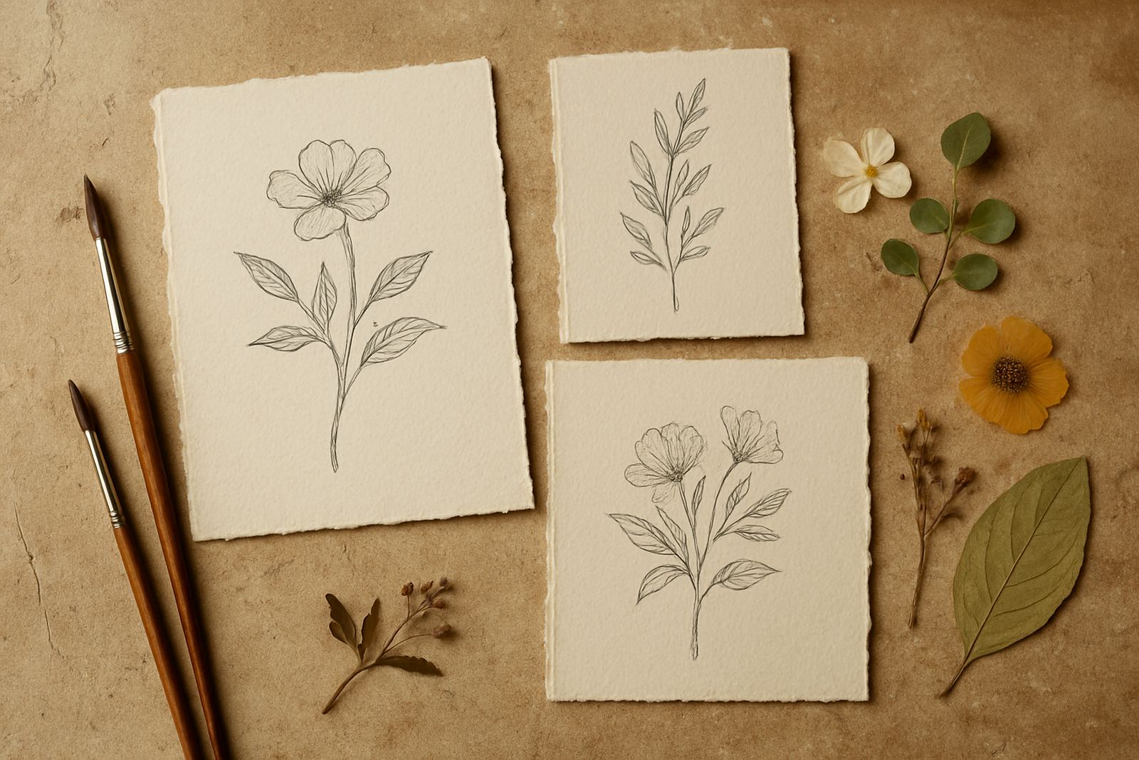
For Cape Town couples, the subject matter often follows the venue. A Constantia garden, a wine estate near Stellenbosch, or a coastal reception in the Atlantic Seaboard all suit different botanical choices. Soft blossoms, leafy borders and fine line drawings work well on cotton paper, while bolder flowers or larger motifs suit simpler layouts where the artwork can breathe.
The key is to decide early where the floral art should lead and where it should support. If the illustration is doing the heavy lifting, the wording can stay clean and simple. If the wording is formal or detailed, the floral treatment should stay lighter so the page does not feel crowded.
How Floral Motifs Change the Mood of an Invitation
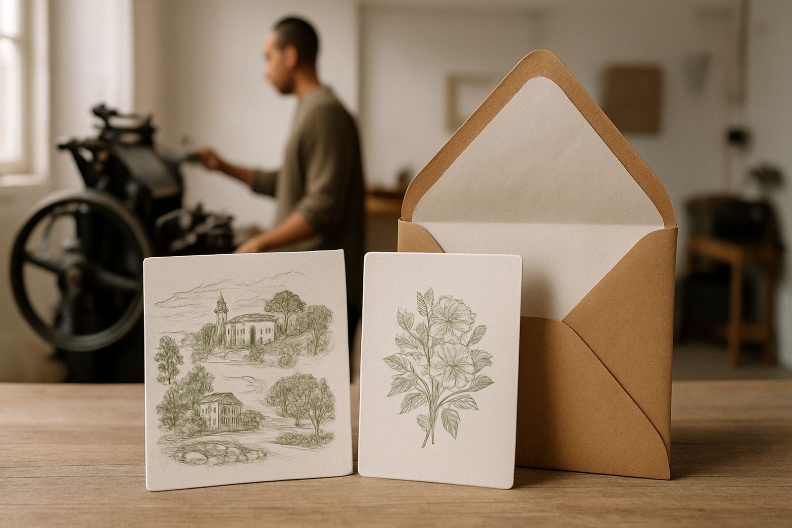
Different floral styles create very different effects. A loose hand-drawn sprig feels relaxed and modern. A detailed botanical study feels more refined and traditional. A painted bloom with soft washes can feel romantic, while a monochrome outline keeps the look sharp and measured.
That choice matters because the invitation is often the first physical cue guests receive. It tells them whether the event will be elegant and formal, relaxed and intimate, or bright and celebratory. Floral illustration can do that job without adding extra wording, which is useful when the invitation text already needs to cover venue details, dress code and timing.
- Fine line florals suit minimal layouts and smaller card sizes.
- Dense floral borders work well on larger invitation cards and welcome signs.
- Single bloom illustrations are useful for monograms, tags and envelope seals.
- Repeating motifs can tie together RSVP cards, details inserts and menus.
When the artwork is matched to the tone of the event, the stationery feels considered rather than decorated for the sake of it.
Using Florals on Day-of Pieces Without Overcrowding the Table
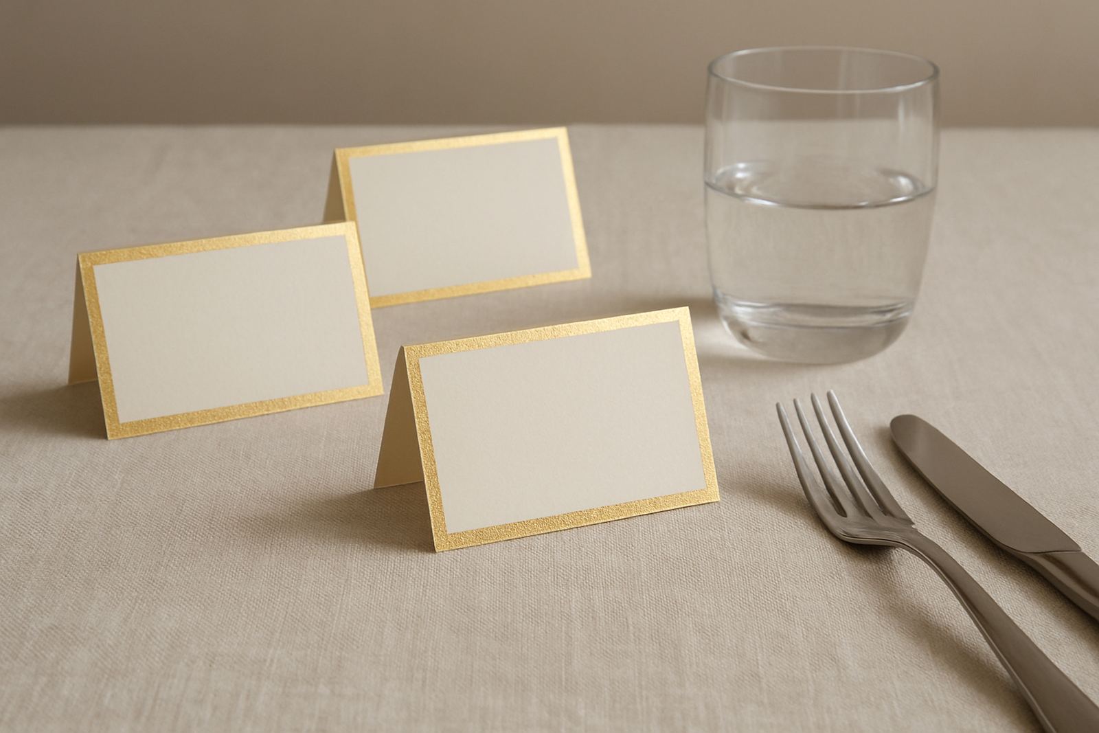
Day-of stationery needs to be read quickly, often in mixed light and sometimes outdoors in wind. That means floral artwork has to support legibility first. On a menu, a small floral corner or a thin top border may be enough. On a table number, a wreath can work if the number stays large and clear. On a seating chart, florals are best used around the edges so the guest names remain easy to scan.
There is also a practical side to materials. In coastal areas around Cape Town, humidity can affect some papers and adhesives, especially if stationery is prepared too early. For that reason, artwork placement and finishing methods should allow for clean assembly closer to the event. If a wedding is in Woodstock during summer or on the Southern Suburbs side where the afternoon can get warm, it is worth checking how the printed surfaces will handle handling, transport and display.
Florals can also be useful for directing attention. A menu with a floral header draws the eye to the courses. A place card with a small blossom at the name line helps each setting feel personal without taking up too much table space.
Matching Florals to Paper, Foil and Finishing
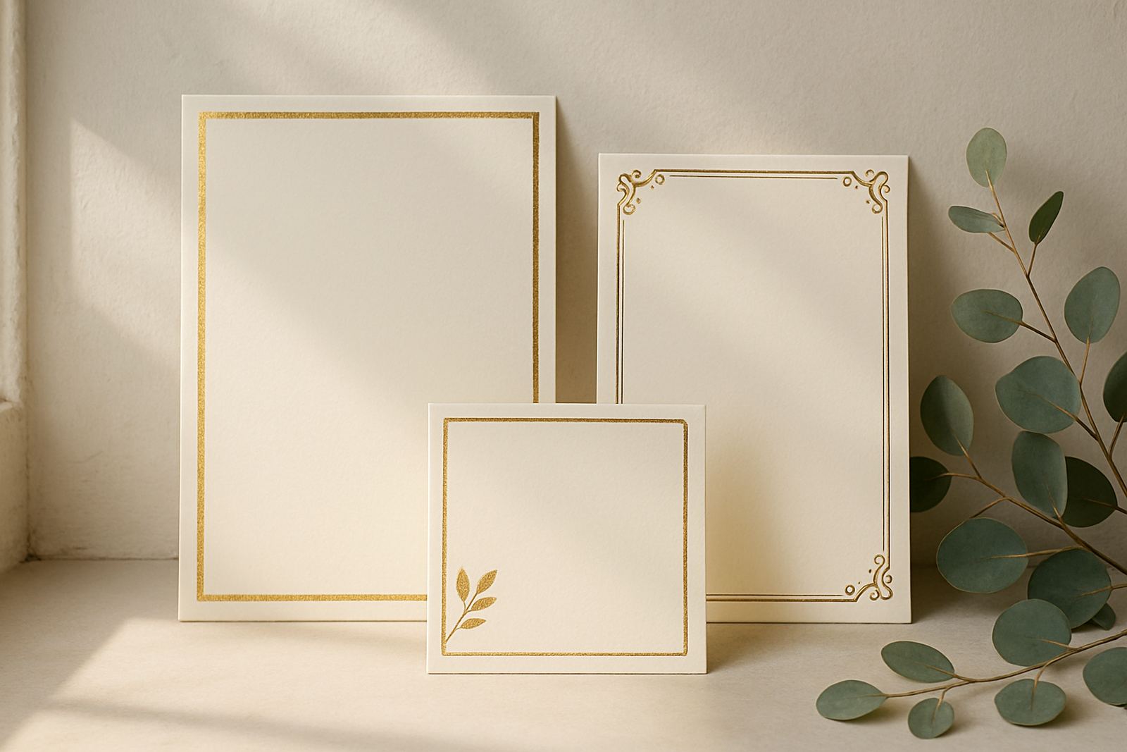
Floral illustration changes character depending on the paper and finishing choices around it. On textured stock, detailed line work can look softer and more organic. On smooth paper, the same artwork looks cleaner and more precise. If foil stamping is added, the foil colour should support the line weight and the mood of the design rather than compete with it.
Gold foil often suits warm botanicals and classic wedding styling. Rose gold can work well with blush florals and softer palettes. Silver or pale metallic finishes can be effective for cooler schemes, especially when the artwork has a crisp botanical feel. For a more understated result, blind embossing or letterpress finishing can bring the flowers forward through texture instead of shine.
- Choose heavier paper if the floral design includes detailed borders or layered inserts.
- Use lighter floral elements when adding wax seals, ribbon or envelope addressing.
- Keep the most detailed illustration for the invitation cover, then simplify for inserts.
- Test the artwork at actual size before approving any final print run.
The best result comes from balancing image, paper and finishing so the stationery feels intentional from first touch to final display.
Floral Artwork for Cape Town Venues and Local Conditions
Local setting makes a big difference to floral stationery. A vineyard wedding in Stellenbosch calls for a different visual language than a dinner reception in the city centre or a small ceremony in Somerset West. In the Winelands, leafy vines and seasonal blooms can echo the surroundings. In town, a tighter and more contemporary floral arrangement can suit the architecture and styling better.
Cape Town weather also plays a part. Strong wind can make lightweight signage less practical, so if florals appear on welcome boards or seating charts, the format must be sturdy enough to stand up on the day. For outdoor ceremonies, avoid overcrowding the page with too much artwork around essential information. Guests need to read names and directions quickly, especially if the ceremony starts close to sunset.
A useful local example is a summer wedding in Paarl with a ceremony in the late afternoon and dinner on a lawn afterwards. The invitation might use soft peony style artwork around the corners, while the menu and place cards use just a small floral line at the top. The day feels connected, but the table still reads clearly in changing light.
When to Keep the Floral Story Simple
Not every stationery suite needs a full floral treatment. If the venue already has strong visual character, or the couple wants a more modern and formal look, a lighter approach is often better. A single stem, a small sprig, or one border detail can be enough to create interest without pulling attention away from the wording.
Simple floral illustration also helps when there are many stationery items to manage. Escort cards, thank-you tags, favour labels and envelope liners can all carry the same small motif without becoming too busy. That makes assembly easier and keeps the suite consistent across the invitation, ceremony and reception.
As a rule, floral artwork should support the event story. If it explains the season, reflects the venue or brings warmth to a clean layout, it is doing its work. If it begins to crowd the text or repeat itself too often, it is time to scale back and let the paper and wording carry more of the load.
For couples in Woodstock and across the country, that practical balance is usually what makes the finished suite feel polished, personal and easy to use on the day.