Why foil and letterpress work so well together
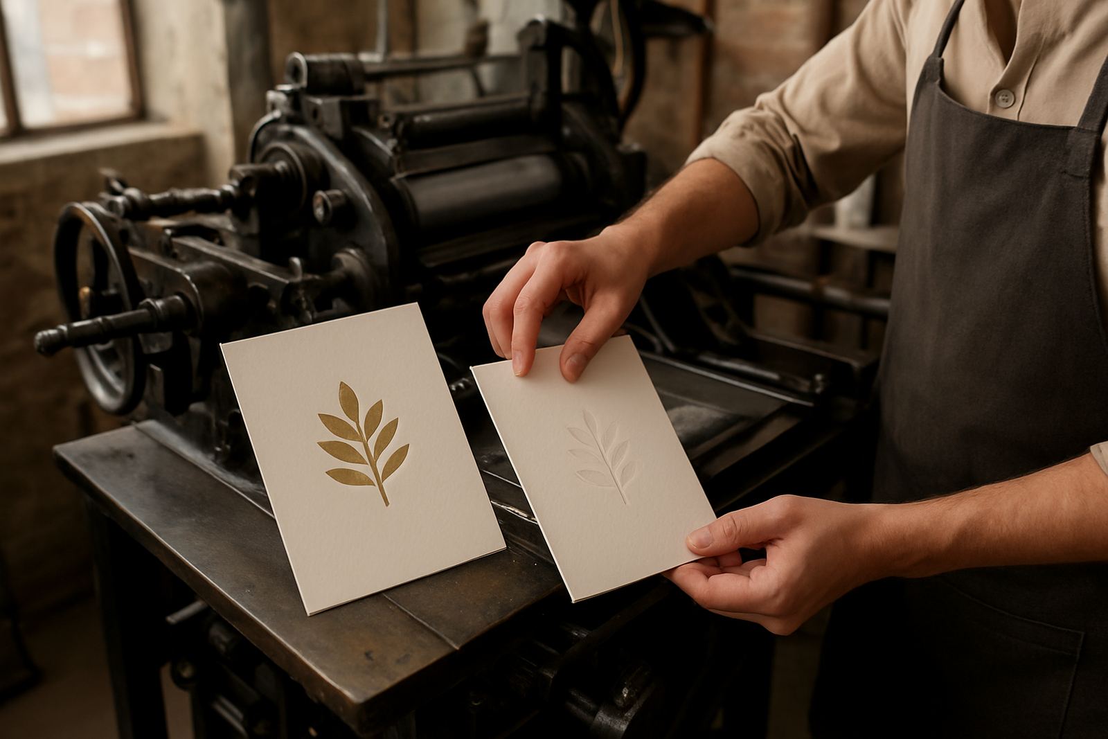
Foil stamping and letterpress each bring a different quality to stationery. Foil gives a crisp metallic or coloured shine, while letterpress presses the artwork into the paper so you can feel the impression with your fingers. When the two are combined, the result is not just pretty on a table or in a photo, it has depth and texture that guests notice straight away.
That balance is what makes this pairing so effective for wedding invitations, event suites and keepsake stationery. Foil catches the light in the right places, while letterpress adds weight and structure to names, borders or monograms. Used together, they can make even a simple layout feel considered and formal without becoming overdone.
For clients in Cape Town and further afield, this finish combination also photographs well. In strong daylight along the Atlantic Seaboard or under softer venue lighting in the Southern Suburbs, the foil detail still shows clearly, while the letterpress gives the card body and character.
- Foil is best for shine, contrast and emphasis.
- Letterpress is best for texture, tactility and quiet detail.
- Together they suit both classic and modern stationery styles.
Choosing the right paper for a clean impression
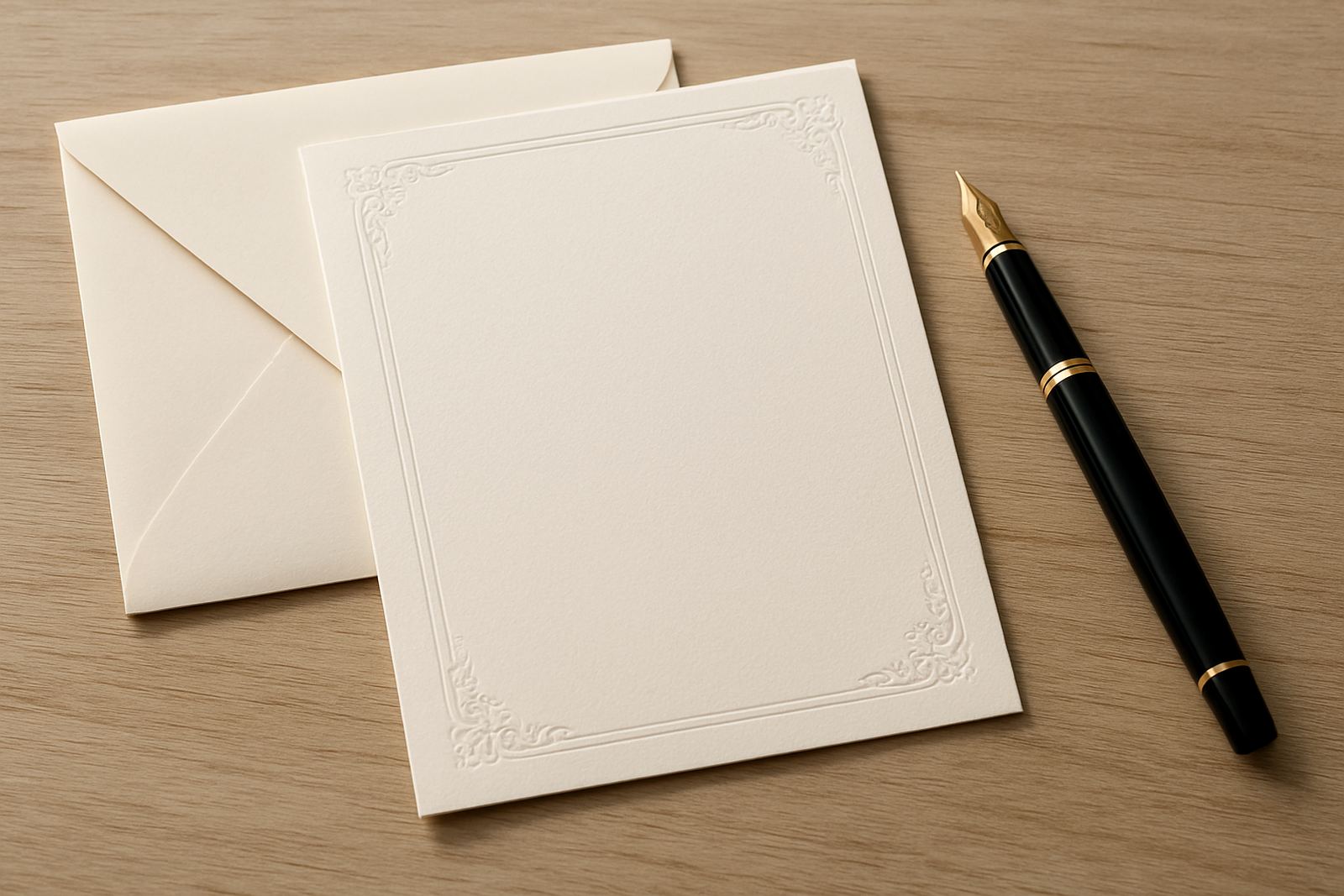
The paper matters as much as the finish itself. Letterpress needs a sheet with enough thickness to hold the impression neatly, otherwise the press can look shallow or uneven. Foil also performs better on paper that is smooth enough for the design to transfer cleanly. For most wedding and event stationery, a heavier cotton or specialist board gives the best result.
We usually guide clients to paper that suits both the look and the practical handling. If the stationery will be posted nationally, a card that is too bulky can push up courier costs and may need extra protection in transit. If it is for hand delivery at a venue in Stellenbosch or Paarl, a heavier stock can be used more freely.
- Thicker paper gives a deeper letterpress impression.
- Smoother paper improves foil clarity.
- Heavier boards feel more luxurious but may need extra postage care.
- If the design includes envelopes, the paper tone should be matched carefully.
Coastal humidity in Cape Town can also affect how paper sits during storage. That is why good production handling matters, especially for suites being kept ahead of a summer wedding weekend. Proper stacking, flat storage and careful packing all help keep the finished pieces crisp.
Where foil should lead and where letterpress should take over
The best designs do not try to make every detail do everything. A stronger result often comes from assigning each finish a clear role. Foil can highlight names, dates, a crest or a border line. Letterpress can carry the main wording, the monogram or the inside panel text. This gives the card visual hierarchy, which makes it easier to read and nicer to hold.
For example, a wedding invitation might use gold foil for the couple’s names and a blind letterpress impression for the wording. Or it may use a deep coloured foil for an emblem, with the date pressed into a thick natural card. The trick is to let one finish lead and the other support. If both finishes compete for attention, the design can start to feel busy.
We often suggest the following combinations:
- Foil names with letterpress invitation wording.
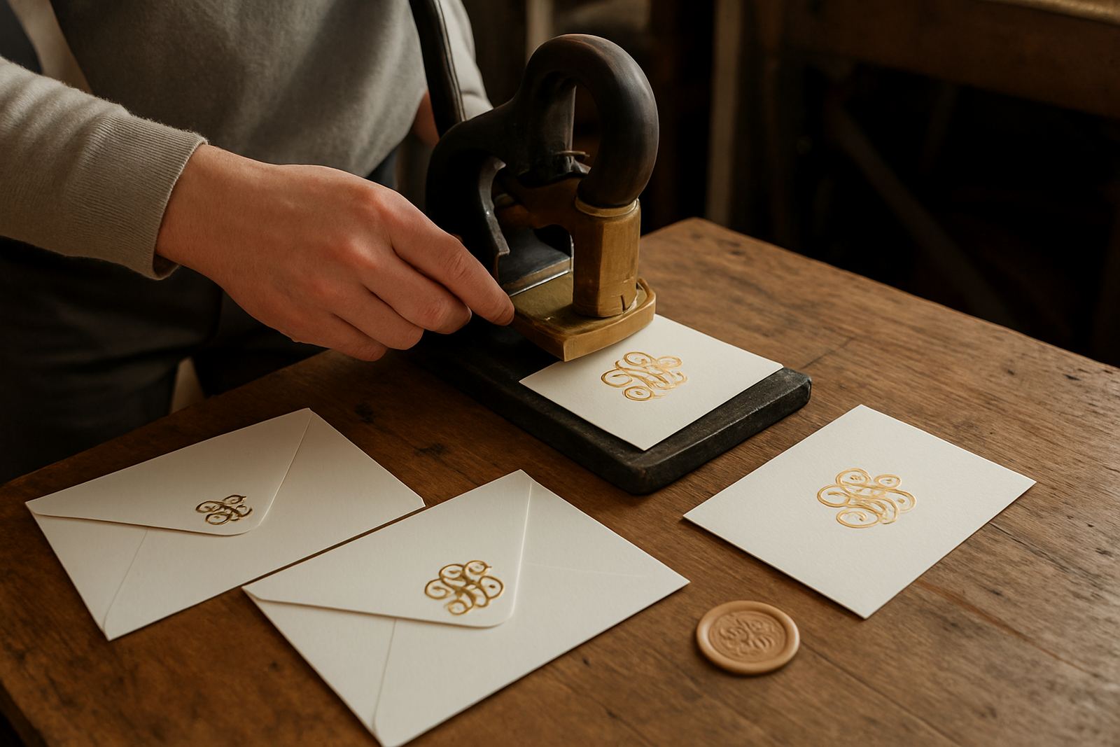
- Foil monogram with letterpress borders and headings.
- Foil on the outer card, letterpress on the detail insert.
- Foil on the envelope flap, letterpress on the main card face.
How colour matching keeps the suite tied together
Once you combine finishes, colour planning becomes even more important. Foil can sit beautifully against ivory, warm white, soft grey or deep tonal paper, but the shade needs to work with the rest of the suite. If the invitation is paired with RSVP cards, details cards and envelopes, the full set should feel intentional from start to finish.
This is where careful colour matching matters. A pale blush foil will read very differently on bright white paper compared with a warmer stock. The same applies to dark metallics, which can look more formal on matte paper and more decorative on textured board. The right match depends on the tone of the event and the amount of text that needs to be included.
For clients in Cape Town, we also look at venue context. A coastal wedding in Camps Bay may suit a lighter palette with clean foil accents, while a farm venue outside Somerset West might call for a warmer paper tone and a deeper impression. The stationery should feel like it belongs to the day, not fight it.
- Match foil colour to dress code, decor and venue lighting.
- Use one main paper tone across the suite for consistency.
- Test small samples before confirming a full run.
Artwork proofing before the press goes down
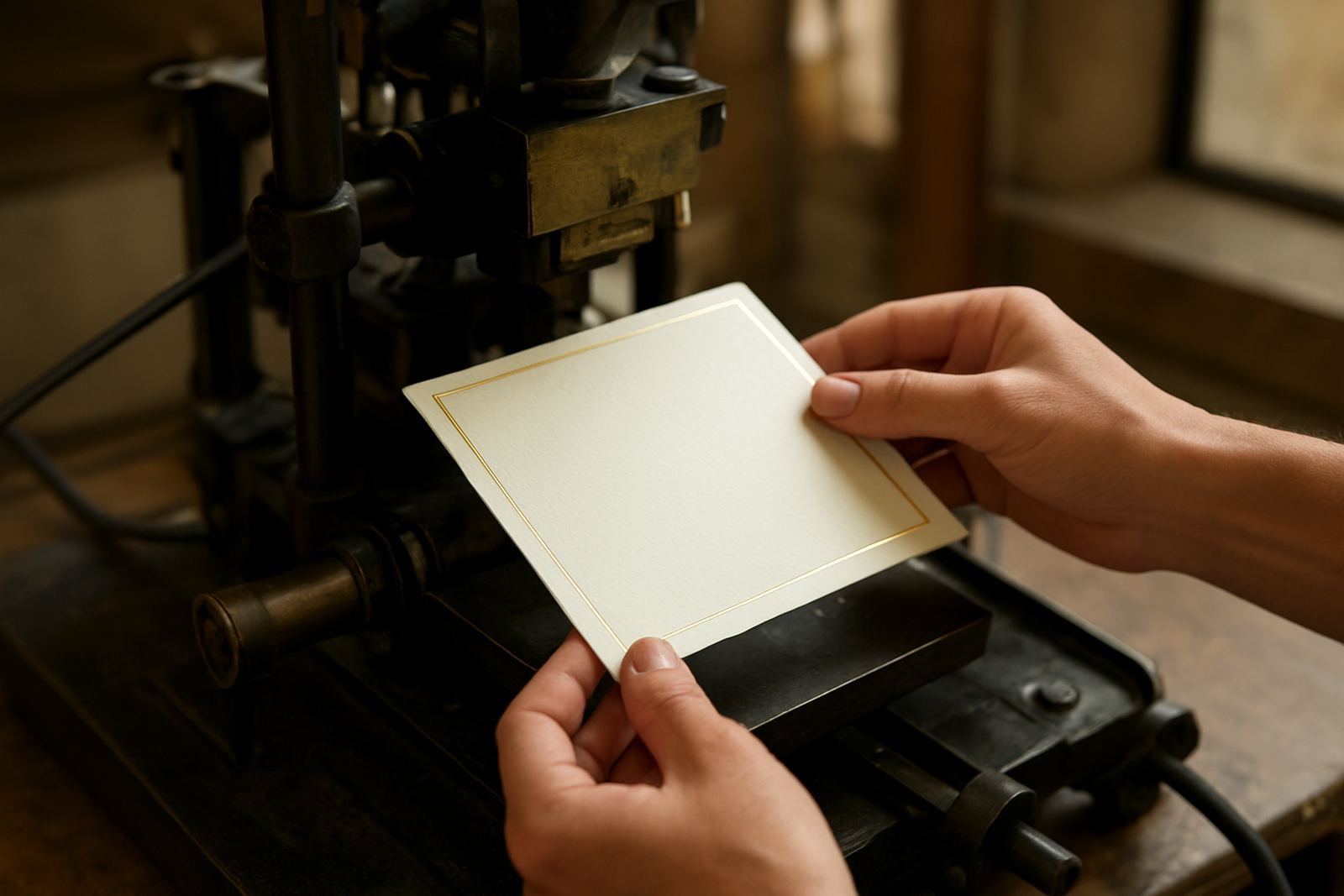
Because foil and letterpress both rely on precise setup, artwork proofing is not something to rush. Line weights, spacing and text placement all matter. Fine script can look elegant on screen but may need adjustment in production, especially if it is being pressed into a textured sheet or foiled at small size. Clear proofing helps avoid fuzzy edges, uneven spacing or text that is too close to the trim.
We recommend checking the wording, spelling, date format and layout line by line before approval. This is particularly important for wedding stationery where family names, titles and venue details must be exact. Once the plates and dies are prepared, changes become costly and can delay the full order.
Practical proofing checks to make before final approval:
- Confirm all names, surnames and venue details.
- Check spelling in both the main invitation and inserts.
- Review margins, alignment and spacing around the foil area.
- Make sure the design still reads clearly at the final card size.
A local example for a Cape Town wedding suite
A client planning a late-summer wedding in Stellenbosch wanted a suite that felt elegant but not formal to the point of stiffness. The invitation used warm white paper, a soft gold foil monogram and letterpress wording in a deep charcoal ink. The RSVP card carried only the key details, while the envelope featured a subtle pressed return address for a tidy finish.
The couple was collecting some pieces in Woodstock and couriering the rest to family in the Northern Suburbs and Paarl. Because the suite included several items, the assembly had to be organised carefully so each envelope, insert and final card stayed in order. That kind of planning matters when guests are receiving different parts of the set in more than one location.
The final effect was understated but rich. The foil gave the suite a clear focal point, while the letterpress made the wording feel considered and permanent. It was the kind of stationery guests kept after the event, which is often the real measure of success.
When to choose both finishes for an event
Foil and letterpress are worth combining when the stationery needs to carry more than information. If the invitation is part of the event experience, if the paper will be kept as a memento, or if the design needs to hold its own in photographs, the extra finish can make a real difference. They are also useful when you want a quieter kind of luxury, rather than something loud or overly decorative.
This approach works well for weddings, milestone birthdays, premium corporate events and gift packaging where presentation matters. It also suits clients who want one cohesive suite across printed pieces and packaging, from the main invitation through to the envelope addressing and final wrap.
If you are unsure whether foil and letterpress are too much together, start with one strong focal point and keep the rest clean. That usually gives the best result, especially when the stationery needs to feel elegant in hand and practical for local or nationwide delivery.
In the right combination, the two finishes do not compete. They support each other, and the whole piece feels more thought through.