Why less detail can say more
A minimalist invite is not plain, and it is not cheap looking either. The point is to remove anything that does not support the message, then let paper, type and finish carry the weight. When a card has clear spacing, one or two fonts and a calm colour palette, the eye settles immediately. That feeling matters for weddings and private events because the invitation sets the tone long before guests arrive.
For Cape Town clients, this style suits many kinds of celebrations, from a small ceremony in the Southern Suburbs to a coastal reception on the Atlantic Seaboard. It also travels well through courier because the layout is usually compact, which helps with packing and keeps handling marks to a minimum. In a market where people often want something different, minimalist work has staying power because it does not chase a trend and its design age well.
The paper choice changes everything
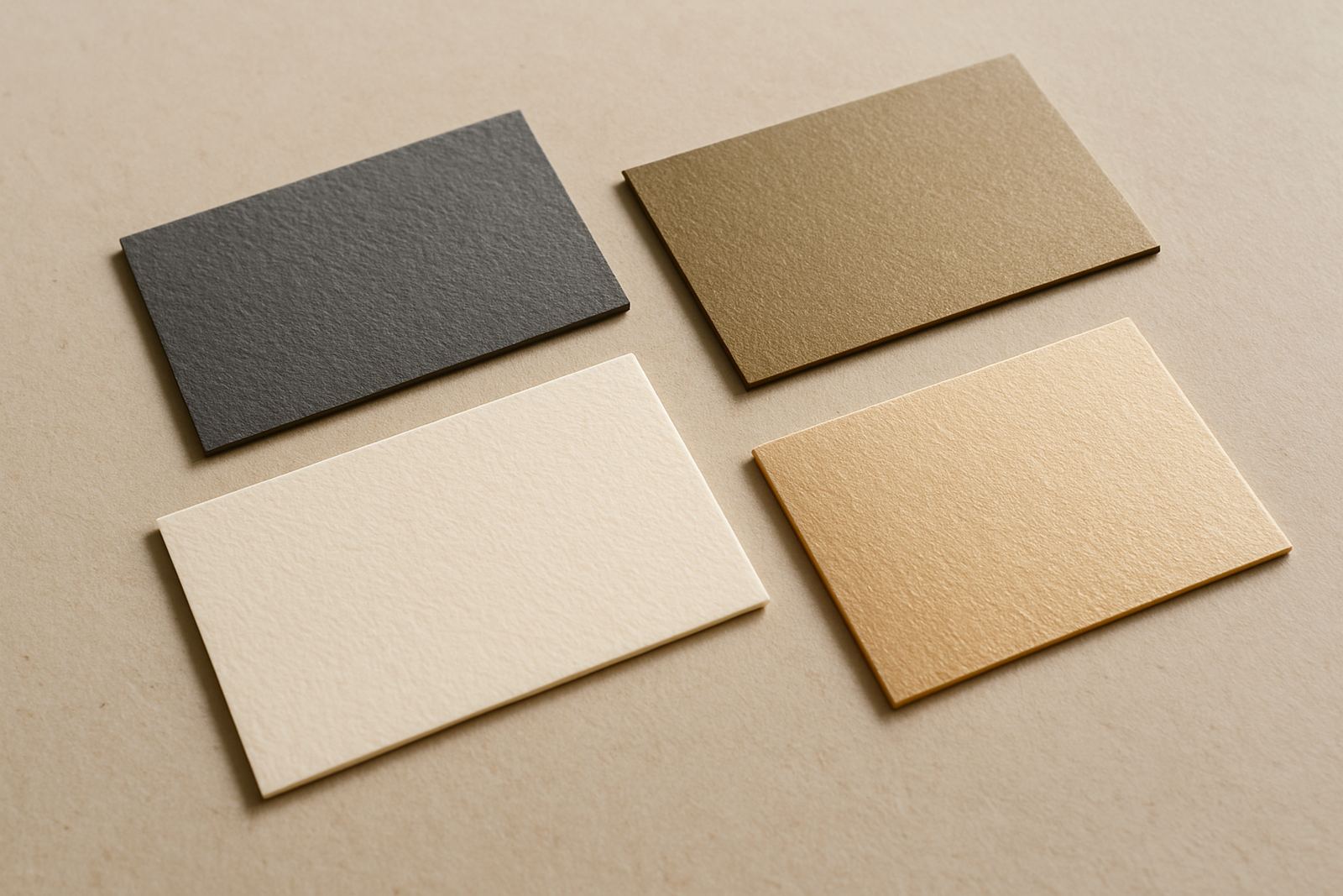
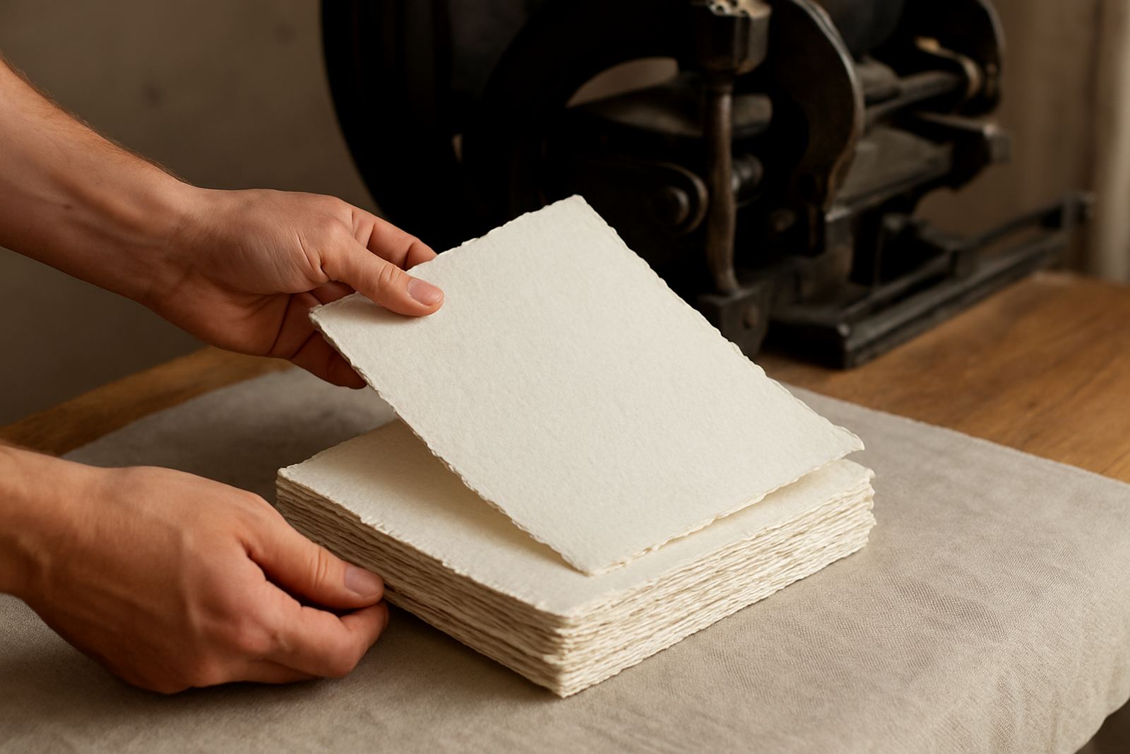
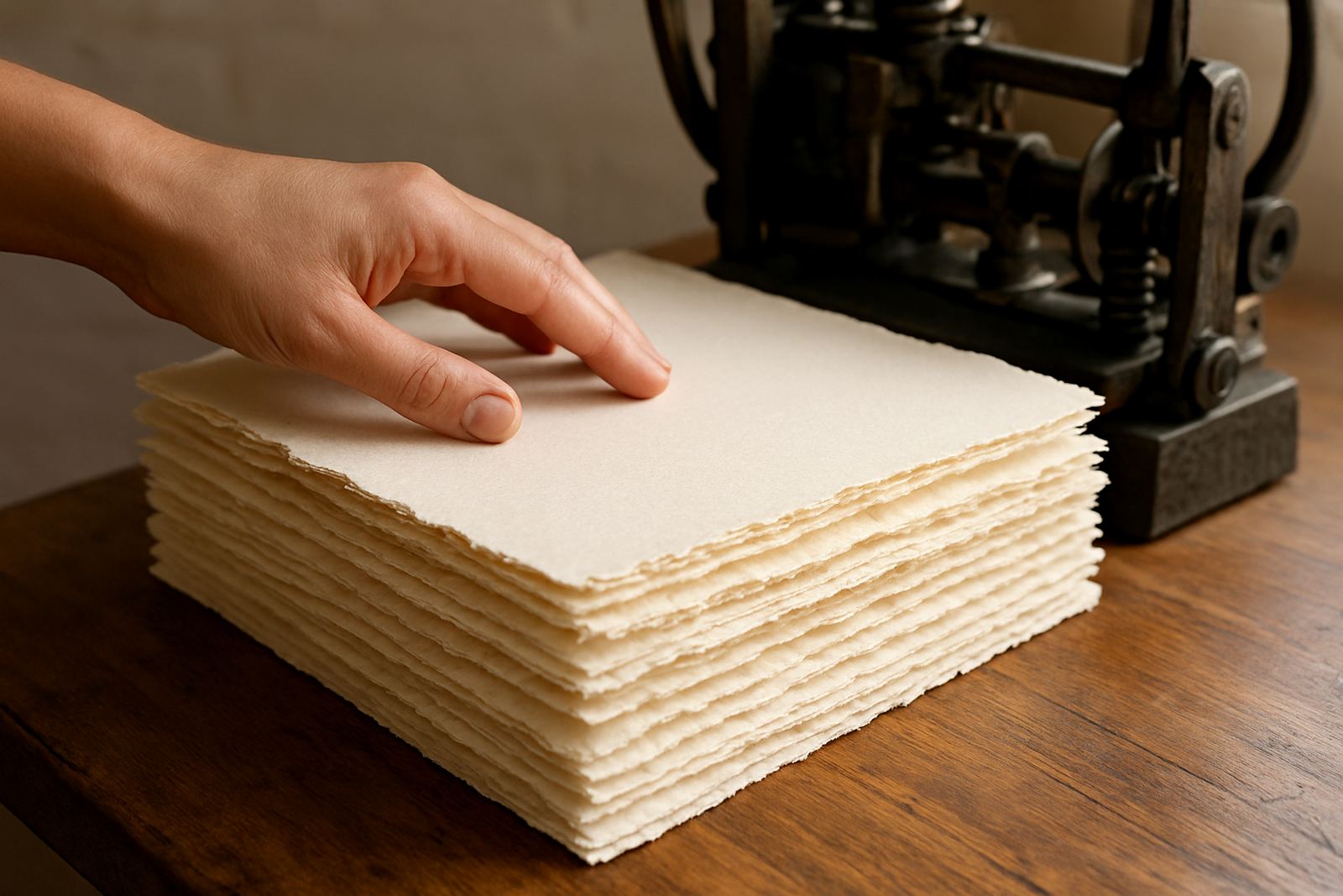
With restrained layouts, the paper becomes part of the design rather than just a carrier for information. A heavier stock gives the card presence in the hand, while a textured sheet can soften a very modern layout. Smooth papers suit crisp typography and foil details, while cotton papers work beautifully when you want a softer, more tactile finish. In humid coastal areas, paper quality matters even more because lower grade stock can curl or mark more easily.
- Choose a weight that feels firm at 300 to 350 gsm for main invitation cards.
- Use matching envelopes so the set feels considered from the start.
- Keep the colour family tight: white, warm ivory, charcoal, blush or muted sage.
- Ask for paper samples if you are comparing textures or shades under natural light.
Paper sourcing is often overlooked, but it is one of the main reasons a simple invitation can look expensive without trying too hard. A clean layout on poor paper still looks flat, while quality stock gives the design a proper finish.
Where foil stamping fits into a clean layout
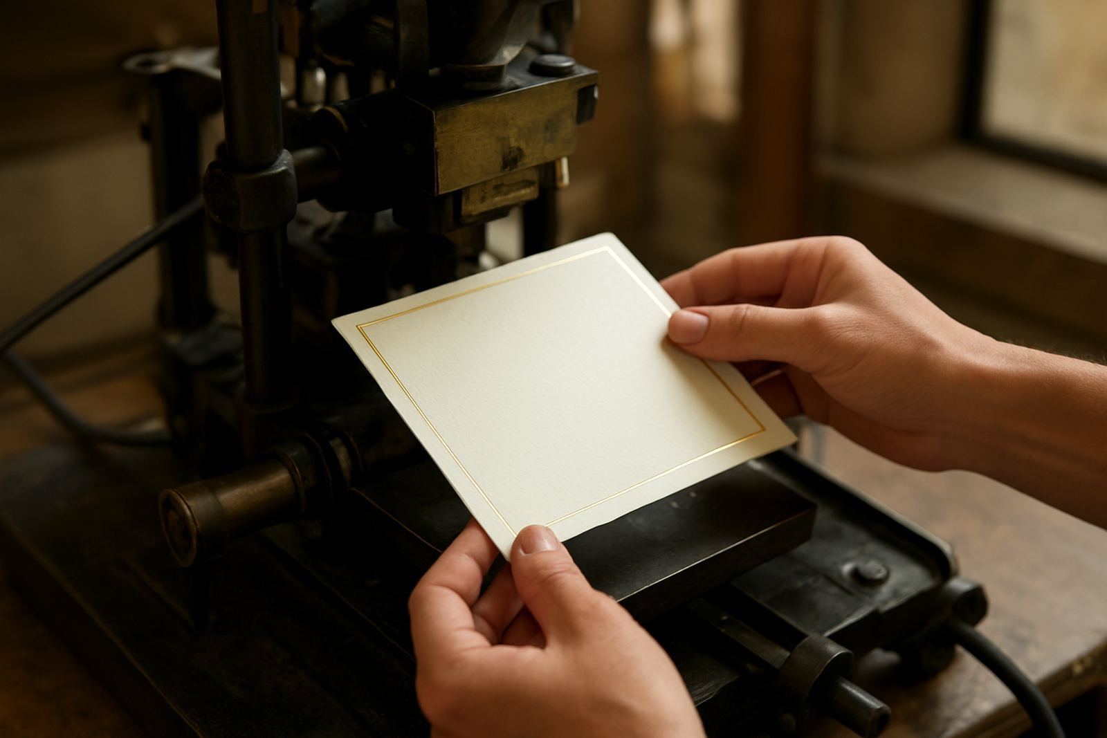
Foil stamping works well in minimalist design because it adds emphasis without adding clutter. A small foil monogram, date or border can give the invitation one clear focal point. Gold is still popular, but silver, rose tones and subtle metallics can work too, especially when the rest of the suite stays quiet. The trick is restraint. Too many foil elements and the invite loses the calm that makes it effective.
At Foil Stamping Studio in Woodstock, the best results usually come from balancing a fine detail against a generous amount of white space. A single line of foil around the main card, or a date tucked low on the page, can be enough. It is a practical approach for couples who want something memorable without overloading the suite. The production process also allows careful colour matching, which is useful when the invitation must sit alongside flowers, linen or bridesmaid attire that has already been chosen.
Simple structure helps guests read faster
Minimalist stationery is not only about looks. It also makes the information easier to read, which is important when you are asking guests to note a venue, date, dress code and RSVP details. Clean structure reduces confusion and keeps the invitation from feeling crowded. That is especially helpful when you have a few moving parts, such as separate cards for directions, accommodation or reception timing.
- Lead with the names or event title.
- Place the date and venue where the eye can find them quickly.
- Keep RSVP instructions short and clear.
- If needed, move extras like map notes or gift guidance to a companion card.
Good hierarchy is a design tool. It means the most important details stand out without needing bold colours or large graphic devices. For event stationery used on the day, the same rule applies. A menu, place card or table number looks better when the wording is clean and the spacing is deliberate.
Minimalist suites still need finishing work
People often think a simple invitation is faster to produce, but in practice it can demand more precision. When there are fewer visual elements, every cut, fold and alignment must be accurate. Envelope addressing needs to be neat, suite assembly must line up properly and wax seals should sit in the same place on every card. If one element is out by even a few millimetres, it shows. That is why finishing matters so much in restrained designs.
For clients in Stellenbosch, Paarl and Somerset West, suite assembly and couriered delivery are often part of the brief because many weddings are hosted at farms, guest houses or private venues. Careful packing protects the edges and keeps the set presentable on arrival. In summer, when load-shedding can slow parts of the day, it helps to plan production and approvals early so there is time for proofing, corrections and final finishing without rushing.
A local example from Woodstock to the Winelands
A couple planning a small wedding between Cape Town and the Winelands might start with a white invitation card, a soft grey envelope and one line of foil in champagne tone. The wording could be centred with generous margins, then paired with a separate details card for directions and accommodation. That kind of suite feels modern without being cold, and it photographs well too.
Because the set is compact, it can be couriered nationwide with less bulk and less chance of scuffing. For Woodstock studio work, that is useful when the client wants a refined look but is coordinating from a different suburb or province. The design still feels personal because the names, colours and wording are tailored to the couple, not lifted from a general template. In the end, minimalist style works best when it is not empty but edited, which is a small difference with a big impact.
How to choose a minimalist route with confidence
If you are unsure whether minimalist stationery suits your event, start by asking what you want the guest to feel first. Calm, formal, modern, intimate or slightly ceremonial each lead to different choices in type, paper and finish. From there, keep the palette tight and decide on one detail to carry the personality, whether that is foil stamping, letterpress finishing, envelope lining or a wax seal. More than one strong feature can be too much for this style.
It also helps to think practically. Will the invitation travel by courier? Will it be opened in a hotel room, a family home or at a venue in the countryside? Will it need matching on-the-day items later? Once those details are clear, the design can stay minimal while still doing its job properly. That is the part many people miss: simple does not mean easier, it means every choice has to count.
- Use one main idea and avoid competing motifs.
- Choose materials that feel good in the hand and hold their shape.
- Keep wording concise so the layout can breathe.
- Ask for proofing before production so small spacing issues can be corrected.