Why the finish matters before the details are read
When someone takes your card at a meeting in Woodstock, at a wedding venue in Stellenbosch or after a site visit in the Southern Suburbs, the first thing they notice is how it feels in the hand. A card with the right finish can suggest care, order and a steady eye for detail. A thin card with poor print quality often gets tucked away or left behind.
For many South African businesses, the card has to do a few jobs at once. It must survive being carried in a wallet, handle humid coastal weather and still look clean after a busy week of meetings. That is why foil, texture and thickness need to be chosen together, not one at a time.
Foil adds contrast without making the card busy
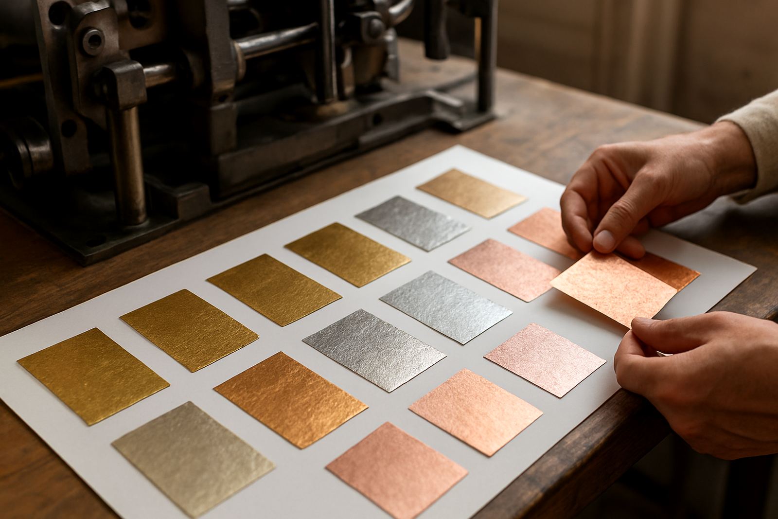
Foil stamping is often used for names, monograms, logos or short lines of text. On a business card it works best when the design is simple and the spacing is generous. A small amount of foil can catch the light nicely, while too much can make the card feel crowded.
- Gold foil suits warm tones, cream stock and formal services.
- Silver foil works well on darker cards and cooler colour palettes.
- Copper or rose tones can soften a modern layout without making it flashy.
- Blind foil or no foil at all may suit understated professional cards.
For Cape Town clients, foil also helps a card hold its own in bright daylight. A matte background with a foiled name reads clearly and still feels special when it is handed over at a meeting in the city bowl or at an evening function in Paarl.
Texture changes the way a card is remembered
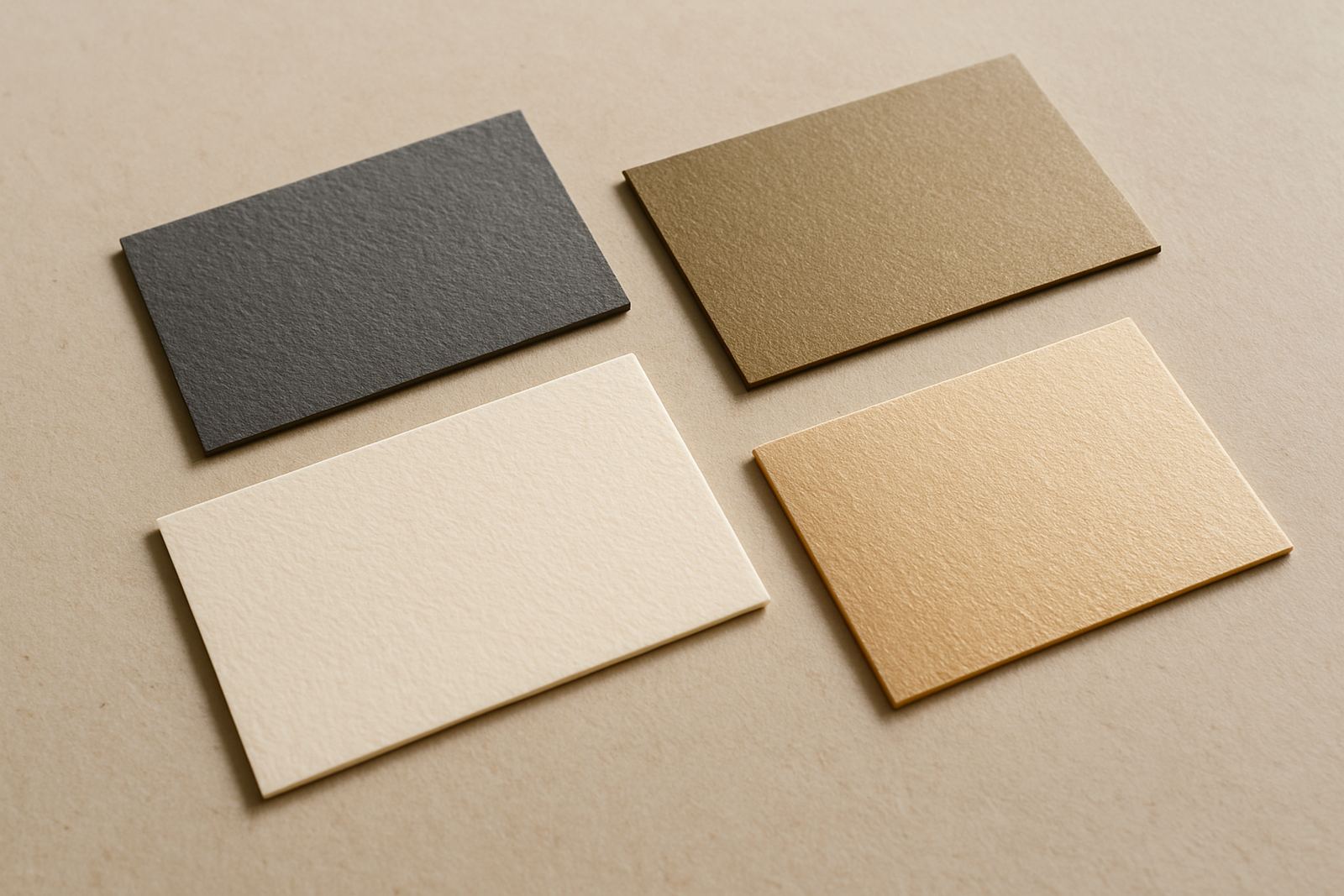
Texture is often overlooked, yet it is one of the quickest ways to make a card feel considered. A smooth coated stock gives a neat, crisp print result. An uncoated stock feels more natural and is easier to write on. Letterpress or debossed areas create a raised or pressed effect that gives the card depth without needing extra decoration.
If your work depends on careful presentation, texture can support that message. A planner, designer, consultant or wedding supplier may prefer a card with a slight impression because it feels tactile and calm. If the card must be written on at events or in showroom appointments, an uncoated surface is usually more practical.
- Smooth stock suits fine detail and sharp typography.
- Textured stock adds a softer, more traditional feel.
- Pressed lettering works well for short names and initials.
- Uncoated stock is handy when notes need to be added by hand.
Thickness and weight affect how people judge the card
Card thickness is measured in grams per square metre, but the hand feel matters more than the number alone. A heavier card often feels more established because it holds shape better and does not bend easily in a wallet or bag. A lighter card may be fine for short-term events, but it can feel flimsy if the design relies on a premium look.
There is also a practical side. In humid areas along the Atlantic Seaboard or after summer rain in the Northern Suburbs, a heavier card is less likely to curl. For businesses that send cards with packages or invite guests to events, a stronger stock can travel better and arrive looking neat.
That said, thick is not always best. Very heavy cards can be costly to courier in larger quantities and may not fit easily into standard card holders. It is worth matching the thickness to how the card will be used day to day.
Choosing a finish for your business type
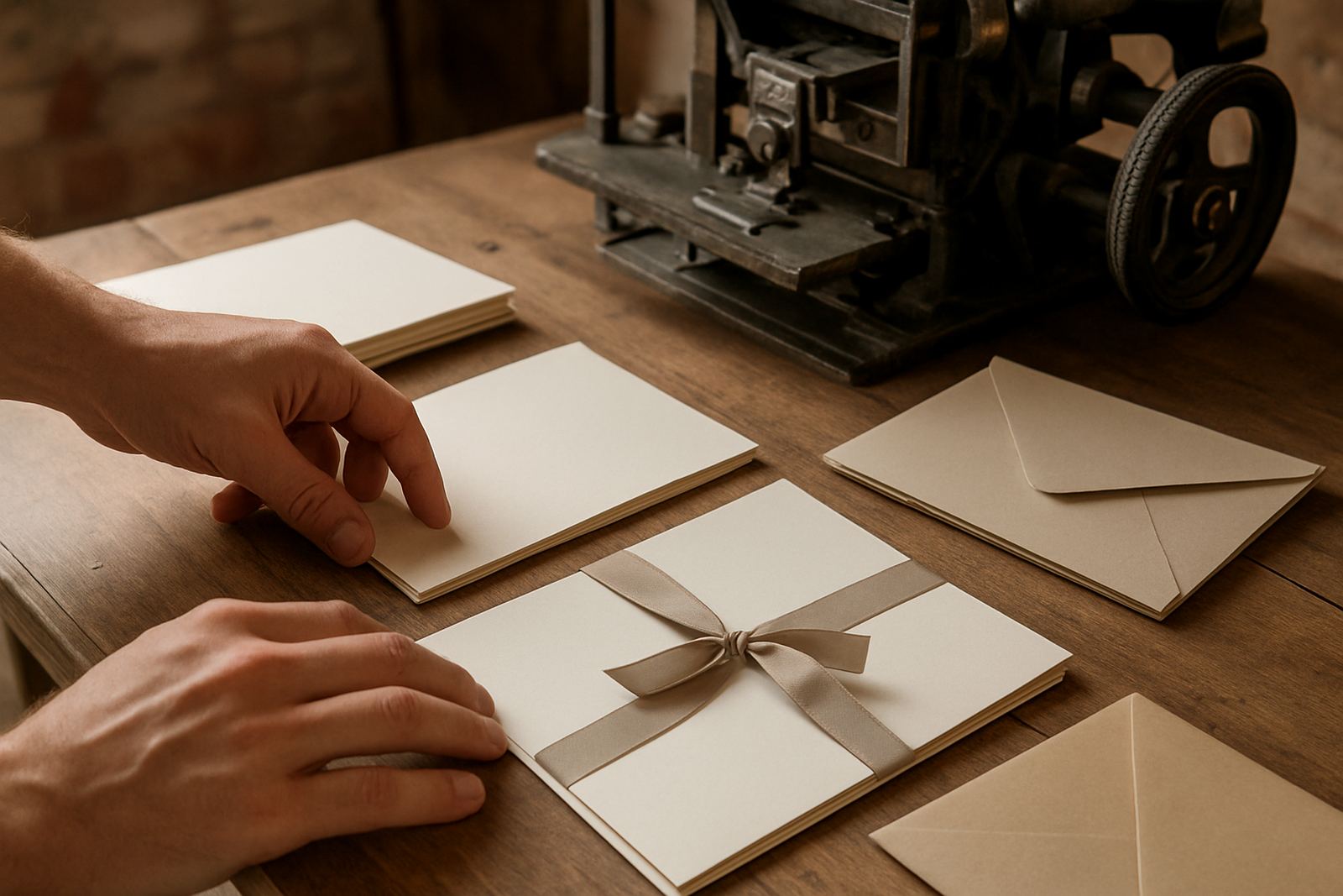
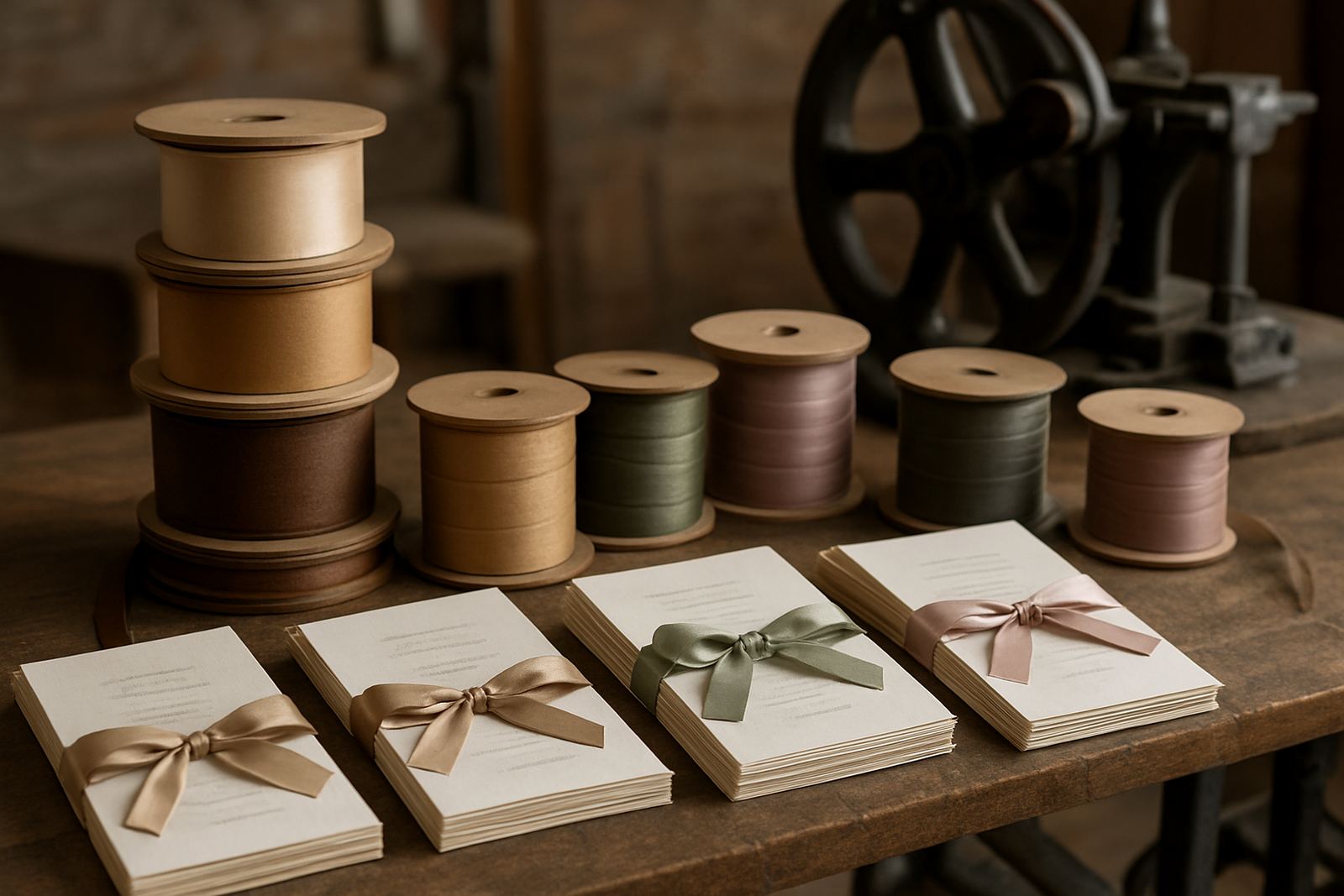
The right combination depends on what the card needs to say. A legal, financial or property business may want a restrained layout with a firm stock and limited foil. A creative studio may choose a more expressive finish, with stronger colour contrast or a textured surface. Wedding suppliers often lean toward softer paper, delicate foil and matching envelopes.
- Professional services: clean layout, heavier stock, minimal foil.
- Creative businesses: more room for texture, colour and special effects.
- Hospitality and event teams: easy-to-read type and durable stock.
- Luxury gifting or stationery: foil details, precise edges and matching sets.
A local example is a Somerset West consultant who meets clients both in office parks and at homes near the coast. That card needs to feel confident but not loud. A matte card with one foiled detail and a slight texture can do that well, without looking overdone.
Practical checks before you commit to a finish
Before ordering, it helps to look at the card under natural light and indoor light. Foil can appear brighter in some settings and softer in others. Textured stocks may show small variations, which is normal, but the artwork still needs to be set up carefully so fine lines do not disappear.
Use this simple checklist before final approval:
- Is the text readable at arm’s length?
- Does the card fit comfortably in a wallet or card holder?
- Will the finish suit both office and event use?
- Can notes be written on the back if needed?
- Will the chosen stock travel well by courier?
It also helps to think about local conditions. A card that looks good in a cool studio in Woodstock should still look tidy after being carried through heat, salt air or a long day of meetings. Small choices make a big difference here, especially when cards are sent nationwide and need to arrive in good condition.
When finish, layout and message work together
The strongest business cards are not the most decorated ones. They are the ones where the finish supports the message. Foil can highlight a name, texture can give presence, and thickness can give confidence, but the whole card still needs balance. If every part is trying to stand out, the card becomes harder to read and less useful.
For clients across Cape Town, Stellenbosch, Paarl and beyond, the best results usually come from keeping the layout simple and letting the material do some of the work. That approach gives the card a calm, well-made feel that people tend to keep. And in a stack of cards, the one that feels right in the hand is often the one that stays on top.