Why foil colour changes the whole first impression
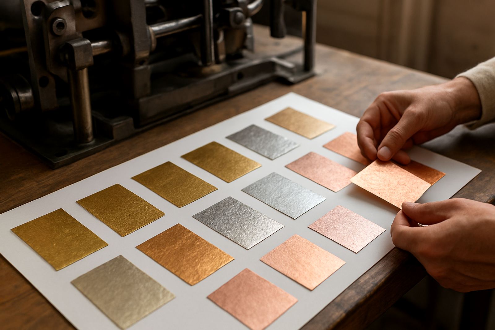
When people open an invitation, foil colour is often the first detail they notice. A soft gold reads warm and traditional, while silver can feel cooler and more contemporary. Rose gold sits somewhere in between, with a softer glow that works well for romantic events and modern designs.
In our Woodstock studio, we often see the same layout take on a very different mood simply because the foil changes. A floral monogram in gold can feel formal and celebratory. The same artwork in black foil becomes bolder and more graphic. That shift matters when you want your stationery to match the tone of a wedding, launch or private dinner.
Matching foil to paper, ink and lighting
Foil does not live on its own. It sits on paper, near ink and under the sort of light your guests will actually see it in. Coastal humidity in Cape Town can affect paper handling, so we keep stock stored carefully and allow for neat finishing before assembly. On textured paper, some foils appear slightly softer. On smooth stock, the edges of the stamping read cleaner.
For events held outdoors or in venues with low evening light, stronger contrast often works best. Pale foil on off-white paper can disappear in a dim reception hall, while darker foil on pale card stays readable. That is one reason we ask clients to think about the full setting, not just a sample strip.
- Gold on ivory: warm, classic and easy to read
- Silver on white: crisp and modern, but needs enough contrast
- Black foil on pale paper: strong for minimal layouts
- Copper on blush: rich and slightly earthy
- Soft rose gold on warm white: gentle and flattering for wedding suites
Popular foil colours and when they suit the brief
There is no single best foil colour. The right choice depends on the style of the event, the artwork and the paper colour. If you are working with a formal black tie invitation, a deep metallic gold or silver can feel appropriate. For a Cape Town beach wedding, a lighter metallic tone or muted copper may suit the setting better than a highly reflective finish.
Clients from Stellenbosch and Paarl often ask for foil that feels refined without becoming too shiny. In those cases, we usually recommend testing a few options against the chosen paper. Some foils have a mirror effect, while others sit a touch flatter. That small difference can matter a lot once the suite is fully assembled.
- Gold: traditional, elegant and versatile
- Silver: cool, formal and good for modern layouts
- Rose gold: soft, romantic and contemporary
- Copper: warm, earthy and suited to autumn colours
- Black: graphic, clean and useful for strong typography
How to choose foil for weddings, gifting and event stationery
For weddings, the foil colour should support the whole visual story. If the flowers are ivory and green, gold often blends in well. If the palette includes dusty pinks or mauves, rose gold can link the pieces together without feeling too heavy. For gift packaging and keepsake items, darker foils are useful when you want a more premium label or tag that still stays readable after handling.
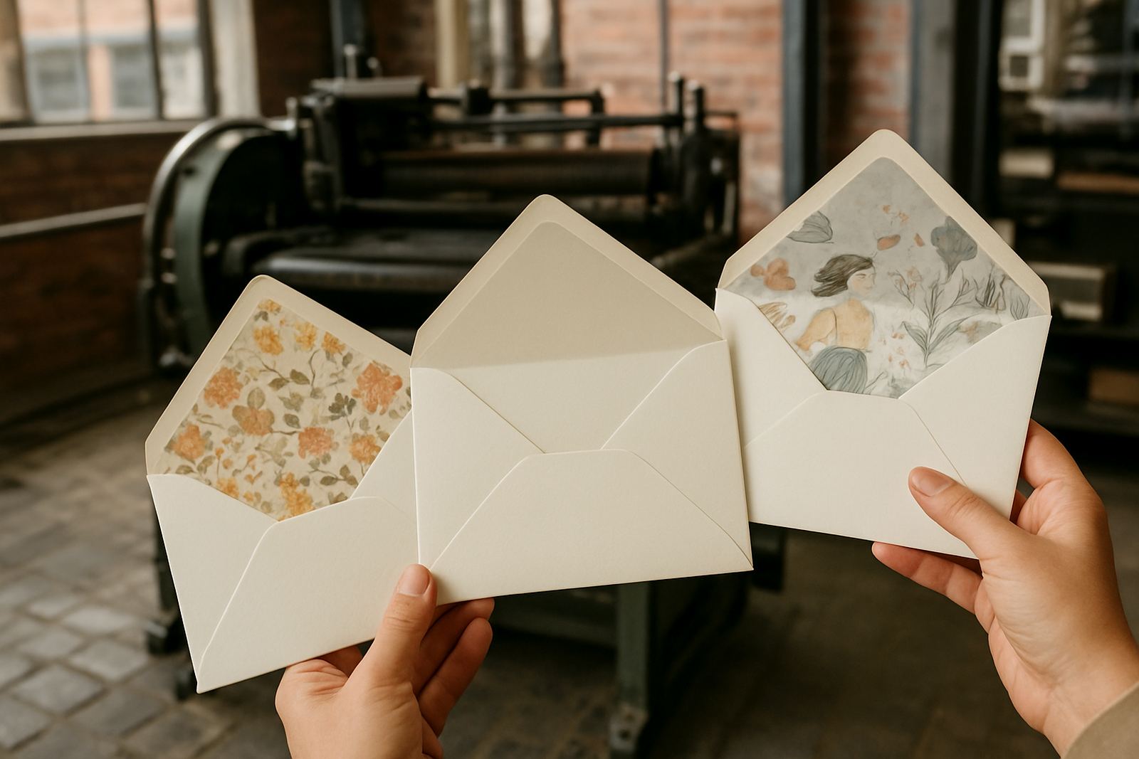
Event day stationery needs practical clarity as much as beauty. Table numbers, menus and place cards must be easy to read from a distance, so contrast matters. We also check how wax seals, ribbon and envelope liners interact with the foil. Too many shiny elements together can make a suite feel busy, so it helps to decide which detail should lead.
- Choose one main foil colour for most of the suite
- Repeat the same finish on key items for consistency
- Use a second foil only if it has a clear purpose
- Keep text readable by checking contrast first
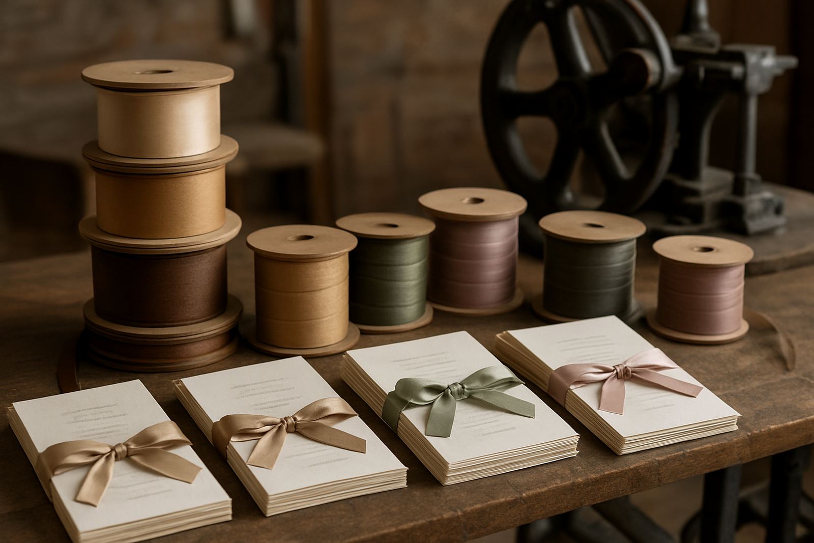
- Match the foil to ribbon, envelope colour and floral tones
Proofing foil on real samples before you commit
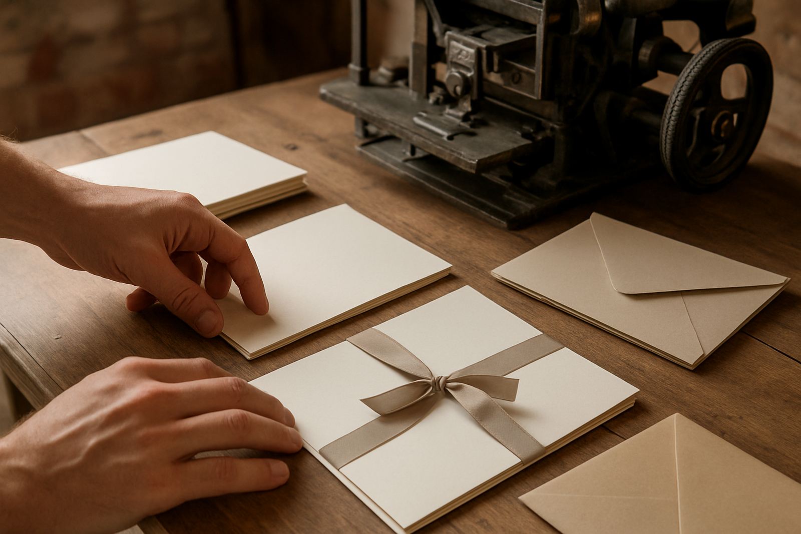
Foil is best judged in person, not on a screen. A sample strip can look one way in bright daylight and another under warm indoor lighting. That is why artwork proofing and physical sample checks are so useful before full production begins. If the project is for a large guest list or a tight event date, this step saves time and avoids costly changes later.
In practice, we look at the foil colour beside the chosen paper, envelope and print wording. A pale gold that looked ideal online might feel too faint on cream stock. A deeper gold might be the better fit if the invitation includes fine script or small details. Small differences are the thing that often decide the final result, not the big dramatic ones.
A local Cape Town example from studio to venue
We recently worked on a wedding suite for a couple in the Southern Suburbs planning their celebration in Stellenbosch. They loved the idea of metallic foil, but wanted the stationery to feel elegant rather than flashy. After comparing gold, rose gold and silver against their paper, they chose a warm gold that lifted the ivory stock without overpowering the floral artwork.
The finished suite included invitations, envelope addressing, wax seal finishing and event day stationery. Because the reception lighting was soft and the tables were candlelit, the gold caught the light gently rather than sharply. That made the whole set feel cohesive from the first envelope to the final menu card, and the result was much better than if they had chosen a cooler foil out of habit.
For clients in Woodstock, the Atlantic Seaboard or nationwide, the practical advice is the same: start with the mood you want, then test the foil against the paper and setting. It is a simple decision, but one that changes the final experience more than most people expect.