Why Soft Neutrals Keep Working Year After Year
Neutral palettes do not shout for attention, which is exactly why they keep their place in invitation design. Shades like ivory, oat, warm white, sand and pale mushroom hold up beautifully from a garden ceremony in Stellenbosch to a formal reception in the Southern Suburbs. They feel current without being tied to one season, and that makes them a practical choice for couples who want stationery that still looks right in ten years time.
In a South African setting, neutrals also help with light and photography. Strong afternoon sun in Cape Town can flatten very bright colour, while softer tones keep printed suites looking balanced. When the paper, foil and envelope all sit in the same gentle range, the whole set reads as considered rather than overly busy. It also gives guests a clear first impression before they even open the envelope.
- Ivory works well for classic formal weddings.
- Warm white suits modern minimal layouts.
- Sand and taupe soften bold floral themes.
- Pale grey can bring structure to a simple suite.
How To Use Foil Without Losing The Calm Look
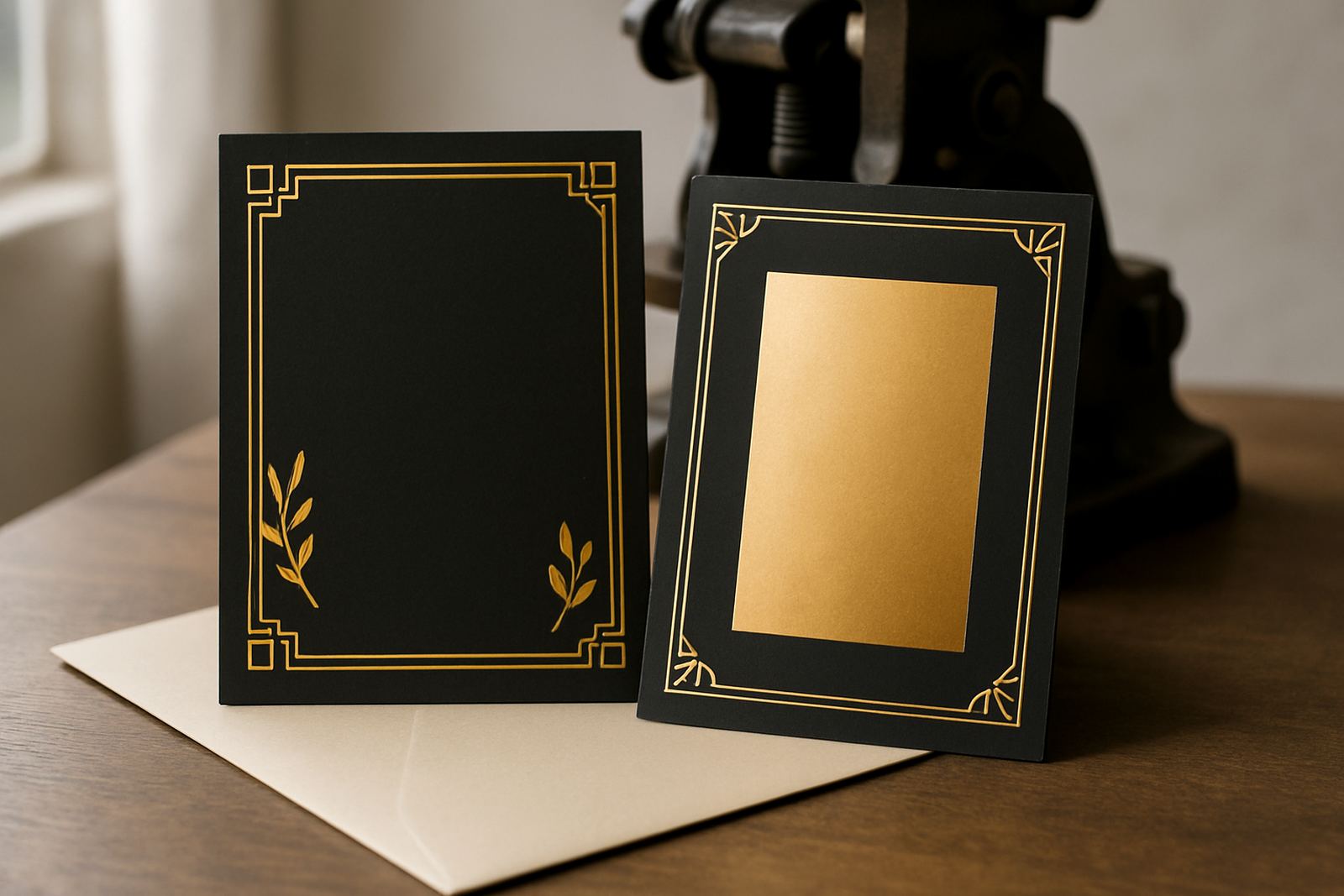
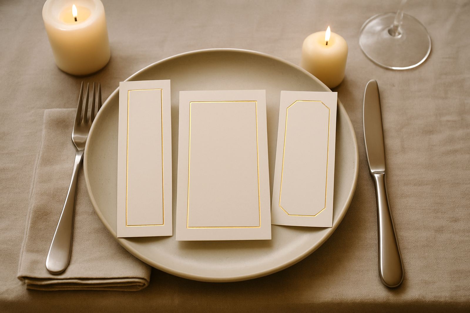
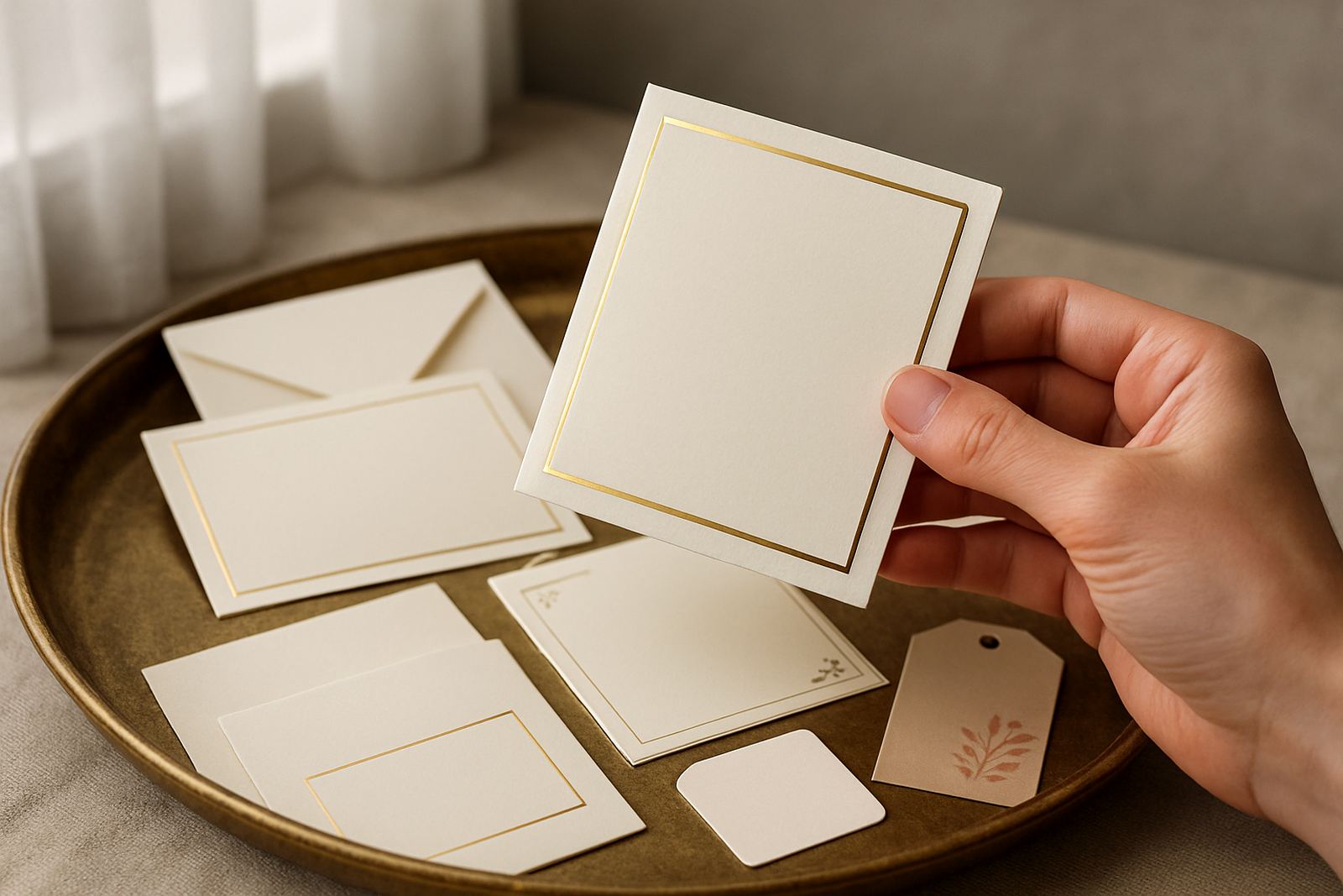
Foil stamping is often seen as a statement finish, but on a neutral palette it can stay subtle. Soft gold, champagne, pale copper and muted silver all add detail without overpowering the paper. The trick is to keep the foil placement measured. A monogram, border line, date or venue name can be enough. If every surface shines, the invitation loses that quiet feel people often want for a wedding.
Paper choice matters too. A smooth cotton sheet gives a clean finish, while a lightly textured stock adds warmth and a more tactile feel. Coastal humidity can affect certain papers if they are not stored properly, so it helps to choose stock that holds its shape well and to keep finished suites sealed until assembly. Small production details like this make a real difference, especially when invitations need to travel by courier across the country.
- Use one foil colour only for a cleaner result.
- Pair foil with plenty of open space on the page.
- Choose paper that will not curl in humidity.
- Match the envelope tone to the main card for a neat finish.
Neutral Does Not Mean Plain
A common mistake is to treat neutral as a single colour, but there is a lot of room inside the palette. Cream, bone, flax, clay, soft blush and muted sage can all sit in a neutral suite if they are used carefully. The point is not to remove personality, but to let texture, wording and finishing do more of the work. A couple who wants a refined look may still choose a wax seal, layered vellum or a letterpress border to add interest.
For local events, this approach is practical as well as pretty. A winelands venue in Paarl may call for warmer tones that sit well with sandstone and oak, while an Atlantic Seaboard function can suit cooler whites and pale greys. You get a suite that reflects the setting without locking the design into one trend. That flexibility is one reason neutral stationery feels so dependable.
Paper, Envelope and Finishing Choices That Matter
Once the colour direction is settled, the rest of the suite should support it. Envelope colour, liner style, addressing method and any add on pieces should all feel like they belong together. For example, hand-printed address labels can look too stark on a soft suite, while carefully addressed envelopes or a tone-on-tone liner keep the presentation gentle. If the design includes multiple inserts, consistency across sizes and spacing matters even more.
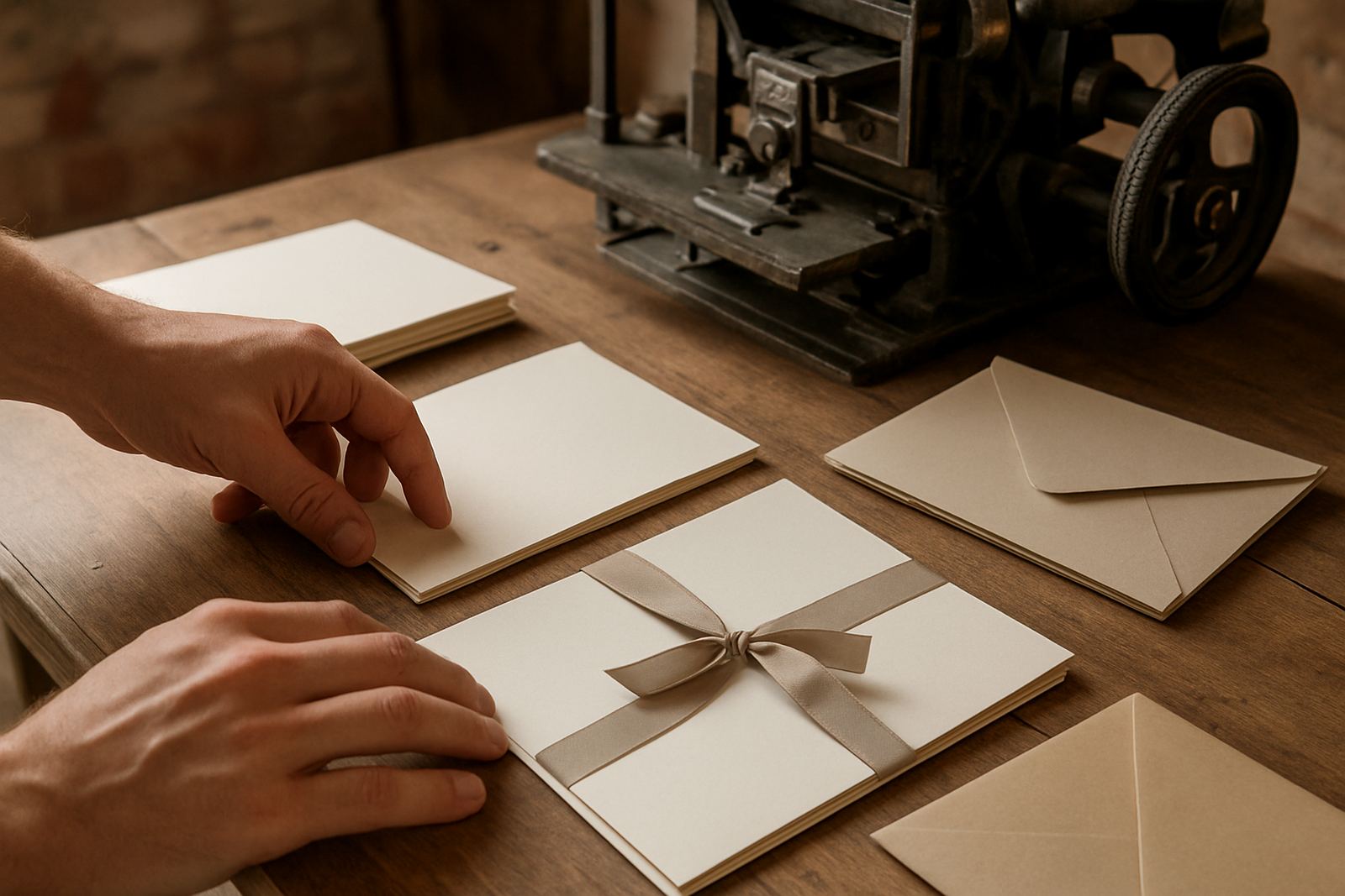
At our Woodstock studio, we often see how small choices change the whole result. A thicker card stock gives the invitation more body. A matte envelope feels quieter than a glossy one. A narrow foil border can frame the wording without crowding it. Even practical details like suite assembly and gift packaging matter when invitations need to arrive in good order, especially for clients sending to remote towns or managing multiple guest lists. It is often the tidiness of the finish that makes the suite feel special, not a pile of extras.
- Keep the main card, details card and RSVP card in the same colour family.
- Use one textured element, not four or five.
- Check that envelopes fit the inserts properly.
- Proof wording before the final foil stage, changes after that can get expensive.
A Cape Town Example From Design Table To Courier Bag
One recent example was a couple planning a small Cape Town wedding with guests coming from Johannesburg, Durban and the Winelands. They wanted a neutral suite that felt elegant but not formal to the point of stiffness. We started with a warm white main card, added pale champagne foil for the names and date, then used a slightly deeper sand envelope to create contrast. The finish stayed calm, but the suite still had enough detail to feel personal.
Because some guests were overseas and others were local, the couple needed the stationery to be assembled carefully and sent out in batches. That meant colour matching had to be consistent across reprints, and the envelopes had to hold up well in transit. The final suite worked in a city apartment, a Somerset West garden setting and a church hall in the Northern Suburbs without looking out of place. That kind of range is where neutral palettes really earn their keep.
For many South African weddings, the best stationery is not the loudest one. It is the suite that sits comfortably alongside flowers, tableware, venue interiors and the rest of the day. Neutral tones do that well because they leave space for everything else to breathe, and they still photograph neatly after the event, which couples appreciate more than they expect.
Choosing A Neutral Palette That Still Feels Personal
If you are deciding on a direction, start with the mood of the day rather than the colour first. Ask whether the event is formal or relaxed, coastal or inland, modern or traditional. Then build the palette around that answer. A soft neutral suite can still carry plenty of character through typography, layout and finishing. It just does so in a quieter way.
The best neutral invitations usually have one clear point of focus. It might be a foil monogram, a letterpress border, a wax seal or a carefully chosen envelope lining. Everything else should support that feature. When the suite is balanced like this, it feels intentional and timeless instead of bland. And that is what makes neutral palettes such a sensible choice for weddings across Cape Town and beyond.