Start With the Table Setting, Not the Typography
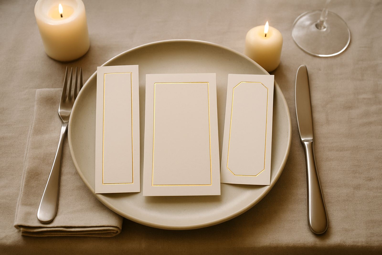
Before you choose a font or a foil colour, think about where the menu will sit. A plated dinner at a Cape Town wine estate calls for a different format from a long banquet table in Woodstock or a coastal marquee in Blouberg. If the plate, charger, cutlery and glassware already fill most of the place setting, the menu needs to stay slim and upright, or it will look crowded.
For most events, the cleanest menu layout is the one that respects the table space first. A narrow card works well when it sits above the plate, while a folded card suits a side setting or a layered place setting. If the venue is using linen napkins, flowers and candlesticks, keep the menu simple so it does not disappear into the rest of the decor. Good layout is about giving the eye a clear path from name to starter to dessert, with no clutter in the way.
- Use portrait layouts for formal plated service.
- Choose landscape when the menu has a shorter list and more white space.
- Keep key details visible from one seated position, no twisting or lifting needed.
Choose a Format That Matches the Service Style
The menu layout should follow the way food is being served. A tasting menu, buffet or family style meal each needs a different structure. If the chef is sending out multiple courses, a tall single-panel menu can keep the sequence neat. For buffet functions, a folded menu or tent card helps explain the flow without taking up too much room.
At weddings, many couples want the menu to double as part of the table styling. That works best when the layout is modest and balanced. A very ornate design can become hard to read once candles are lit and glasses catch reflections. In Cape Town venues with strong afternoon sun, gloss finishes can pick up glare so matte stock often reads better, especially if the reception runs into the evening and the lighting changes. On the coast, heavier paper also helps the card stay flat when the humidity comes up.
- Single-panel cards suit formal plated dinners.
- Folded cards work well for longer menus and tasting notes.
- Tent cards are practical for buffet tables and shared settings.
When a layout is matched to service, the menu feels organised and calm. That matters at events where guests are arriving from Stellenbosch, Paarl or the Southern Suburbs and need to find their place, their meal and the schedule quickly.
Spacing Does More Work Than Decoration
Readable menu design is mostly about spacing. A menu with generous margins, clear line breaks and a sensible font size will always outperform one that is packed edge to edge. Foil stamping adds refinement, but it should not do the heavy lifting on its own. If the words are cramped, even the nicest finish will not save the layout.
We usually recommend a strong hierarchy: the title at the top, course names below, and descriptions only where they add real value. For example, a three-course wedding menu can be clean and elegant with just the dish name and a short ingredient note. Overwriting the layout with too many details makes it harder to follow. A little restraint goes a long way, and it also leaves room for the foil detail to shine without shouting.
- Keep body text large enough to read in low evening light.
- Use line spacing that lets each course breathe.
- Leave blank space around the edges so the card does not feel heavy.
For events in older venues around Cape Town where table lamps or candles are the main light source, this kind of spacing is even more important. Guests should be able to read the menu without leaning in or moving the card under a lamp.
Paper, Finish and Foil Need to Work Together
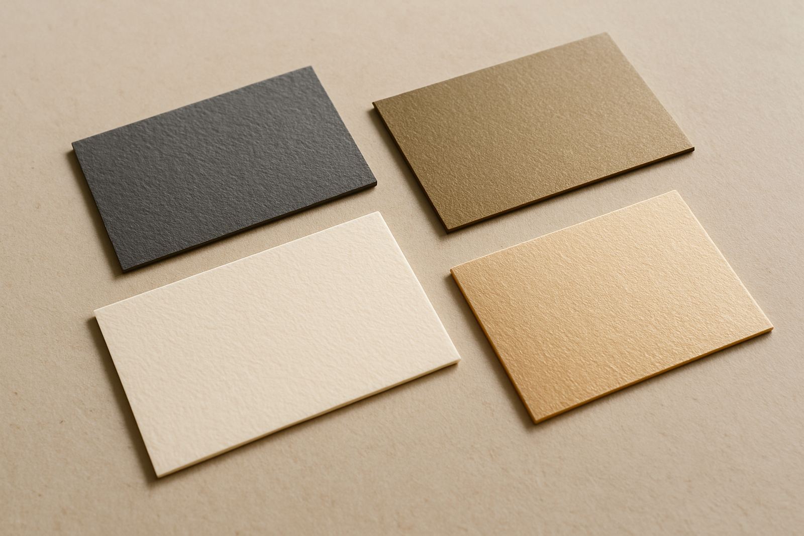
The paper stock affects how the whole layout feels in the hand. A soft cotton stock suits letterpress and foil beautifully, while a smooth premium board gives crisp results for fine typography. If the menu is being handled repeatedly during a larger function, choose a stock that is firm enough to stay upright and not curl at the edges. That is especially useful for outdoor weddings in the Atlantic Seaboard where breeze and damp air can be part of the evening.
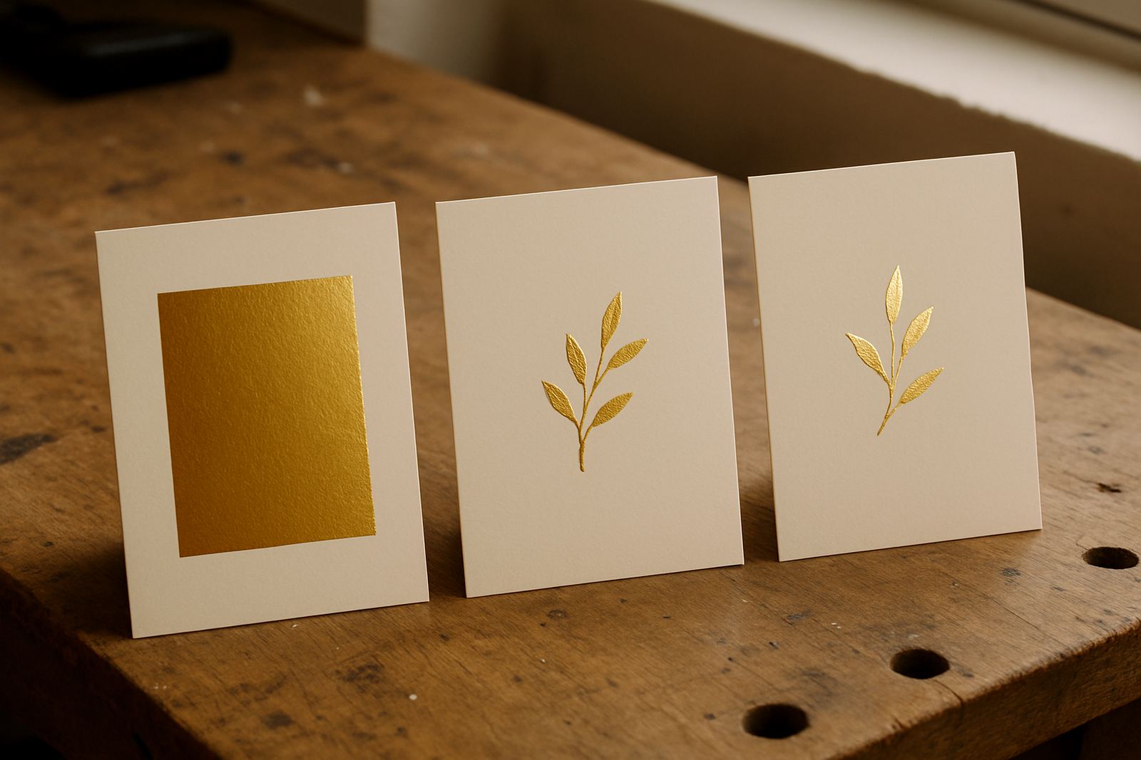
Foil can be used in the title, border or section headings, but it works best when used sparingly. Gold, copper and silver all have their place, yet the right choice depends on the table linen, floral colours and lighting. A warm metallic can suit autumn tones, while a cooler finish may suit a black tie reception or a pale coastal palette. Colour matching matters too, particularly when the menu needs to sit alongside invitations, place cards and table numbers.
- Use heavier stock for tent cards and folded formats.
- Match foil tone to the flowers, linen and candlelight.
- Test the layout against the final print size before production.
In humid conditions or where the venue is open to sea air, paper choice is not only about looks. It also helps the menu stay neat from setup to the last course.
How to Keep a Menu Elegant Without Overcomplicating It
The most common mistake is trying to make the menu do too much. A menu is not a programme, a gift card or a table plan. It should tell guests what they are eating and do it with poise. If the wording is too long, the layout loses its shape. If the type is too decorative, the menu can become difficult to scan quickly.
There is real value in a restrained design. A single accent line, a small monogram or a subtle foil border can frame the text without taking over. For weddings, many couples ask for initials or a small motif at the top, which is enough to tie the menu into the rest of the stationery suite. The goal is not to fill every inch. It is to make the card feel considered.
- Shorten dish descriptions where possible.
- Use one or two fonts at most.
- Keep decorations consistent with the rest of the event stationery.
A neat menu layout also makes packing and assembly easier when you are preparing multiple tables, especially for larger functions across Cape Town, the Northern Suburbs or the Winelands. Less clutter means fewer mistakes during finishing and sorting.
A Local Example for a Cape Town Reception
Picture a wedding reception in Woodstock with a guest list travelling in from the Southern Suburbs, Stellenbosch and Paarl. The venue has long tables, white linen and low floral centrepieces, with dinner starting just as the light begins to drop. In that setting, a slim folded menu in warm ivory stock with a small foil title works well. It is elegant, easy to place and simple to read across a busy table.
For this kind of event, the layout would usually be organised in three clear blocks: welcome, courses and dietary notes. A left aligned format can feel modern, while centred text creates a more formal look. The important thing is consistency across the suite so the menu feels like part of the same event, not an extra item added at the last minute. That bit of planning saves time on the day and keeps the setup neat when the team is moving fast.
- Use one layout style across all tables.
- Make sure venue lighting is considered before final print approval.
- Keep spare menus packed separately for last minute guest changes.
Whether the order is going out locally in Cape Town or couriered nationwide, the best menu layout is the one that arrives ready to place and still looks good after travel. That is why careful assembly and proofing matter just as much as the final finish.
Proof the Layout Before It Goes to Print
Even a beautiful layout can fail if the proof is rushed. Always check the menu at actual size, not just on a screen. The line breaks, spacing and paper weight should all be reviewed together. If a line feels tight or a course name runs too long, adjust it before production. Small changes now prevent awkward trimming or reworking later.
It also helps to read the menu out loud. That catches repeated words, awkward breaks and missing punctuation that are easy to miss on a quick skim. At high-end events, the detail matters. A guest may only spend ten seconds with the card, but those ten seconds should feel polished from start to finish.
For weddings and formal functions, a strong menu layout is one that is calm, legible and suited to the setting. It should reflect the tone of the day without overpowering the table. When the format, paper and finish all work together, the menu does its job quietly and well.