What Serif Type Does Best on Formal Stationery
Serif lettering uses small finishing strokes at the ends of letters, which gives the text a steady, classic look. On invitation suites, that steadiness helps guests read the important details quickly, especially when the print is small or the wording is fairly long.
For weddings, serif type suits couples who want a calm, refined feel without making the card feel too busy. It works well for venue addresses, RSVP notes and order-of-service booklets where clarity matters as much as style. In Cape Town, where many weddings mix city venues with garden settings, a serif style also holds up nicely on textured papers and warmer cream stocks.
- Best for names, dates and addresses that must read at a glance
- Works well with classic layouts and wider margins
- Pairs neatly with foil stamping, letterpress finishing and embossing
- Handles long lines of text better than highly decorative lettering
Why Script Feels Personal, Soft and Occasion-Ready
Script lettering brings a more flowing, handwritten mood. It often feels romantic and personal, which is why many couples choose it for names, monograms or a short quote on the front of an invitation. When used carefully, it can turn a simple card into something that feels considered and intimate.
The key word is carefully. Script should support the wording, not compete with it. If every line is in a decorative script, the invitation can become hard to read, especially for older guests or when the card is printed in a small size. A good rule is to use script for emphasis, then keep the rest of the text in a clear serif or clean sans serif style. That balance is what gives the suite its polish.
- Best for names, short headings and signature moments
- Ideal for romantic, garden and evening wedding themes
- Needs enough spacing so the loops do not crowd each other
- Can lose clarity if used for long paragraphs or tiny text
Reading Clarity Should Decide More Than Taste Alone
Most couples start with mood, but reading clarity should come first. An invitation is not a poster, its a working piece of stationery. Guests need to see who, what, where and when without squinting or guessing.
Serif styles usually win when the wording is dense or the format is compact. Script can still work beautifully, but only where there is room for the letter shapes to breathe. If the invitation includes a church name, reception venue, map notes and RSVP instructions, using script everywhere may create unnecessary strain. This is especially relevant for stationery sent by courier nationwide, where the card must arrive looking crisp and remain easy to read after handling.
A practical test is simple: step back from the proof and glance once. If the date or venue takes a second look, the lettering needs adjusting. If the main names are readable immediately, the style is doing its job.
Matching Lettering Style to Paper, Foil and Finishing
The lettering choice also depends on the materials. Foil stamping works beautifully with both serif and script, but each reacts differently to the paper surface and the amount of detail in the letters. Fine script can look elegant in foil, yet it needs enough pressure and spacing to keep the thin joins clean. Serif lettering gives a sharper impression on papers with a bit of tooth, which can be useful for luxury suites with letterpress finishing or deckle-edge elements.
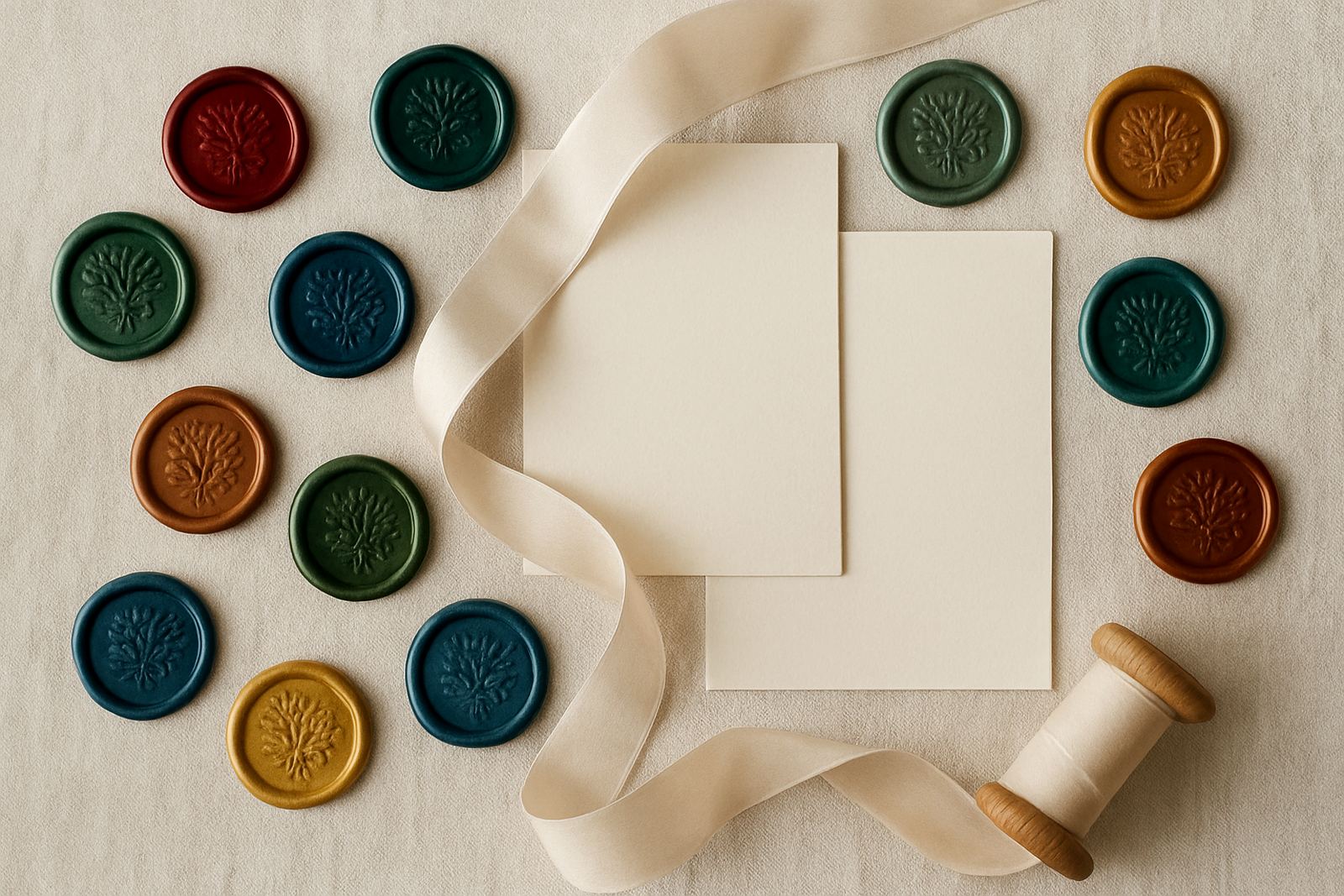
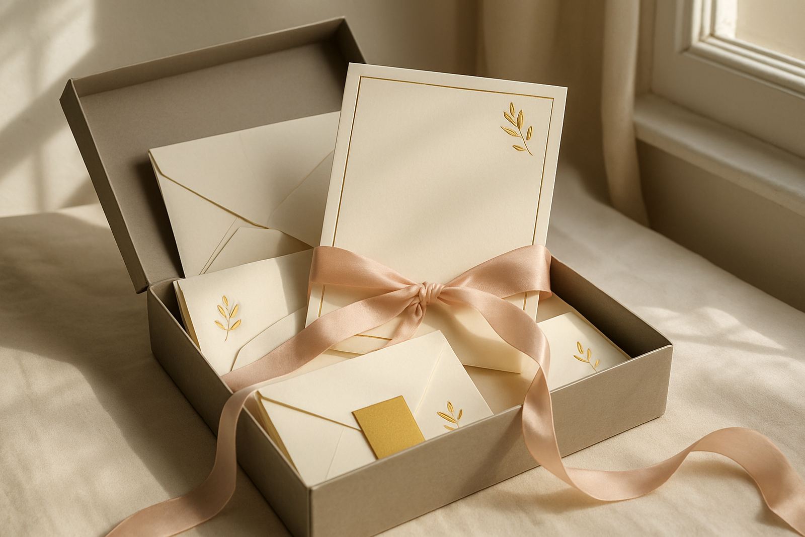
On coastal jobs, especially for clients in the Atlantic Seaboard or around Somerset West where humidity can be high, paper selection matters. Softer stocks can react differently to heat and handling, so the chosen lettering style must suit the paper as much as the event theme. For a wax-sealed suite or gift packaging, the lettering should also stay legible when layered with envelopes, address panels and inserts.
- Use serif on textured paper for stronger readability
- Use script sparingly when foil lines are very fine
- Choose heavier paper for layered suites and sealing wax
- Ask for artwork proofing before final production
A Woodstock Wedding Example: Soft Romance Without Losing Structure
Picture a couple planning a summer wedding in Stellenbosch, with a reception in the Cape Winelands and guests travelling in from Cape Town, Paarl and the Southern Suburbs. They want a soft romantic feel, but they also need the details to be clear because many guests will be receiving the suite by courier.
The strongest solution is often mixed lettering. The couple’s names can appear in a graceful script on the outer card, while the venue details and RSVP information stay in a serif font inside. That way the suite feels warm and personal, but nobody has to work hard to find the practical information. It also gives the finishing specialist room to add foil, envelope addressing and a neat assembly order without crowding the layout.
For a Woodstock studio handling a full run, this approach saves time during proofing too. One style carries the mood, the other carries the facts.
How to Choose Serif or Script for Your Own Suite
If you are deciding between the two, start with the event tone, then check the amount of text. A black-tie evening reception with a short invitation body can carry more script. A multi-card suite with directions, accommodation notes and dietary prompts should lean more heavily on serif. If you want a blend of both, keep one style for display and one for reading.
It also helps to think about who will be opening the envelope. A modern wedding with younger guests may tolerate more flourish, but family guests often appreciate clear lettering that reads straight away. In practical terms, the safest choice is usually a serif base with script accents. That gives you style without risking confusion, and it tends to age well across different printing methods and paper colours.
- Short wording allows more script
- Long wording calls for serif clarity
- Use one style for headings and one for body text
- Check proofs in daylight, not under warm indoor light only
At the end of the day, the right choice is the one that feels right and still reads cleanly. Serif brings order. Script brings mood. The best invitation often uses both in the right places.